FabCon is coming to Atlanta
Join us at FabCon Atlanta from March 16 - 20, 2026, for the ultimate Fabric, Power BI, AI and SQL community-led event. Save $200 with code FABCOMM.
Register now!Go To
- Power BI forums
- Get Help with Power BI
- Desktop
- Service
- Report Server
- Power Query
- Mobile Apps
- Developer
- DAX Commands and Tips
- Custom Visuals Development Discussion
- Health and Life Sciences
- Power BI Spanish forums
- Translated Spanish Desktop
- Training and Consulting
- Instructor Led Training
- Dashboard in a Day for Women, by Women
- Galleries
- Data Stories Gallery
- Themes Gallery
- Contests Gallery
- Quick Measures Gallery
- Notebook Gallery
- Translytical Task Flow Gallery
- TMDL Gallery
- R Script Showcase
- Webinars and Video Gallery
- Ideas
- Custom Visuals Ideas (read-only)
- Issues
- Issues
- Events
- Upcoming Events
Turn on suggestions
Auto-suggest helps you quickly narrow down your search results by suggesting possible matches as you type.
Showing results for
To celebrate FabCon Vienna, we are offering 50% off select exams. Ends October 3rd. Request your discount now.
- Power BI forums
- Issues
- Issues
- bug - Bullet Chart by OKViz
Idea Options
- Subscribe to RSS Feed
- Mark as New
- Mark as Read
- Bookmark
- Subscribe
- Printer Friendly Page
- Report Inappropriate Content
0
bug - Bullet Chart by OKViz
Submitted by
aeyre_ppba
 on
10-22-2017
10:55 PM
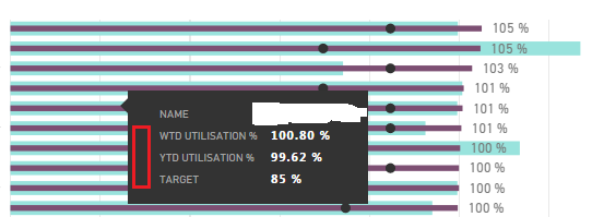
Using the Bullet Chart by OKViz visualisation, there used to be a colour/color next to each of the values when hovering over a Category name, indicated where by the red highlight appears below. ie purple for the WTD and green for the YTD values
Can this be restored?
It would aid interpretation/readability of the data.
See more ideas labeled with:
Comments
You must be a registered user to add a comment. If you've already registered, sign in. Otherwise, register and sign in.
Latest Comments
- Pig1838 on: DirectQuery not available anymore in Incremental r...
- DataMindedLLC on: 'Refresh Preview' gone from Home Menu Bar in Aug 2...
- qutnd on: Issue with giving Power BI App access to new users
- Sree9100822653 on: undefinedHow to send daily RLS-based Power BI repo...
- Bart_Berg on: Export Data to Excel from powerbi embed reports | ...
- annelebel on: August 2025 Update Changed DirectQuery so each tab...
- manu_panizi on: Direct Query Mode Missing
- Jstukenborg on: Data on Power BI desktop is not refreshing
- noahfox on: Fabric 'Deploy Stage Content' API fails when user ...
- erpfau on: Fields Parameter w. hierarchies: provide option to...
Idea Statuses
- New 8,112
- Needs Info 3,502
- Investigating 3,602
- Accepted 2,088
- Declined 38
- Delivered 3,970
-
Reports
10,274 -
Data Modeling
4,159 -
Dashboards
4,124 -
Report Server
2,121 -
Gateways
2,120 -
APIS and Embedding
1,972 -
Custom Visuals
1,795 -
Content Packs
527 -
Mobile
354 -
Need Help
11 -
Show and Tell
3 -
General Comment
2 -
Tips and Tricks
1 -
Power BI Desktop
1
