Idea Options
- Subscribe to RSS Feed
- Mark as New
- Mark as Read
- Bookmark
- Subscribe
- Printer Friendly Page
- Report Inappropriate Content
0
Different Visual Output between PowerBI Desktop and PowerPoint Tile
Submitted by
Pleojera
on
12-01-2023
01:15 AM
Hi all,
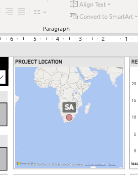
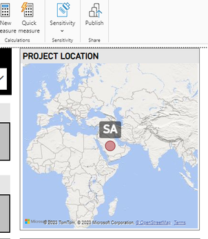
Very strange thing here. I'd like to visualize my project locations. Saudi Arabia is shortened as SA and shown correctly on desktop app and the web, but in PowerPoint, it places the pin on South Africa. Databases are the same, values are the same, same visual, same abbreviation... How come?

See more ideas labeled with:
Comments
You must be a registered user to add a comment. If you've already registered, sign in. Otherwise, register and sign in.
Latest Comments
-
allyklee
 on:
Remove / Copy Visual issue - July 2025 Desktop Iss...
- stipa on: Error "[403.12–403.30] The name 'Lakehouse.Content...
-
klinejordan
 on:
URL is not filtering on field parameter
- MaAl on: "The import PowerPlatform.Dataflows matches no exp...
-
NikNithiy
 on:
URGENT!! Paginated Report not loading on Mozilla F...
- duarte on: Unable to sort months in PowerBI
- zsombor on: Matrix Visual doesn't work with Field Parameters ...
-
 mattlee
on:
“Add Value” in Textbox Not Visible in Dark Theme
- mattin on: Report Server Permissions Jan/May 2025
-
bhalicki
 on:
Bi Crashes on launch with (AS Process PID=XXXXXX H...
Idea Statuses
- New 8,049
- Needs Info 3,502
- Investigating 3,602
- Accepted 2,088
- Declined 38
- Delivered 3,970
-
Reports
10,247 -
Data Modeling
4,135 -
Dashboards
4,116 -
Gateways
2,116 -
Report Server
2,116 -
APIS and Embedding
1,966 -
Custom Visuals
1,790 -
Content Packs
525 -
Mobile
354 -
Need Help
11 -
Show and Tell
3 -
General Comment
2 -
Tips and Tricks
1 -
Power BI Desktop
1
