Join us at the 2025 Microsoft Fabric Community Conference
Microsoft Fabric Community Conference 2025, March 31 - April 2, Las Vegas, Nevada. Use code MSCUST for a $150 discount.
Register now- Power BI forums
- Get Help with Power BI
- Desktop
- Service
- Report Server
- Power Query
- Mobile Apps
- Developer
- DAX Commands and Tips
- Custom Visuals Development Discussion
- Health and Life Sciences
- Power BI Spanish forums
- Translated Spanish Desktop
- Training and Consulting
- Instructor Led Training
- Dashboard in a Day for Women, by Women
- Galleries
- Webinars and Video Gallery
- Data Stories Gallery
- Themes Gallery
- Contests Gallery
- Quick Measures Gallery
- R Script Showcase
- COVID-19 Data Stories Gallery
- Community Connections & How-To Videos
- 2021 MSBizAppsSummit Gallery
- 2020 MSBizAppsSummit Gallery
- 2019 MSBizAppsSummit Gallery
- Events
- Ideas
- Custom Visuals Ideas
- Issues
- Issues
- Events
- Upcoming Events
The Power BI DataViz World Championships are on! With four chances to enter, you could win a spot in the LIVE Grand Finale in Las Vegas. Show off your skills.
- Power BI forums
- Forums
- Get Help with Power BI
- Desktop
- line chart with secondary y axis and legend
- Subscribe to RSS Feed
- Mark Topic as New
- Mark Topic as Read
- Float this Topic for Current User
- Bookmark
- Subscribe
- Printer Friendly Page
- Mark as New
- Bookmark
- Subscribe
- Mute
- Subscribe to RSS Feed
- Permalink
- Report Inappropriate Content
line chart with secondary y axis and legend
- Mark as New
- Bookmark
- Subscribe
- Mute
- Subscribe to RSS Feed
- Permalink
- Report Inappropriate Content
Hi @Frankie_Vannini
No core line/area chart doesn't have all the functionalities as attached.
A comparison chart is available at market place so you can download it from there.
You can suggest adding these functionalities as idea by the link:
https://ideas.fabric.microsoft.com/
If this post helps, then please consider Accepting it as the solution to help the other members find it more quickl
Rita Fainshtein | Microsoft MVP
https://www.linkedin.com/in/rita-fainshtein/
Blog : https://www.madeiradata.com/profile/ritaf/profile
- Mark as New
- Bookmark
- Subscribe
- Mute
- Subscribe to RSS Feed
- Permalink
- Report Inappropriate Content
Hi there, my answer finally is there after it has been removed from Spam
I've not clearly understood if with the line chart I can obtain something as described above, something that is similar on the result I can obtain using the Comparison Chart Visual (that indeed has other problems)
https://appsource.microsoft.com/en-us/product/power-bi-visuals/WA200002554?tab=Overview
Thanks in advance for your help
F
- Mark as New
- Bookmark
- Subscribe
- Mute
- Subscribe to RSS Feed
- Permalink
- Report Inappropriate Content
Hi @Frankie_Vannini
No core line/area chart doesn't have all the functionalities as attached.
A comparison chart is available at market place so you can download it from there.
You can suggest adding these functionalities as idea by the link:
https://ideas.fabric.microsoft.com/
If this post helps, then please consider Accepting it as the solution to help the other members find it more quickl
Rita Fainshtein | Microsoft MVP
https://www.linkedin.com/in/rita-fainshtein/
Blog : https://www.madeiradata.com/profile/ritaf/profile
- Mark as New
- Bookmark
- Subscribe
- Mute
- Subscribe to RSS Feed
- Permalink
- Report Inappropriate Content
Hi @Frankie_Vannini ,
Just as @Ritaf1983 says, line chart with secondary y axis and legend has already existed.
We can add Secondary y-axis and Legend. I think you can read this document and the topic for a further study: Create line charts in Power BI - Power BI | Microsoft Learn and Solved: Add a secondary Y axis on a line chart with Legend - Microsoft Fabric Community
Best Regards
Yilong Zhou
If this post helps, then please consider Accept it as the solution to help the other members find it more quickly.
- Mark as New
- Bookmark
- Subscribe
- Mute
- Subscribe to RSS Feed
- Permalink
- Report Inappropriate Content
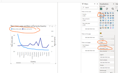
This functionality already exists:
If this post helps, then please consider Accepting it as the solution to help the other members find it more quickly
Rita Fainshtein | Microsoft MVP
https://www.linkedin.com/in/rita-fainshtein/
Blog : https://www.madeiradata.com/profile/ritaf/profile
- Mark as New
- Bookmark
- Subscribe
- Mute
- Subscribe to RSS Feed
- Permalink
- Report Inappropriate Content
No it doesn't work if you add a legend using the related field. There are only third party paid solutions, so far
- Mark as New
- Bookmark
- Subscribe
- Mute
- Subscribe to RSS Feed
- Permalink
- Report Inappropriate Content
Hi @Frankie_Vannini
2 Y axes are 2 different measures ...
It just cannot work in any other way logically...
Maybe I am missing something in your request, please show the expected results...
Rita Fainshtein | Microsoft MVP
https://www.linkedin.com/in/rita-fainshtein/
Blog : https://www.madeiradata.com/profile/ritaf/profile
- Mark as New
- Bookmark
- Subscribe
- Mute
- Subscribe to RSS Feed
- Permalink
- Report Inappropriate Content
Hi @Ritaf1983, I'm trying to post a replay however the reply is marked as spam and it disappears. I don't understand why!
- Mark as New
- Bookmark
- Subscribe
- Mute
- Subscribe to RSS Feed
- Permalink
- Report Inappropriate Content
I already posted an answer but it disappeared ....
Anyway, to make it simple, assume this scenario as per the (dummy) table below where:
X-axis is a calculated column and is a number from -x to 0
Year is the fiscal year, so the 2023 data is actual and the 2024 data is also actual. The forecast number is the 2023 data plus a percentage I get from a RELATED dataset.
I then have one measure of the running total for the actual 2023 and 2024 and another measure of the running total for the forecast.
The aim is to get a graph where on the x-axis I have values from -x down to 0 (depending on the filters enabled on the dashboard), then I have a line with the 2023 data down to 0, a line with the 2024 data down to a certain value, and a line with the Fcast data down to 0. I currently use the value from running tital fcast as a tooltip and it displays the data correctly, but I would like to display it as a line along with the others as the x-axis is common. something like the attached "manual" line chart
I hope this helps to better explain
Thanks in advance for your help
| X AXIS | year (Legend) | Running total values measure | Running total forecast |
| -20 | 2023 | 112 | 123 |
| -19 | 2023 | 114 | 125 |
| -18 | 2023 | 116 | 128 |
| -17 | 2023 | 118 | 130 |
| -16 | 2023 | 120 | 132 |
| -15 | 2023 | 122 | 134 |
| -14 | 2023 | 124 | 136 |
| -13 | 2023 | 126 | 139 |
| -12 | 2023 | 128 | 141 |
| -11 | 2023 | 130 | 143 |
| -10 | 2023 | 132 | 145 |
| -9 | 2023 | 134 | 147 |
| -8 | 2023 | 136 | 150 |
| -7 | 2023 | 138 | 152 |
| -6 | 2023 | 140 | 154 |
| -5 | 2023 | 142 | 156 |
| -4 | 2023 | 144 | 158 |
| -3 | 2023 | 146 | 161 |
| -2 | 2023 | 148 | 163 |
| -1 | 2023 | 150 | 165 |
| 0 | 2023 | 152 | 167 |
| -20 | 2024 | 110 | |
| -19 | 2024 | 115 | |
| -18 | 2024 | 120 | |
| -17 | 2024 | 125 | |
| -16 | 2024 | 130 | |
| -15 | 2024 | 135 | |
| -14 | 2024 | 140 | |
| -13 | 2024 | 145 | |
| -12 | 2024 | 150 | |
| -11 | 2024 | 155 | |
| -10 | 2024 | 160 | |
| -9 | 2024 | 165 |


