- Power BI forums
- Updates
- News & Announcements
- Get Help with Power BI
- Desktop
- Service
- Report Server
- Power Query
- Mobile Apps
- Developer
- DAX Commands and Tips
- Custom Visuals Development Discussion
- Health and Life Sciences
- Power BI Spanish forums
- Translated Spanish Desktop
- Power Platform Integration - Better Together!
- Power Platform Integrations (Read-only)
- Power Platform and Dynamics 365 Integrations (Read-only)
- Training and Consulting
- Instructor Led Training
- Dashboard in a Day for Women, by Women
- Galleries
- Community Connections & How-To Videos
- COVID-19 Data Stories Gallery
- Themes Gallery
- Data Stories Gallery
- R Script Showcase
- Webinars and Video Gallery
- Quick Measures Gallery
- 2021 MSBizAppsSummit Gallery
- 2020 MSBizAppsSummit Gallery
- 2019 MSBizAppsSummit Gallery
- Events
- Ideas
- Custom Visuals Ideas
- Issues
- Issues
- Events
- Upcoming Events
- Community Blog
- Power BI Community Blog
- Custom Visuals Community Blog
- Community Support
- Community Accounts & Registration
- Using the Community
- Community Feedback
Earn a 50% discount on the DP-600 certification exam by completing the Fabric 30 Days to Learn It challenge.
- Power BI forums
- Forums
- Get Help with Power BI
- Desktop
- Re: Which Visual to use if Increase or Decrease
- Subscribe to RSS Feed
- Mark Topic as New
- Mark Topic as Read
- Float this Topic for Current User
- Bookmark
- Subscribe
- Printer Friendly Page
- Mark as New
- Bookmark
- Subscribe
- Mute
- Subscribe to RSS Feed
- Permalink
- Report Inappropriate Content
Which Visual to use if Increase or Decrease
Hi,
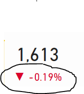
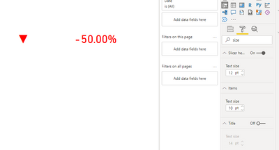
I am after a visual like something below, which it will show a arrown down if the % value is negative and arrow showing up if the % value is positive
The DAX I have that tells be the percentage is the below
Thanks
Solved! Go to Solution.
- Mark as New
- Bookmark
- Subscribe
- Mute
- Subscribe to RSS Feed
- Permalink
- Report Inappropriate Content
Hi, @AvPowerBI
You need to create cards for arrown icon and data separately and apply custom color measure to the color of data lable.
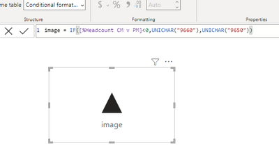
1. create arrown icon card
image = IF([%Headcount CM v PM]<0,UNICHAR("9660"),UNICHAR("9650"))
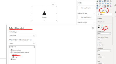
2.create meausre 'color' and apply it to the color of card data label
color = IF([%Headcount CM v PM]<0,"red","green")
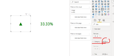
result:
Best Regards,
Community Support Team _ Eason
- Mark as New
- Bookmark
- Subscribe
- Mute
- Subscribe to RSS Feed
- Permalink
- Report Inappropriate Content
Use KPI Card this will give you the expected result
Did I answer your question? If so, please mark my post as a solution!
Proud to be a Super User!
- Mark as New
- Bookmark
- Subscribe
- Mute
- Subscribe to RSS Feed
- Permalink
- Report Inappropriate Content
Hi @mh2587
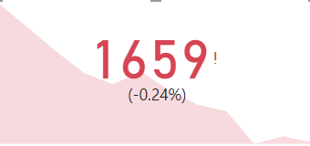
Thanks for your reply, I have used the KPI visualization but it does not give me a option to change the indicator icons, I want a triangle like my my picture but all it is showing is a tick icon if postive or and exclamation mark if negative
Are you aware of any other KPI visuals that I could use?
- Mark as New
- Bookmark
- Subscribe
- Mute
- Subscribe to RSS Feed
- Permalink
- Report Inappropriate Content
Hi, @AvPowerBI
You need to create cards for arrown icon and data separately and apply custom color measure to the color of data lable.
1. create arrown icon card
image = IF([%Headcount CM v PM]<0,UNICHAR("9660"),UNICHAR("9650"))
2.create meausre 'color' and apply it to the color of card data label
color = IF([%Headcount CM v PM]<0,"red","green")
result:
Best Regards,
Community Support Team _ Eason
Helpful resources
| User | Count |
|---|---|
| 98 | |
| 87 | |
| 77 | |
| 67 | |
| 63 |
| User | Count |
|---|---|
| 110 | |
| 95 | |
| 95 | |
| 64 | |
| 58 |
