- Power BI forums
- Updates
- News & Announcements
- Get Help with Power BI
- Desktop
- Service
- Report Server
- Power Query
- Mobile Apps
- Developer
- DAX Commands and Tips
- Custom Visuals Development Discussion
- Health and Life Sciences
- Power BI Spanish forums
- Translated Spanish Desktop
- Power Platform Integration - Better Together!
- Power Platform Integrations (Read-only)
- Power Platform and Dynamics 365 Integrations (Read-only)
- Training and Consulting
- Instructor Led Training
- Dashboard in a Day for Women, by Women
- Galleries
- Community Connections & How-To Videos
- COVID-19 Data Stories Gallery
- Themes Gallery
- Data Stories Gallery
- R Script Showcase
- Webinars and Video Gallery
- Quick Measures Gallery
- 2021 MSBizAppsSummit Gallery
- 2020 MSBizAppsSummit Gallery
- 2019 MSBizAppsSummit Gallery
- Events
- Ideas
- Custom Visuals Ideas
- Issues
- Issues
- Events
- Upcoming Events
- Community Blog
- Power BI Community Blog
- Custom Visuals Community Blog
- Community Support
- Community Accounts & Registration
- Using the Community
- Community Feedback
Register now to learn Fabric in free live sessions led by the best Microsoft experts. From Apr 16 to May 9, in English and Spanish.
- Power BI forums
- Forums
- Get Help with Power BI
- Desktop
- Re: Visualise percentage of column by values, on a...
- Subscribe to RSS Feed
- Mark Topic as New
- Mark Topic as Read
- Float this Topic for Current User
- Bookmark
- Subscribe
- Printer Friendly Page
- Mark as New
- Bookmark
- Subscribe
- Mute
- Subscribe to RSS Feed
- Permalink
- Report Inappropriate Content
Visualise percentage of column by values, on a rolling 4 period basis
Hello!
My data set includes individual rows for a number of store audit visits that were either "completed" or "not completed" on a weekly basis. I currently have data for 10 weeks, but this will grow over a period of years.
I need to visualise the percentage of audits that were "completed" over time, but this must be on a 4 week rolling basis. For example, filtering on week 7 should show % of all audits that were completed in weeks 4, 5, 6 and 7.
I was able to do this on a static basis for the latest 4 weeks, by using three measures (one to count the total number of rows, one to count the number of rows that say "completed", and one to divide completed / total) and then applying a "TopN" filter to the gauge visual I created to only include the latest 4 weeks (which are in yymm format).
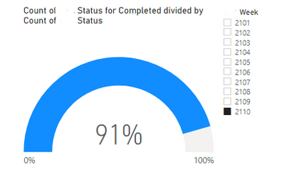
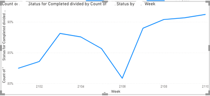
However, I need to be able to do this dynamically, so that a slicer can be used to select a week and see the 4 week rolling % completed for latest 4 weeks (example 1). I also need to display the 4 week rolling averages in a line or bar chart over time, where each data point includes the latest 4 weeks rather than only the week on the axis (example 2).
Any help would be really appreciated!
example 1:
example 2:
Thanks
Solved! Go to Solution.
- Mark as New
- Bookmark
- Subscribe
- Mute
- Subscribe to RSS Feed
- Permalink
- Report Inappropriate Content
Hi @Chris_Kennedy ,
You can extract the week column as a new table, use it in the slicer:
Week table = DISTINCT('Table'[Week])Create a measure like this:
Rolling average =
AVERAGEX (
    FILTER (
        'Table',
        'Table'[Week]
            >= SELECTEDVALUE ( 'Week table'[Week] ) - 3
            && 'Table'[Week] <= SELECTEDVALUE ( 'Week table'[Week] )
    ),
    COUNTX ( FILTER ( 'Table', 'Table'[Status] = "Completed" ), [Week] )
)
    / AVERAGEX (
        FILTER (
            'Table',
            'Table'[Week]
                >= SELECTEDVALUE ( 'Week table'[Week] ) - 3
                && 'Table'[Week] <= SELECTEDVALUE ( 'Week table'[Week] )
        ),
        COUNTROWS ( 'Table' )
    )
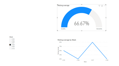
Attached a sample file in the below, hopes it could help.
Best Regards,
Community Support Team _ Yingjie Li
If this post helps, then please consider Accept it as the solution to help the other members find it more quickly.
- Mark as New
- Bookmark
- Subscribe
- Mute
- Subscribe to RSS Feed
- Permalink
- Report Inappropriate Content
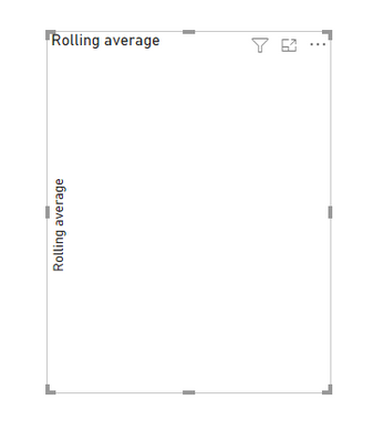
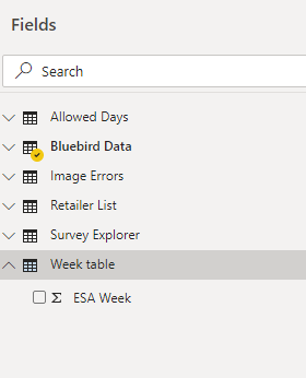
Thanks very much for your help. I followed the steps by creating a table called "Week table" and then a measure by adapting the example you kindly provided, however the Rolling Average measure I created does not display any data when added to a visual (see example below).
Can you see any obvious errors in the measure I created? Please note I have tried the section in bold below both with and without the "Bluebird Data" table prefix, but neither seems to work.
- Mark as New
- Bookmark
- Subscribe
- Mute
- Subscribe to RSS Feed
- Permalink
- Report Inappropriate Content
Hi @Chris_Kennedy ,
Have you select the field in the slicer? Since the formula used selectedvalue() fucntion, if you do not select one field in the slicer, the visual chart would show blank.
Best Regards,
Community Support Team _ Yingjie Li
If this post helps, then please consider Accept it as the solution to help the other members find it more quickly.
- Mark as New
- Bookmark
- Subscribe
- Mute
- Subscribe to RSS Feed
- Permalink
- Report Inappropriate Content
Thanks for your help, that has done it!
Helpful resources

Microsoft Fabric Learn Together
Covering the world! 9:00-10:30 AM Sydney, 4:00-5:30 PM CET (Paris/Berlin), 7:00-8:30 PM Mexico City

Power BI Monthly Update - April 2024
Check out the April 2024 Power BI update to learn about new features.

| User | Count |
|---|---|
| 105 | |
| 105 | |
| 87 | |
| 73 | |
| 66 |
| User | Count |
|---|---|
| 122 | |
| 112 | |
| 98 | |
| 79 | |
| 72 |
