- Power BI forums
- Updates
- News & Announcements
- Get Help with Power BI
- Desktop
- Service
- Report Server
- Power Query
- Mobile Apps
- Developer
- DAX Commands and Tips
- Custom Visuals Development Discussion
- Health and Life Sciences
- Power BI Spanish forums
- Translated Spanish Desktop
- Power Platform Integration - Better Together!
- Power Platform Integrations (Read-only)
- Power Platform and Dynamics 365 Integrations (Read-only)
- Training and Consulting
- Instructor Led Training
- Dashboard in a Day for Women, by Women
- Galleries
- Community Connections & How-To Videos
- COVID-19 Data Stories Gallery
- Themes Gallery
- Data Stories Gallery
- R Script Showcase
- Webinars and Video Gallery
- Quick Measures Gallery
- 2021 MSBizAppsSummit Gallery
- 2020 MSBizAppsSummit Gallery
- 2019 MSBizAppsSummit Gallery
- Events
- Ideas
- Custom Visuals Ideas
- Issues
- Issues
- Events
- Upcoming Events
- Community Blog
- Power BI Community Blog
- Custom Visuals Community Blog
- Community Support
- Community Accounts & Registration
- Using the Community
- Community Feedback
Register now to learn Fabric in free live sessions led by the best Microsoft experts. From Apr 16 to May 9, in English and Spanish.
- Power BI forums
- Forums
- Get Help with Power BI
- Desktop
- Re: Use slicer value in X axis of line chart
- Subscribe to RSS Feed
- Mark Topic as New
- Mark Topic as Read
- Float this Topic for Current User
- Bookmark
- Subscribe
- Printer Friendly Page
- Mark as New
- Bookmark
- Subscribe
- Mute
- Subscribe to RSS Feed
- Permalink
- Report Inappropriate Content
Use slicer value in X axis of line chart
Hi gurus,
I need help, I can't figure it out. I have read a lot of articles and I know it is not possible to use a measure as the X axis of a chart, but I can't believe there is no workaround.
Here my simple situation.
I have a table with Day number, Number of employee, e.g.:
| Day Number | Number of employee |
| 0 | 10 |
| 1 | 20 |
| 2 | 30 |
| 3 | 40 |
| 4 | 50 |
| 5 | 60 |
| 6 | 70 |
| 7 | 80 |
| 8 | 90 |
| 9 | 100 |
| 10 | 110 |
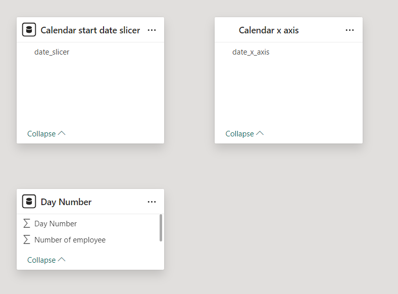
I have a slicer for the end user to choose the start date which is connected to a calendar table:
I use a measure to capture the selected date:

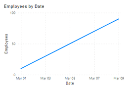
Of course I can create a simple measure that is working but I can't use it as X axis
X_Axis = Calendar[start date selected] + max(Table[Day Number])
Any recommandation?
thanks a lot
Solved! Go to Solution.
- Mark as New
- Bookmark
- Subscribe
- Mute
- Subscribe to RSS Feed
- Permalink
- Report Inappropriate Content
Hi,
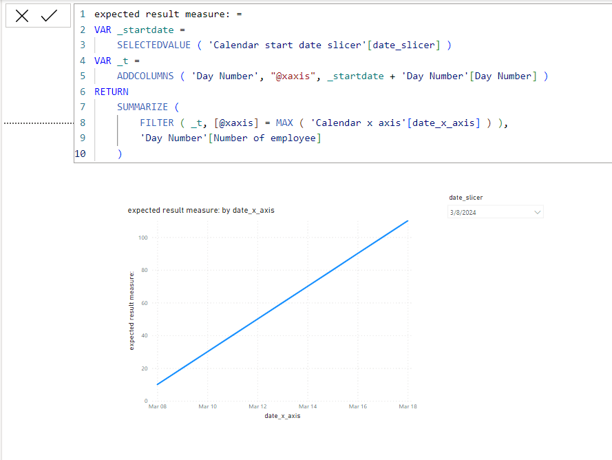
I am not sure if I understood your question correctly, but please check the below picture and the attached pbix file whether it suts your requirement.
expected result measure: =
VAR _startdate =
    SELECTEDVALUE ( 'Calendar start date slicer'[date_slicer] )
VAR _t =
    ADDCOLUMNS ( 'Day Number', "@xaxis", _startdate + 'Day Number'[Day Number] )
RETURN
    SUMMARIZE (
        FILTER ( _t, [@xaxis] = MAX ( 'Calendar x axis'[date_x_axis] ) ),
        'Day Number'[Number of employee]
    )
If this post helps, then please consider accepting it as the solution to help other members find it faster, and give a big thumbs up.
- Mark as New
- Bookmark
- Subscribe
- Mute
- Subscribe to RSS Feed
- Permalink
- Report Inappropriate Content
Hi again @Jihwan_Kim ,
If I can use few more minutes of your experience.
In reality, the number of employee needs a cap and there is multiple "Day Number" value (e.g. Day Number 1, value 10 and Day Number 1, value 20).
So at the end the is based on a measure:
I have modified your pbix by adding "Number of employee with MAX" but I can't add attachment to this forum...
How should I modify your "expected result measure:" formula to use this measure?
Thanks again
Guillaume
- Mark as New
- Bookmark
- Subscribe
- Mute
- Subscribe to RSS Feed
- Permalink
- Report Inappropriate Content
Hi,
Please share your sample pbix file's link, and then I can try to look into it.
Thank you.
If this post helps, then please consider accepting it as the solution to help other members find it faster, and give a big thumbs up.
- Mark as New
- Bookmark
- Subscribe
- Mute
- Subscribe to RSS Feed
- Permalink
- Report Inappropriate Content
Hi @Jihwan_Kim
Here is the link: dropbox
You will see the table is Projection_Curve.
The measure that is to be displayed on the graph is "5.#Patients_x_axis" (I used you code) but is is not working.
You can see also that the cumulative sum in measure "4.Patients_Cumulative" is not working also.
Thanks a million time.
Guillaume
- Mark as New
- Bookmark
- Subscribe
- Mute
- Subscribe to RSS Feed
- Permalink
- Report Inappropriate Content
Hi,
It is quite difficult for me to understand the logic, but I tried and please check the attached pbix file down below.
If this post helps, then please consider accepting it as the solution to help other members find it faster, and give a big thumbs up.
- Mark as New
- Bookmark
- Subscribe
- Mute
- Subscribe to RSS Feed
- Permalink
- Report Inappropriate Content
Hi @Jihwan_Kim
If I can abuse of your time/expertise another time. I need to add a factor on the #patients after you plot the dates with the weeknumber (that you did). I tried to understand your code but I have to admit it is way above my competancies 😉
The link to the updated file is here
Basically after step "5.#Patients_x_axis 1" of the data "Projection_Curve Scenario1", I need to add a condition such as:
- Mark as New
- Bookmark
- Subscribe
- Mute
- Subscribe to RSS Feed
- Permalink
- Report Inappropriate Content
Good morning @Jihwan_Kim ,
You nailed it!!!
This is exactly what I was looking for.
Thank you so much.
Guillaume
- Mark as New
- Bookmark
- Subscribe
- Mute
- Subscribe to RSS Feed
- Permalink
- Report Inappropriate Content
Hi @Jihwan_Kim ,
This is amazing, thank you for taking the time to answer. This is exactly what I wanted. You made my day!
Guillaume
Helpful resources

Microsoft Fabric Learn Together
Covering the world! 9:00-10:30 AM Sydney, 4:00-5:30 PM CET (Paris/Berlin), 7:00-8:30 PM Mexico City

Power BI Monthly Update - April 2024
Check out the April 2024 Power BI update to learn about new features.

| User | Count |
|---|---|
| 102 | |
| 101 | |
| 78 | |
| 70 | |
| 63 |
| User | Count |
|---|---|
| 141 | |
| 106 | |
| 101 | |
| 85 | |
| 72 |


