- Power BI forums
- Updates
- News & Announcements
- Get Help with Power BI
- Desktop
- Service
- Report Server
- Power Query
- Mobile Apps
- Developer
- DAX Commands and Tips
- Custom Visuals Development Discussion
- Health and Life Sciences
- Power BI Spanish forums
- Translated Spanish Desktop
- Power Platform Integration - Better Together!
- Power Platform Integrations (Read-only)
- Power Platform and Dynamics 365 Integrations (Read-only)
- Training and Consulting
- Instructor Led Training
- Dashboard in a Day for Women, by Women
- Galleries
- Community Connections & How-To Videos
- COVID-19 Data Stories Gallery
- Themes Gallery
- Data Stories Gallery
- R Script Showcase
- Webinars and Video Gallery
- Quick Measures Gallery
- 2021 MSBizAppsSummit Gallery
- 2020 MSBizAppsSummit Gallery
- 2019 MSBizAppsSummit Gallery
- Events
- Ideas
- Custom Visuals Ideas
- Issues
- Issues
- Events
- Upcoming Events
- Community Blog
- Power BI Community Blog
- Custom Visuals Community Blog
- Community Support
- Community Accounts & Registration
- Using the Community
- Community Feedback
Register now to learn Fabric in free live sessions led by the best Microsoft experts. From Apr 16 to May 9, in English and Spanish.
- Power BI forums
- Forums
- Get Help with Power BI
- Desktop
- Re: Share your thoughts on the new On-Object Inter...
- Subscribe to RSS Feed
- Mark Topic as New
- Mark Topic as Read
- Float this Topic for Current User
- Bookmark
- Subscribe
- Printer Friendly Page
- Mark as New
- Bookmark
- Subscribe
- Mute
- Subscribe to RSS Feed
- Permalink
- Report Inappropriate Content
Share your thoughts on the new On-Object Interaction feature (preview)
Hit Reply to tell us what you think about the new On-Object Interaction feature so we can continue to improve.
For example:
- What changes would you like to see?
- If you turned off the preview switch, why?
- Any suggestions for addititional settings or capabilities?
Thanks,
-Power BI team
To read more about the feature, see the announcement in the Power BI Product Blog or our documentation on how to Use on-object interaction
FAQs:
- Q: How can I open multiple panes at once?
- A: You can CTRL + click or right click on the unselected pane you wish to open and choose "Open in new pane"
- Q: Where did aggregations move to?
- A: It's still on right click of a field, or you can use the new flyout aggregations dropdown while choosing or swapping a field.
- Q: Where did drillthrough and tooltip page setup move to?
- A: Drillthrough is now in the page settings of the format pane under Page Information > Page type > Drillthrough or Tooltip.
- Mark as New
- Bookmark
- Subscribe
- Mute
- Subscribe to RSS Feed
- Permalink
- Report Inappropriate Content
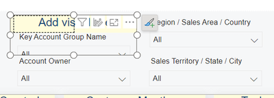
This one is a simple text box, but the issue exists with all visuals. For example here a screenshot of my slicers.
The issue is that in the past per default the Title is always set to ON, but then if the user never entered a title it was hidden. Now the new on-object editing, requires that i manually turn off the title on each visual if I don't want to be bothered with the "Add Visual title" overlay.
You may even consider disabling title per default for some visuals where it is less common to use them (e.g. slicers, text boxes, etc.) or maybe have an option stored in each report file where the user can say per default enable title or disable titles
- Mark as New
- Bookmark
- Subscribe
- Mute
- Subscribe to RSS Feed
- Permalink
- Report Inappropriate Content
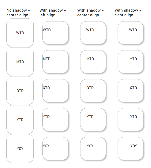
I am unable to align the new slicer visual with center alignment and with shadows. There is no problem when there is no shadows but when I add a shadow, the alignment goes wrong. Any suggestions to have it corrected? It used to be aligned when I initially designed.
- Mark as New
- Bookmark
- Subscribe
- Mute
- Subscribe to RSS Feed
- Permalink
- Report Inappropriate Content
I even reinstalled Power BI to see if that would help but didn't. Any suggestions other than button's padding as it is still not aligning in the middle.
- Mark as New
- Bookmark
- Subscribe
- Mute
- Subscribe to RSS Feed
- Permalink
- Report Inappropriate Content
Hello,
So after a while sitting out of physical testing, I decided to try out the latest iteration (December 18 release, version:
2.124.1052.0) using the new 'classic' option, and while it does show a great deal of improvement since I last tested OOI (thank you), the main problem since I last tested it has still not been addressed.
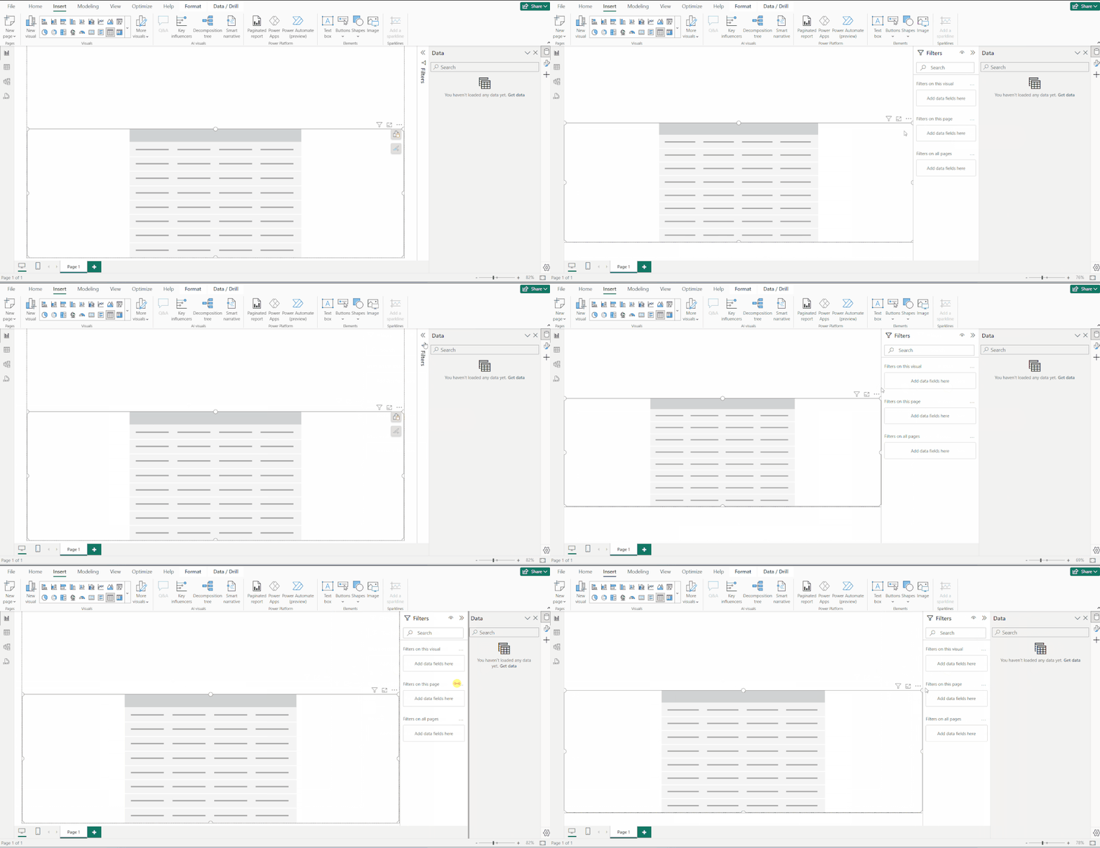
Namely, the concept of 'collapsing' the right-hand panes. This behaviour as its name suggests should simply 'collapse' (or if you prefer, 'fold down') the panel to a thin column, much like the 'Filters' pane, which still works perfectly.
Notice also in the screenshot below, the tooltip for the Filters pane even refers to this as a 'collapsing' action:
Simply, when working in PBI desktop, myself and many other users would like this action replicated across ALL right-hand panes. This is also best practice in terms of consistent behavior in line with other aspects of the PBI interface. With that in place permanenty, we would have a truly 'classic' behavior (i.e. the '>>' icon/button should behave the same way in all cases).
In the current OOI 'classic' mode however, instead it feels like an incomplete hybrid of the two because of this inconsistency. Also as I've stated in some of my previous commentary, if having this option means removing the icon menu on the far right edge of the application window, that's fine. I'm agnostic to the icons themselves, but the current behaviour is very counter-intuitive and simply doesnt 'flow' as well as the original equivalent.
This is because it's physically slower due to the unnatural/extra step of having to go back to the icon menu, find the right icon, then click on it to bring back the required pane, not to mention the amount of screen real-estate that changes when doing so, which creates a rather jarring experience overall, not to mention is less efficient. This is all basic UX/UI best practice, but it bears repeating as it's been the main ask from the beginning.
With that said though, again I do appreciate the positive changes that have been made otherwise since I last tested it, and this new classic option is definitely a step in the right direction! Please continue to develop this in the same way and fully implement what's currently in place (and works perfectly) in terms of the default non-OOI pane 'collapse' behaviour.
For now though, I'm reverting back to the current default as the UX/UI behaviour is still too counter-intuitive otherwise: anything that slows down my work is a hazard, not a benefit, thanks.
- Mark as New
- Bookmark
- Subscribe
- Mute
- Subscribe to RSS Feed
- Permalink
- Report Inappropriate Content
I agree that the collapse button on the Filters pane is a much nicer experience than the current menu to collapse panes. I've created an Ideas post on adding the collapse button to the data pane, but I like the idea of having it on everything. That idea is at https://ideas.fabric.microsoft.com/ideas/idea/?ideaid=6e77b339-b69c-ee11-a81c-000d3a7c2745.
- Mark as New
- Bookmark
- Subscribe
- Mute
- Subscribe to RSS Feed
- Permalink
- Report Inappropriate Content
@andrewpirie Check out the latest December update and you will find the collapse option has been added.
- Mark as New
- Bookmark
- Subscribe
- Mute
- Subscribe to RSS Feed
- Permalink
- Report Inappropriate Content
- Mark as New
- Bookmark
- Subscribe
- Mute
- Subscribe to RSS Feed
- Permalink
- Report Inappropriate Content
I agree that the Pane area feels like a hybrid of the old and new interfaces, but I for one would like to see the opposite of what you suggest in regards to the Filter pane. I have grown to like the Pane Switcher and would like to see the Filter pane collaped to the Pane Switcher instead of just folded down like it currently is. I use a large screen as well, but find the Filter pane as the only visible one in a folded down position to be unnecessary. For me, the icons in the Pane Switcher have become easier to identify as I get used to their position.
I was extremely critical of the initial rollout of the OOI feature, but with this December 2023 update I am now satisfied (so far) with what the developers have come up with.
- Mark as New
- Bookmark
- Subscribe
- Mute
- Subscribe to RSS Feed
- Permalink
- Report Inappropriate Content
Agree on Filter pane, currently it is the only pane that is separated from the rest, which is very odd choice of UI. It should behave as the rest.
To make things worse, the filter pane is completely missing from PBI online, there is simply no option to turn it on in Edit view, which forces user to go back to PBI Desktop, very inconvenient.
- Mark as New
- Bookmark
- Subscribe
- Mute
- Subscribe to RSS Feed
- Permalink
- Report Inappropriate Content
Finally! After half a year of enabling and then disabling the on-object feature, I can finally leave it for longer to play with.
Finally when I click on an object the panes don't suddenly disappear!
Now I can finally start to enjoy double clicking the titles and editing them directly, etc...
Microsoft, please do not change the pane behaviour - we love it as it is very effective!
And please, make your developers and the UI/UX team build a dashboard hands-on each week, every week so they feel what we feel.
I'd gladly teach them how to build dashboards in Power BI.
- Mark as New
- Bookmark
- Subscribe
- Mute
- Subscribe to RSS Feed
- Permalink
- Report Inappropriate Content
With the December update we are starting to see a light at the end of the tunnel. We are moving forward.
- Mark as New
- Bookmark
- Subscribe
- Mute
- Subscribe to RSS Feed
- Permalink
- Report Inappropriate Content
That's an interesting point, what you say is true in both cases, i.e. it's an inconsistent behaviour; PBI desktop users should have the option of either having all planes 'collapse' to a regular column, or if preferred, collapse to the icon column, including the 'Filters' pane in both scenarios.
So I guess ideally it would be 'one or the other'. I would be in favour of giving users that option, yes.
(Also as an aside, though not strictly a OOI issue, the behaviour of the 'Filters' pane is somewhat tied to the fact it could potentially be a 'end user' item for interaction, so it's appearance in PBI desktop serves the dual [potential] purpose of acting as a preview of how it 'might' appear to end users when shared etc. This could be further resolved by instead having the equivalent of 'Reading view/preview mode' available in PBI desktop, though again a separate [but related] topic.)
- Mark as New
- Bookmark
- Subscribe
- Mute
- Subscribe to RSS Feed
- Permalink
- Report Inappropriate Content
Honestly it takes some time to adjust, but the new collapse is not that bad, it simply collapses to the same side bar, rather than a bar of its own, which saves screen-space and keeps it clean & organized, with no extra click (same 1-click).
The most important is that it no longer removes icons from the side bar, which was very annoying and takes extra clicks to get it back. I agree it's an improvement.
- Mark as New
- Bookmark
- Subscribe
- Mute
- Subscribe to RSS Feed
- Permalink
- Report Inappropriate Content
I appreciate the thoughtful comment, but just to clarify (or expand slightly) the underlying point in my post within the context you present: I understand the adjustment, but having to adjust 'for the sake of it' when there is no benefit to the end user is unproductive. And while I do agree that on a smaller screen there is absolutely a benefit to this behaviour (of the right-hand panes), for many experienced users on a larger screen (including myself) this is simply a slower interaction regardless of said 'adjustment'.
Also, just to give a wider (and somewhat relevant) context, I have 'adjusted' to similar interface changes in Microsoft Excel, but as a result, many tasks are provably slower now versus previous UX/UI options. Fortunately Excel is not my main go-to software (PBI currently is), but as I have access to both the latest version and a (much) older copy, I can quickly prove out this 'theory' in real time. For certain (admittedly specific) editing tasks, the old UX/UI in Excel was faster than the new one, and myself and others are understandbly concerned about the same happening to PBI, though in a more severe way.
So yes, one can 'adjust' to anything over time, theoretically, however that doesn't mean such change is beneficial or meaningful.
I agree the current options have real benefit for some users, especially on smaller screens, that's never been in question. The only request from the 'rest of us' is to also have the option of maintaining the status quo for the right-hand pane behaviour where we see real benefit in the current UX/UI.
But we're in full agreement it's a good improvement all the same, the previously dissapearing icons you mention in particular were illogical.
- Mark as New
- Bookmark
- Subscribe
- Mute
- Subscribe to RSS Feed
- Permalink
- Report Inappropriate Content
Totally agree. But here's the bigger issue in my mind. Too much development time is getting sucked into a hole for something that is just pissing off the majority of the Power BI community. Remember when you used to look forward to new releases because Microsoft would provide new features that made Power BI better? Remember when they had a roadmap with exciting features coming? Remember when we were eagerly awaiting the new visuals, like the "New Card"? Sigh. On-object first came out in March and we still don't have collapsable panes done right. Come on Microsoft. You have to be better than this.
- Mark as New
- Bookmark
- Subscribe
- Mute
- Subscribe to RSS Feed
- Permalink
- Report Inappropriate Content
Well said.
- Mark as New
- Bookmark
- Subscribe
- Mute
- Subscribe to RSS Feed
- Permalink
- Report Inappropriate Content
Hey @RosieL I've noticed several times both at work and home (one large monitor, one laptop), when I am editing a visual that is using the entire canvas width, the on-object interaction build and formatting menus go off screen.
I can collapse menus so they show back overtop of the visual on the canvas, but it's a disruption to flow when I go looking for them and they're not visible. I suspect the on-object menu is positioned to the right of the visual, which happens to be off-screen behind the expanded panes.
Also, I like I can see and edit the column list for the visual close on the screen to where I'm working through the on-object interaction menu.
- Mark as New
- Bookmark
- Subscribe
- Mute
- Subscribe to RSS Feed
- Permalink
- Report Inappropriate Content
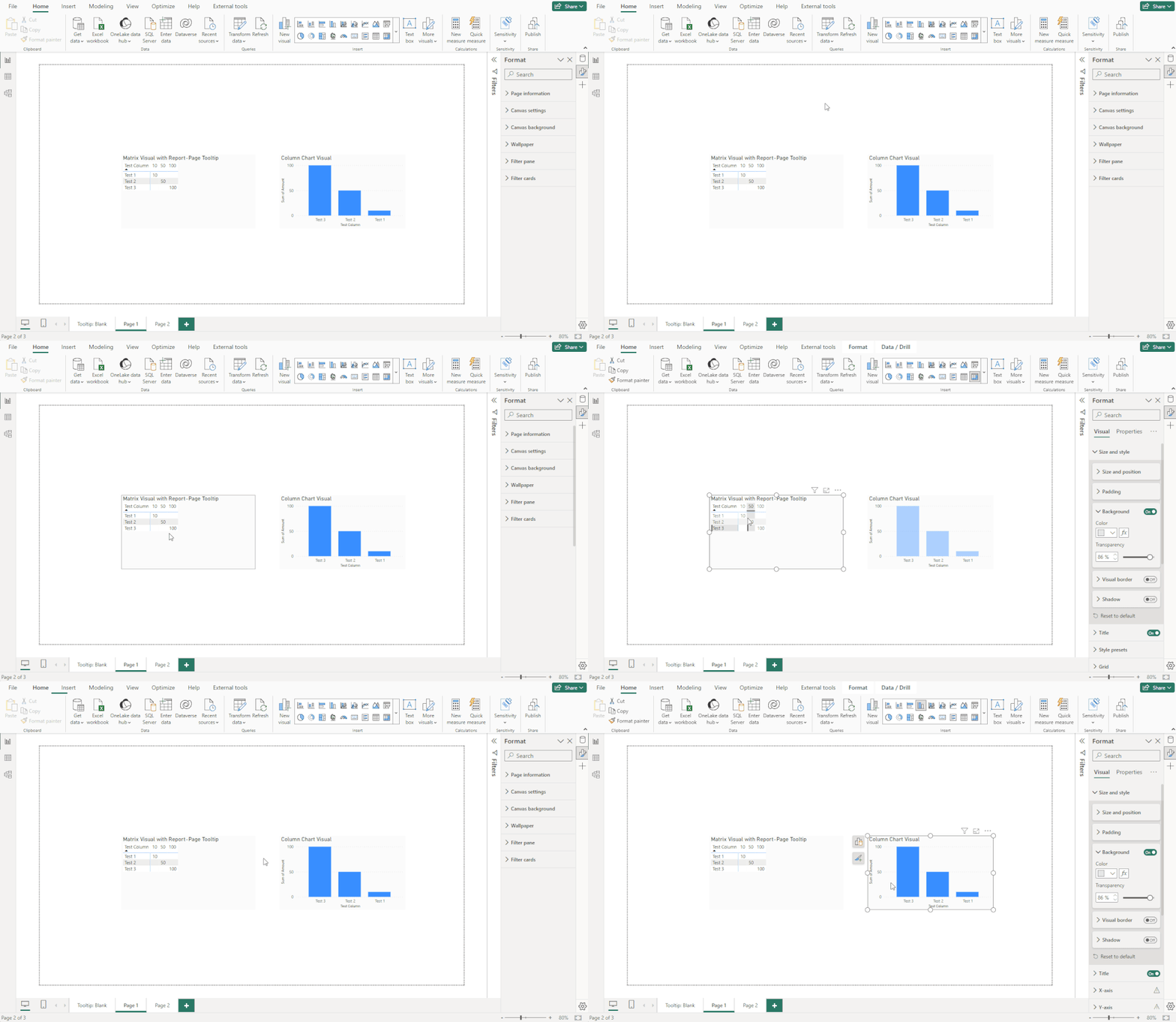
Hey @RosieL, the on-object interaction menu seems to have problems appearing when used alongside a Report Page tooltip on my setup. If the report page tooltip displays, the on-object interaction buttons seem follow the report page tooltip, and when the tooltip disappears, the buttons disappear until the visual is moved. It does seem to be related to the tooltip appearing - if I switch between data and report view and between pages, but avoid hovering so the tooltip doesn't display, all is well.
Here's an example using the November 2023 release. After the tooltip appears, the on-object interaction buttons stop appearing and do not show when deselecting and reselecting the visual until the visual is moved. The not appearing buttons issue also affects the visual with no report page tooltip while it is occurring. Apologies if this issue is already reported.
- Mark as New
- Bookmark
- Subscribe
- Mute
- Subscribe to RSS Feed
- Permalink
- Report Inappropriate Content
Thanks for reporting Andrew! Definitely unexpected behavior, we'll take a closer look.
- Mark as New
- Bookmark
- Subscribe
- Mute
- Subscribe to RSS Feed
- Permalink
- Report Inappropriate Content
Good news. Maybe you've already see the December 23 update preview that shows MS allowing options for how the on-object interactions are setup for you. While not perfect, it is better than being forced into the new format right away... https://www.youtube.com/watch?v=PycL2_T0DxM
- Mark as New
- Bookmark
- Subscribe
- Mute
- Subscribe to RSS Feed
- Permalink
- Report Inappropriate Content
I tried, but for someone use powerbi from the begining is lowest. i need make a more clicks and the typical problem of click area.
I suggest make it optional and not a reemplace of the nomal UX of powerbi.
Helpful resources

Microsoft Fabric Learn Together
Covering the world! 9:00-10:30 AM Sydney, 4:00-5:30 PM CET (Paris/Berlin), 7:00-8:30 PM Mexico City

Power BI Monthly Update - April 2024
Check out the April 2024 Power BI update to learn about new features.

| User | Count |
|---|---|
| 96 | |
| 93 | |
| 83 | |
| 70 | |
| 65 |
| User | Count |
|---|---|
| 118 | |
| 106 | |
| 93 | |
| 79 | |
| 72 |

