- Power BI forums
- Updates
- News & Announcements
- Get Help with Power BI
- Desktop
- Service
- Report Server
- Power Query
- Mobile Apps
- Developer
- DAX Commands and Tips
- Custom Visuals Development Discussion
- Health and Life Sciences
- Power BI Spanish forums
- Translated Spanish Desktop
- Power Platform Integration - Better Together!
- Power Platform Integrations (Read-only)
- Power Platform and Dynamics 365 Integrations (Read-only)
- Training and Consulting
- Instructor Led Training
- Dashboard in a Day for Women, by Women
- Galleries
- Community Connections & How-To Videos
- COVID-19 Data Stories Gallery
- Themes Gallery
- Data Stories Gallery
- R Script Showcase
- Webinars and Video Gallery
- Quick Measures Gallery
- 2021 MSBizAppsSummit Gallery
- 2020 MSBizAppsSummit Gallery
- 2019 MSBizAppsSummit Gallery
- Events
- Ideas
- Custom Visuals Ideas
- Issues
- Issues
- Events
- Upcoming Events
- Community Blog
- Power BI Community Blog
- Custom Visuals Community Blog
- Community Support
- Community Accounts & Registration
- Using the Community
- Community Feedback
Register now to learn Fabric in free live sessions led by the best Microsoft experts. From Apr 16 to May 9, in English and Spanish.
- Power BI forums
- Forums
- Get Help with Power BI
- Desktop
- Re: Share your thoughts on the new On-Object Inter...
- Subscribe to RSS Feed
- Mark Topic as New
- Mark Topic as Read
- Float this Topic for Current User
- Bookmark
- Subscribe
- Printer Friendly Page
- Mark as New
- Bookmark
- Subscribe
- Mute
- Subscribe to RSS Feed
- Permalink
- Report Inappropriate Content
Share your thoughts on the new On-Object Interaction feature (preview)
Hit Reply to tell us what you think about the new On-Object Interaction feature so we can continue to improve.
For example:
- What changes would you like to see?
- If you turned off the preview switch, why?
- Any suggestions for addititional settings or capabilities?
Thanks,
-Power BI team
To read more about the feature, see the announcement in the Power BI Product Blog or our documentation on how to Use on-object interaction
FAQs:
- Q: How can I open multiple panes at once?
- A: You can CTRL + click or right click on the unselected pane you wish to open and choose "Open in new pane"
- Q: Where did aggregations move to?
- A: It's still on right click of a field, or you can use the new flyout aggregations dropdown while choosing or swapping a field.
- Q: Where did drillthrough and tooltip page setup move to?
- A: Drillthrough is now in the page settings of the format pane under Page Information > Page type > Drillthrough or Tooltip.
- Mark as New
- Bookmark
- Subscribe
- Mute
- Subscribe to RSS Feed
- Permalink
- Report Inappropriate Content
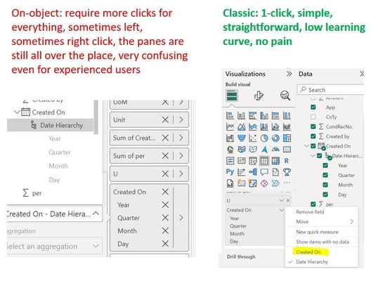
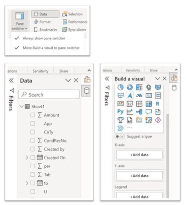
Testing June update: I see some improvements, for example, allowing "Build a visual" pane to be pinned to side-pane, but user still can't see Data & Build-visual panes at the same time, making drag-drop data fields impossible. It forces users to Build pane, click on "add data" button, click again to add data fields. This is very redudant.
Overall, the "On-object" feature is still very confusing and all-over the place even for experienced users like myself. It complicates everything, what used to be simple now needs more clicks. At the meantime, unlike well-implemented "right-click" functions in other office apps like Excel, "On-object" adds little to no value or dynamic commands that can't be easily done in Classic.
In the end, I am not sure this new "feature" helps on-board new users more easily - if anything, it will do just the opposite.
Btw, the community has asked for many improvemnts, such as a Dark mode, adding column width control to table visual, or make hyperlink to table/matrix row header ... years past nothing happened yet, but MS choose to work on this one when no one seemed to have asked for it.
- Mark as New
- Bookmark
- Subscribe
- Mute
- Subscribe to RSS Feed
- Permalink
- Report Inappropriate Content
- Mark as New
- Bookmark
- Subscribe
- Mute
- Subscribe to RSS Feed
- Permalink
- Report Inappropriate Content
Hi,
I love the alternating background colors for values on certain visuals (ie: Table visual) but I lose this option if I want to do something simple like horizontally center values (done at the specific column formatting option). Is this something that could be added as part of the On-Object Interaction, since it would feel intuitive to have the option to center all values within the visual when I'm interacting with the object?
- Mark as New
- Bookmark
- Subscribe
- Mute
- Subscribe to RSS Feed
- Permalink
- Report Inappropriate Content
Tried the feature for little over a week before turning it off again. Found it less intuitive and resulting in more clicks to do the same task. particularly less intuitive for selecting data for which I usually drag and drop. Not being able to see both data and formatting panes at the same time was a bit painful at times.
- Mark as New
- Bookmark
- Subscribe
- Mute
- Subscribe to RSS Feed
- Permalink
- Report Inappropriate Content
In theory it's a good option to have, but I found the menu far too small/limiting and because it's not persistent, it ended up requiring a lot more clicks to keep opening it + scrolling to the section I needed to edit.
- Mark as New
- Bookmark
- Subscribe
- Mute
- Subscribe to RSS Feed
- Permalink
- Report Inappropriate Content
Where can I find the "Add futher analyses to your visual" pane gone to? I can't find it after switching to the new On-Object interaction feature. If it's still there, it's not obvious as it used to be. It's an important feature, and I like the ability to browse what analysis options I can add to the chosen visual.
- Mark as New
- Bookmark
- Subscribe
- Mute
- Subscribe to RSS Feed
- Permalink
- Report Inappropriate Content
- Mark as New
- Bookmark
- Subscribe
- Mute
- Subscribe to RSS Feed
- Permalink
- Report Inappropriate Content
You're halfway there, but I think you are missing the point of having the panes on the right-hand side which is to always have ALL of them open when needed without the additional step of right clicking. Once again you are adding extra steps to something that was easier previously. I suggest you please consider adding a menu item toggle which says "keep all panes open" that allows us to always leave panes open when we click on another in the pane switcher.
- Mark as New
- Bookmark
- Subscribe
- Mute
- Subscribe to RSS Feed
- Permalink
- Report Inappropriate Content
I fully agree. In the June update, we had an improvement in being able to have the panels open completely on the right side, but only one at a time in an alternating way, which does not help, for example, with dragging and dropping from tables. My suggestion is that the 3 panels have the option of being open at the same time, one next to the other, as is the previous pattern.
- Mark as New
- Bookmark
- Subscribe
- Mute
- Subscribe to RSS Feed
- Permalink
- Report Inappropriate Content
Hello, it is possible to open multiple panes side by side by right clicking an unselected pane in the pane switcher and choosing "open in new pane", next month we're making this even easier by allowing this gesture with CTRL click.
We're also currently in the works for allowing you to "bind panes" so if you prefer 2 or more panes to always open together you can also configure that. Thanks for continued feedback on the preview!
- Mark as New
- Bookmark
- Subscribe
- Mute
- Subscribe to RSS Feed
- Permalink
- Report Inappropriate Content
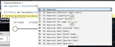
The small icons that appear when selecting a visual should not remain on top at all times. Example: if you select a visual, then decide to write a measure, the icons stay on top of that space, which is super annoying. See screenshot.
- Mark as New
- Bookmark
- Subscribe
- Mute
- Subscribe to RSS Feed
- Permalink
- Report Inappropriate Content
This is fixed for the upcoming July release! Appreciate your patience.
- Mark as New
- Bookmark
- Subscribe
- Mute
- Subscribe to RSS Feed
- Permalink
- Report Inappropriate Content
We need the option to pin a pane - especially the data pane. It's extremely annoying when we select a visual and the visual pane takes the place of the data pane. The filters pane is always on, there's no reason to not have the ability to let the data pane always on as well.
Unfortunatelly I'm disabling the feature because I can no longer keep right-clicking on the data pane icon and then clicking on "Open in new pane". It's very frustrating when you're trying hard to think on what to do next, then you find a measure you were looking for, then it's "gone" because you had to select the visual and the data pane gives place to the visual pane. Please fix this, and do not make this new way of working mandatory without fixing, because it totally kills the end-user experience.
- Mark as New
- Bookmark
- Subscribe
- Mute
- Subscribe to RSS Feed
- Permalink
- Report Inappropriate Content
Hi @RosieL ,
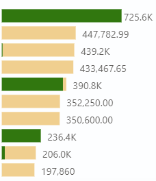
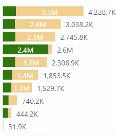
On-Object Interaction is great, but formatting of Total Lables in stacked bar chart is not working propally such as it sometimes formats the lables wrong or not at all. This is only for Total Lables, Data Lables works so far.
I tried with and without dynamic formating of measure, neighter works (with and without Display units set to auto and none).
- Mark as New
- Bookmark
- Subscribe
- Mute
- Subscribe to RSS Feed
- Permalink
- Report Inappropriate Content
Thanks for catching this! We have fixed this for the upcoming August release.
- Mark as New
- Bookmark
- Subscribe
- Mute
- Subscribe to RSS Feed
- Permalink
- Report Inappropriate Content
Great step in the right direction. That said, why can't you make the formatting/data etc. icons persistent in the right column? You have enough real estate there. As it is, when I click on a visual to make a change, I now have to jump through more hoops than before to bring it up.
- Mark as New
- Bookmark
- Subscribe
- Mute
- Subscribe to RSS Feed
- Permalink
- Report Inappropriate Content
Keep a look out for the July blog, we've added the ability for you to customize what panes you want in the pane switcher so you can choose to have both data and formatting always on across reports if you prefer.
Just want to double check on the current behavior though, once open, the format pane should stay on the pane switcher as you work across visuals, are you finding that to not be the case?
- Mark as New
- Bookmark
- Subscribe
- Mute
- Subscribe to RSS Feed
- Permalink
- Report Inappropriate Content
I'll wait for the July update to confirm usability. Grateful
- Mark as New
- Bookmark
- Subscribe
- Mute
- Subscribe to RSS Feed
- Permalink
- Report Inappropriate Content
Hi,
This is great but have some limitations like if i want to show values as agregated (% row Total, % of Coloumn Total Or % Of Grand Total) It does not let us do these thing even in matrix. Please Fix That.
New Development suggesion - Please develope gradient option for Background colours like PPT.
Thanks ..
- Mark as New
- Bookmark
- Subscribe
- Mute
- Subscribe to RSS Feed
- Permalink
- Report Inappropriate Content
This is a great help : In a visual such as a clustered bar chart, when you select an element ( data label, axis, data series ) the visualization pane automatically scrolls and opens the corresponding format cards.
I just hope that this feature will quickly be extended to all visual types. As an example, the waterfall chart does not feature this behaviour yet.
- Mark as New
- Bookmark
- Subscribe
- Mute
- Subscribe to RSS Feed
- Permalink
- Report Inappropriate Content
Would be great if by default all different panes are already selected:
Even with a new object-level interaction we often need to work with "Data" and "Format" panes. Making them available on the right side by default would make it easier to work otherwise I need to open all of them every time I launch PowerBI Desktop.
Thanks!
Helpful resources

Microsoft Fabric Learn Together
Covering the world! 9:00-10:30 AM Sydney, 4:00-5:30 PM CET (Paris/Berlin), 7:00-8:30 PM Mexico City

Power BI Monthly Update - April 2024
Check out the April 2024 Power BI update to learn about new features.

| User | Count |
|---|---|
| 99 | |
| 98 | |
| 76 | |
| 66 | |
| 59 |
| User | Count |
|---|---|
| 142 | |
| 106 | |
| 103 | |
| 85 | |
| 70 |
