Join the #PBI10 DataViz contest
Power BI is turning 10, and we’re marking the occasion with a special community challenge. Use your creativity to tell a story, uncover trends, or highlight something unexpected.
Get started- Power BI forums
- Get Help with Power BI
- Desktop
- Service
- Report Server
- Power Query
- Mobile Apps
- Developer
- DAX Commands and Tips
- Custom Visuals Development Discussion
- Health and Life Sciences
- Power BI Spanish forums
- Translated Spanish Desktop
- Training and Consulting
- Instructor Led Training
- Dashboard in a Day for Women, by Women
- Galleries
- Webinars and Video Gallery
- Data Stories Gallery
- Themes Gallery
- Contests Gallery
- Quick Measures Gallery
- Notebook Gallery
- Translytical Task Flow Gallery
- R Script Showcase
- Ideas
- Custom Visuals Ideas (read-only)
- Issues
- Issues
- Events
- Upcoming Events
Join us for an expert-led overview of the tools and concepts you'll need to become a Certified Power BI Data Analyst and pass exam PL-300. Register now.
- Power BI forums
- Forums
- Get Help with Power BI
- Desktop
- Merge columns in column chart
- Subscribe to RSS Feed
- Mark Topic as New
- Mark Topic as Read
- Float this Topic for Current User
- Bookmark
- Subscribe
- Printer Friendly Page
- Mark as New
- Bookmark
- Subscribe
- Mute
- Subscribe to RSS Feed
- Permalink
- Report Inappropriate Content
Merge columns in column chart
Hi,
I'm trying to show the result of a new column i created as one column within a barchart:
Spend + Prediction =
VAR _monthtoday =
    MONTH ( TODAY () )

VAR _month_table =
    MONTH ('Actual Spend + Firm'[Date] )
RETURN
    IF (
        _month_table >= _monthtoday
            ,
        'Actual Spend + Firm'[Pred_Adj],
        'Actual Spend + Firm'[ActualSpending_Loc]
    )
The above code essentially creates a column by usinga certain value from either Pred_Adj or ActualSpending_Loc based on if the month is in the past or future. e.g. use Actualspending_Loc up until may, then use Pred_Adj.
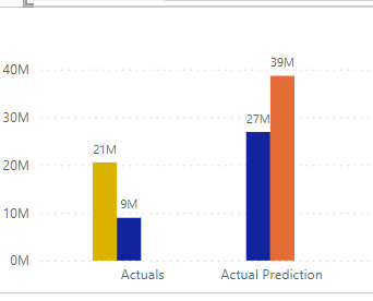
In a table the data shows correct but in a column chart it splits the column into two bars:
Is there any way to merge the two blue columns into one? is this something i need to do in the DAX formula or the graph itself?
Solved! Go to Solution.
- Mark as New
- Bookmark
- Subscribe
- Mute
- Subscribe to RSS Feed
- Permalink
- Report Inappropriate Content
- Mark as New
- Bookmark
- Subscribe
- Mute
- Subscribe to RSS Feed
- Permalink
- Report Inappropriate Content
show the x axis field details of your chart.
Helpful resources

Join our Fabric User Panel
This is your chance to engage directly with the engineering team behind Fabric and Power BI. Share your experiences and shape the future.

Power BI Monthly Update - June 2025
Check out the June 2025 Power BI update to learn about new features.

| User | Count |
|---|---|
| 76 | |
| 70 | |
| 55 | |
| 37 | |
| 35 |
| User | Count |
|---|---|
| 66 | |
| 66 | |
| 59 | |
| 53 | |
| 46 |

