New Offer! Become a Certified Fabric Data Engineer
Check your eligibility for this 50% exam voucher offer and join us for free live learning sessions to get prepared for Exam DP-700.
Get Started- Power BI forums
- Get Help with Power BI
- Desktop
- Service
- Report Server
- Power Query
- Mobile Apps
- Developer
- DAX Commands and Tips
- Custom Visuals Development Discussion
- Health and Life Sciences
- Power BI Spanish forums
- Translated Spanish Desktop
- Training and Consulting
- Instructor Led Training
- Dashboard in a Day for Women, by Women
- Galleries
- Community Connections & How-To Videos
- COVID-19 Data Stories Gallery
- Themes Gallery
- Data Stories Gallery
- R Script Showcase
- Webinars and Video Gallery
- Quick Measures Gallery
- 2021 MSBizAppsSummit Gallery
- 2020 MSBizAppsSummit Gallery
- 2019 MSBizAppsSummit Gallery
- Events
- Ideas
- Custom Visuals Ideas
- Issues
- Issues
- Events
- Upcoming Events
Don't miss out! 2025 Microsoft Fabric Community Conference, March 31 - April 2, Las Vegas, Nevada. Use code MSCUST for a $150 discount. Prices go up February 11th. Register now.
- Power BI forums
- Forums
- Get Help with Power BI
- Desktop
- Re: Data label - end of line - name of the legend ...
- Subscribe to RSS Feed
- Mark Topic as New
- Mark Topic as Read
- Float this Topic for Current User
- Bookmark
- Subscribe
- Printer Friendly Page
- Mark as New
- Bookmark
- Subscribe
- Mute
- Subscribe to RSS Feed
- Permalink
- Report Inappropriate Content
Data label - end of line - name of the legend (category)
Hi,
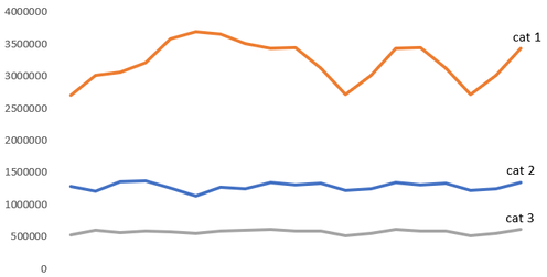
I am trying to make a line chart splited on multiple categories and months.
At the end of each line I would like to label the line with the name of the category.
This is an example of what I want to obtain at the end.
Can you please help me with how can I do this?
Solved! Go to Solution.
- Mark as New
- Bookmark
- Subscribe
- Mute
- Subscribe to RSS Feed
- Permalink
- Report Inappropriate Content
Hi @Anonymous ,
In line chart, you can enable Legend function under Format to set its position, name and so on while the legend name could not be shown at the end of each line.
When you enable Data label function under Format, it will just show the value of each group and you can change their position and fomats.
For further information about Line chart, you can refer the following Microsoft document:
https://docs.microsoft.com/en-us/power-bi/visuals/power-bi-line-chart
Best Regards,
Yingjie Li
If this post helps then please consider Accept it as the solution to help the other members find it more quickly.
- Mark as New
- Bookmark
- Subscribe
- Mute
- Subscribe to RSS Feed
- Permalink
- Report Inappropriate Content
It would be realy nice to add this "end of line label" as a feature. Tableau has it and it makes my life easier 🙂
- Mark as New
- Bookmark
- Subscribe
- Mute
- Subscribe to RSS Feed
- Permalink
- Report Inappropriate Content
Agreed! This seems like it should be an easy win!
- Mark as New
- Bookmark
- Subscribe
- Mute
- Subscribe to RSS Feed
- Permalink
- Report Inappropriate Content
Hi @Anonymous ,
Thanks for your suggestion!
You can submit it to ideas and add your comments there to make this feature coming sooner: https://ideas.powerbi.com/forums/265200-power-bi-ideas
Best Regards,
Yingjie Li
- Mark as New
- Bookmark
- Subscribe
- Mute
- Subscribe to RSS Feed
- Permalink
- Report Inappropriate Content
Thanks @v-yingjl ... My chart has 5 categories and it's not easy to search for each color aside.
Anyway, I have made a simple color scheme to bea easier for the users to find the corect line 🙂
Helpful resources
| User | Count |
|---|---|
| 117 | |
| 73 | |
| 58 | |
| 49 | |
| 48 |
| User | Count |
|---|---|
| 171 | |
| 122 | |
| 60 | |
| 59 | |
| 56 |


