Join us at the 2025 Microsoft Fabric Community Conference
March 31 - April 2, 2025, in Las Vegas, Nevada. Use code MSCUST for a $150 discount! Early bird discount ends December 31.
Register Now- Power BI forums
- Get Help with Power BI
- Desktop
- Service
- Report Server
- Power Query
- Mobile Apps
- Developer
- DAX Commands and Tips
- Custom Visuals Development Discussion
- Health and Life Sciences
- Power BI Spanish forums
- Translated Spanish Desktop
- Training and Consulting
- Instructor Led Training
- Dashboard in a Day for Women, by Women
- Galleries
- Community Connections & How-To Videos
- COVID-19 Data Stories Gallery
- Themes Gallery
- Data Stories Gallery
- R Script Showcase
- Webinars and Video Gallery
- Quick Measures Gallery
- 2021 MSBizAppsSummit Gallery
- 2020 MSBizAppsSummit Gallery
- 2019 MSBizAppsSummit Gallery
- Events
- Ideas
- Custom Visuals Ideas
- Issues
- Issues
- Events
- Upcoming Events
Be one of the first to start using Fabric Databases. View on-demand sessions with database experts and the Microsoft product team to learn just how easy it is to get started. Watch now
- Power BI forums
- Forums
- Get Help with Power BI
- Desktop
- Creating a diverging stacked bar chart to show sen...
- Subscribe to RSS Feed
- Mark Topic as New
- Mark Topic as Read
- Float this Topic for Current User
- Bookmark
- Subscribe
- Printer Friendly Page
- Mark as New
- Bookmark
- Subscribe
- Mute
- Subscribe to RSS Feed
- Permalink
- Report Inappropriate Content
Creating a diverging stacked bar chart to show sentiment
I was trying to create a diverging stacked bar chart to show the %'s of sentiment on data. I can't figure out an easy way to do this in power BI.
Here is a sample set of data:
| Sport | TEXT | Sentiment |
| Hockey | Text 1 | Positive |
| Hockey | Text 2 | Positive |
| Hockey | Text 3 | Negative |
| Hockey | Text 4 | Positive |
| Hockey | Text 5 | Negative |
| Hockey | Text 6 | Positive |
| Hockey | Text 7 | Positive |
| Golf | Text 8 | Positive |
| Golf | Text 9 | Positive |
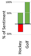
This is a an example of the type of chart i'd like to create from the data:
Solved! Go to Solution.
- Mark as New
- Bookmark
- Subscribe
- Mute
- Subscribe to RSS Feed
- Permalink
- Report Inappropriate Content
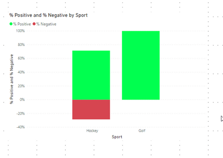
@jvirgi add following 3 measure, of course, these can be done in one measure but I like to break up the measure for easy debugging and maintenance.
Would appreciate Kudos 🙂 if my solution helped.
Base Count = COUNTROWS ( 'Table' )

Sentiment Count = IF ( SELECTEDVALUE( 'Table'[Sentiment] ) = "Negative", -1, 1 ) * [Base Count]

% Sentiment = DIVIDE ( [Sentiment Count], CALCULATE ( [Base Count], ALLSELECTED( 'Table'[Sentiment] ) ) )
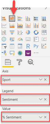
To visualize do the following and on format pane, you can change the colors
Subscribe to the @PowerBIHowTo YT channel for an upcoming video on List and Record functions in Power Query!!
Learn Power BI and Fabric - subscribe to our YT channel - Click here: @PowerBIHowTo
If my solution proved useful, I'd be delighted to receive Kudos. When you put effort into asking a question, it's equally thoughtful to acknowledge and give Kudos to the individual who helped you solve the problem. It's a small gesture that shows appreciation and encouragement! ❤
Did I answer your question? Mark my post as a solution. Proud to be a Super User! Appreciate your Kudos 🙂
Feel free to email me with any of your BI needs.
- Mark as New
- Bookmark
- Subscribe
- Mute
- Subscribe to RSS Feed
- Permalink
- Report Inappropriate Content
Hi,
I've been trying to work through a similar viz using 100% stacked bars. I've got it mostly working, except that the negative values are displayed out of order.
Workflow:
- Already coded responses to -2 (strongly disagree) to 2 (strongly agree); neutral is 0
- Created a -1/+1 helper column: 1 if > 0, -1 if <= 0 (I want neutrals on the "negative" side for this purpose)
- Take sum of -1/+1 helper column
- Sort responses based on value
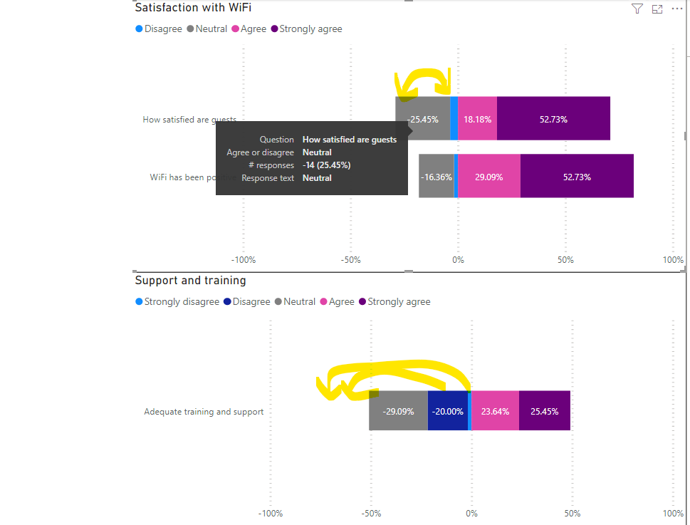
The problem is that for whatever reason, the negative values show in order of increasing count size, not response size: neutral, disagree, strongly disagree. The positive values are correct: agree, strongly agree. I've actually gotten the legend to sort correctly by using a "sort by" column, but not the actual chart. It's hard to explain verbally; I'm attaching the screenshot.
I tried checking the "reverse stacks" setting under "bars". That makes the negative values correct, but then also reverses the positive values...
Any suggestions?
- Mark as New
- Bookmark
- Subscribe
- Mute
- Subscribe to RSS Feed
- Permalink
- Report Inappropriate Content
.@parry2k - Any suggestions for when there is a five-point scale vs a two-point one?
- Mark as New
- Bookmark
- Subscribe
- Mute
- Subscribe to RSS Feed
- Permalink
- Report Inappropriate Content
@Anonymous Do you have an example of how you'd want it to look? I guess you'd want some of the 5 going on the negative axis and some on the positive side?
- Mark as New
- Bookmark
- Subscribe
- Mute
- Subscribe to RSS Feed
- Permalink
- Report Inappropriate Content
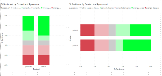
I would like it to look similar to this visualization. The challenge I am facing with the proposed solution is that the SELECTEDVALUE operator for the Sentiment count only works with binary responses. I am trying to figure out how to modify that step as I have now created a conditional column to range from -2 to 2.
- Mark as New
- Bookmark
- Subscribe
- Mute
- Subscribe to RSS Feed
- Permalink
- Report Inappropriate Content
@Anonymous Did you ever find a solution for this? I'm working against a very similar challenge. Any advice on how you've displayed neutrals would be much appreciated.
- Mark as New
- Bookmark
- Subscribe
- Mute
- Subscribe to RSS Feed
- Permalink
- Report Inappropriate Content
What if you just use an OR statement to label the 2 negative aspects with the -1; the 2 positive ones would automatically get a 1; youd have to decide how you want to handle the neutrals if you show or not.
Since the legend is used to stack your data by the 5 different responses, it would show them all. you'd have to think if you display the neutrals or not.
- Mark as New
- Bookmark
- Subscribe
- Mute
- Subscribe to RSS Feed
- Permalink
- Report Inappropriate Content
This is so helpful! I would like to show neutrals. How could I go about that?
- Mark as New
- Bookmark
- Subscribe
- Mute
- Subscribe to RSS Feed
- Permalink
- Report Inappropriate Content
I have the neutrals (neither agree / disagree) being shown on the positive side of the axis in the example so they are in there colored gray.
If you wanted the neutrals shown on the negative side, you'd add another OR statement in that sentiment count formula.
- Mark as New
- Bookmark
- Subscribe
- Mute
- Subscribe to RSS Feed
- Permalink
- Report Inappropriate Content
Thanks for noting that! I am going to look for a solution to anchor the neutrals to display evenly across negative and positive sides of the axis if possible.
- Mark as New
- Bookmark
- Subscribe
- Mute
- Subscribe to RSS Feed
- Permalink
- Report Inappropriate Content
Let me know if you find a way to do it.
The only way i'm thinking about is splitting your Neutrals into 2 buckets, a positive side and a negative side. Then you'd basically take the percentage of neutrals and divide by 2 for each of those buckets.
- Mark as New
- Bookmark
- Subscribe
- Mute
- Subscribe to RSS Feed
- Permalink
- Report Inappropriate Content
It sounds like giving both negative values -1 and the positive values a 1 would lead to the same example in the stated solution without distinguishing them but I may be mistaken. Can you demonstrate with an example?
- Mark as New
- Bookmark
- Subscribe
- Mute
- Subscribe to RSS Feed
- Permalink
- Report Inappropriate Content
The -1 and 1 are used as a means of counting the number within each bucket, and then the % sentiment divides by the total #. so the -1 just assigns it to the negative side of the axis.
I'm not sure how you'd center the neutrals on the axis, but heres an example pbix:
I just changed the sentiment Count formula to use the OR statement:
Sentiment Count = IF(SELECTEDVALUE('test data'[Agreement]) = "strongly disagree" || SELECTEDVALUE('test data'[Agreement]) = "somewhat disagree",-1,1)* [Base Count]
- Mark as New
- Bookmark
- Subscribe
- Mute
- Subscribe to RSS Feed
- Permalink
- Report Inappropriate Content
Hi! I added a more specific workflow further up in the thread, but how did you get the strongly disagree > disagree > neutral to be in the right order on the negative part of the axis? Mine were reversed, even though the positives were in the right order...
- Mark as New
- Bookmark
- Subscribe
- Mute
- Subscribe to RSS Feed
- Permalink
- Report Inappropriate Content
@jvirgi is this what you are looking for?
Subscribe to the @PowerBIHowTo YT channel for an upcoming video on List and Record functions in Power Query!!
Learn Power BI and Fabric - subscribe to our YT channel - Click here: @PowerBIHowTo
If my solution proved useful, I'd be delighted to receive Kudos. When you put effort into asking a question, it's equally thoughtful to acknowledge and give Kudos to the individual who helped you solve the problem. It's a small gesture that shows appreciation and encouragement! ❤
Did I answer your question? Mark my post as a solution. Proud to be a Super User! Appreciate your Kudos 🙂
Feel free to email me with any of your BI needs.
- Mark as New
- Bookmark
- Subscribe
- Mute
- Subscribe to RSS Feed
- Permalink
- Report Inappropriate Content
- Mark as New
- Bookmark
- Subscribe
- Mute
- Subscribe to RSS Feed
- Permalink
- Report Inappropriate Content
@jvirgi add following 3 measure, of course, these can be done in one measure but I like to break up the measure for easy debugging and maintenance.
Would appreciate Kudos 🙂 if my solution helped.
Base Count = COUNTROWS ( 'Table' )

Sentiment Count = IF ( SELECTEDVALUE( 'Table'[Sentiment] ) = "Negative", -1, 1 ) * [Base Count]

% Sentiment = DIVIDE ( [Sentiment Count], CALCULATE ( [Base Count], ALLSELECTED( 'Table'[Sentiment] ) ) )
To visualize do the following and on format pane, you can change the colors
Subscribe to the @PowerBIHowTo YT channel for an upcoming video on List and Record functions in Power Query!!
Learn Power BI and Fabric - subscribe to our YT channel - Click here: @PowerBIHowTo
If my solution proved useful, I'd be delighted to receive Kudos. When you put effort into asking a question, it's equally thoughtful to acknowledge and give Kudos to the individual who helped you solve the problem. It's a small gesture that shows appreciation and encouragement! ❤
Did I answer your question? Mark my post as a solution. Proud to be a Super User! Appreciate your Kudos 🙂
Feel free to email me with any of your BI needs.
- Mark as New
- Bookmark
- Subscribe
- Mute
- Subscribe to RSS Feed
- Permalink
- Report Inappropriate Content
@parry2k How did you setup the chart on the format pane? Looked like you were going to post a picture? Thanks!
- Mark as New
- Bookmark
- Subscribe
- Mute
- Subscribe to RSS Feed
- Permalink
- Report Inappropriate Content
@jvirgi oops, sorry about that, here it is. working on gazillion things at the same time. Would appreciate Kudos 🙂 if my solution helped.
Subscribe to the @PowerBIHowTo YT channel for an upcoming video on List and Record functions in Power Query!!
Learn Power BI and Fabric - subscribe to our YT channel - Click here: @PowerBIHowTo
If my solution proved useful, I'd be delighted to receive Kudos. When you put effort into asking a question, it's equally thoughtful to acknowledge and give Kudos to the individual who helped you solve the problem. It's a small gesture that shows appreciation and encouragement! ❤
Did I answer your question? Mark my post as a solution. Proud to be a Super User! Appreciate your Kudos 🙂
Feel free to email me with any of your BI needs.
Helpful resources

Join us at the Microsoft Fabric Community Conference
March 31 - April 2, 2025, in Las Vegas, Nevada. Use code MSCUST for a $150 discount!

We want your feedback!
Your insights matter. That’s why we created a quick survey to learn about your experience finding answers to technical questions.

Microsoft Fabric Community Conference 2025
Arun Ulag shares exciting details about the Microsoft Fabric Conference 2025, which will be held in Las Vegas, NV.

| User | Count |
|---|---|
| 134 | |
| 91 | |
| 90 | |
| 64 | |
| 58 |
| User | Count |
|---|---|
| 201 | |
| 137 | |
| 107 | |
| 70 | |
| 68 |
