Re: Executive Insights by Decisive Data
12-01-2023 00:31 AM - last edited 12-22-2023 09:04 AM
38892 Views


- Mark as New
- Bookmark
- Subscribe
- Mute
- Subscribe to RSS Feed
- Permalink
- Report Inappropriate Content
Executive Insights by Decisive Data
05-24-2017
09:35 AM
Summary
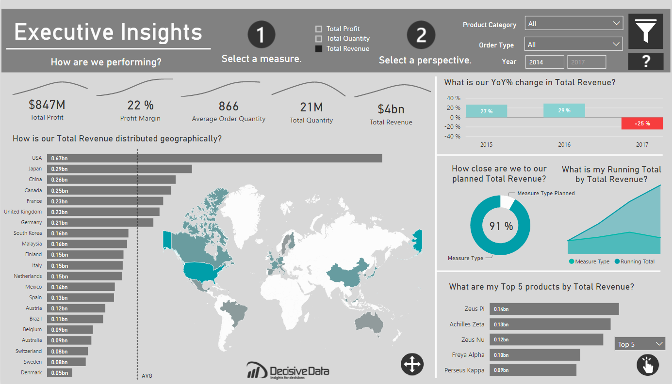
Often asking, “How are we performing?” can be a question that cascades into a series of further questions, spinoffs and investigative research. This is especially true for globally minded companies. I wanted to create a report that preemptively addressed this kind of exploration. This report is meant to provide data-driven decision making, while emphasizing user-flexibility and visual analysis. I was able to achieve my goal to empower the user by leveraging dynamic visuals. Thus, this dashboard can scale as the needs of the global business changes.
Approach
A dashboard is most valuable when you immediately understand what you can do. I looked into what attributes that can be influenced by the company:
- What we are selling (products)
- When we are selling (year)
- Where we are selling (country)
- How we are selling (order type)
The focus here is to view the business from multiple angles for these attributes, providing a holistic approach to the business, through dynamic parameters. I was able to provide deeper analysis with Top/Bottom products, YoY growth and Running totals to name a few. I leveraged, bar charts, line charts, donut charts and custom visuals for visual analysis.
Pushing the Boundaries
There were two things I wished to achieve with this dashboard, attractive mapping and next-level user interactivity.
I wanted to have a map that was design oriented and subtle, like an art piece, meant to invite the user into the dashboard. If users are going to be using a report all the time, why not make it pleasing to the eye? I found that design piece with the new “Shape Map” feature, where one can import custom TopoJSON files. I edited and imported a custom world map from http://mapstarter.com/. The simple map was meant to ground the user geographically and compliment the adjacent bar chart, which holds the same information.
Moreover, I am a firm believer that interactivity is empowering. Giving users the tools to investigate data on their own terms is liberating. As such, I wanted to provide two layers of dynamic parameters. This was done with a Top 5/Bottom 5 measure that reflects whatever measure the user has selected at the top of the dashboard. This was executed within DAX. The question I wanted to be able to answer was “What is my [Top/Bottom] products by [Value]?” in one, simple, clean visual.
For the first part of this method of creating dynamic measures, I was inspired by Sam McKay’s wonderful blog post on Dynamic Visuals, within Power BI. This provided me the groundwork for my dynamic values, and how I would approach the rest of this problem.
Now came the real challenge. I had to build two ranks on a value that could change with a click. To do this I set my dynamic parameter as two rank fields, one Ascending and the other to Descending, for the respective ends of the product performance. These were calculated across my desired field, Products.
Next, I needed to filter each of these Ranks to only keep the Top 5 Products. This can be down with two IF statements, keeping the Rank with only five values or else appearing as BLANK(). Once the IFs are built, you can then build another selector table with McKay’s method with a “Top 5” and “Bottom 5”, which can eventually be used with a SWITCH function to include only the [Filtered Rank DESC] or the [Filtered Rank ASC].
The result means that instead of six individual bar charts, one for a Top or Bottom, across three measures, Quantity, Revenue and Profit, you end up with one, dynamic visual. The result empowers users and saves valuable real estate for other interesting insights.
Quality over quantity.
Wrapping it up
The dynamic parameters and tables worked very well, but it took a little research to have the two dynamic parameters work in conjunction, as I had yet to see any specific topic utilize such before in Power BI. Another aspect that comes to mind, is whether one could make the number of values, in this case 5, also a parameter, so you could select how many TopN you are seeing. Food for thought. In the end, it’s great to know that great visuals can be created just with DAX, determination and some trial and error.
Overall, with the combination of the custom visuals, and dynamic parameters, I created a clean dashboard for analytical insights that’s also a pleasure to interact with.
Jake Olsby


Anonymous
Not applicable
- Mark as New
- Bookmark
- Subscribe
- Mute
- Subscribe to RSS Feed
- Permalink
- Report Inappropriate Content
12-01-2023
12:31 AM
Hi, excited by marvellous work! Could you please share a template?
- Mark as New
- Bookmark
- Subscribe
- Mute
- Subscribe to RSS Feed
- Permalink
- Report Inappropriate Content
11-25-2023
12:11 AM
Hello, amazing report 😃
Can you share PBIX?
Thank you very much
- Mark as New
- Bookmark
- Subscribe
- Mute
- Subscribe to RSS Feed
- Permalink
- Report Inappropriate Content
11-16-2023
06:24 AM
Please share the file pbix.
Grats
- Mark as New
- Bookmark
- Subscribe
- Mute
- Subscribe to RSS Feed
- Permalink
- Report Inappropriate Content
11-11-2023
12:12 PM
Hello! Can you kindly share the template? Look very insightful!
- Mark as New
- Bookmark
- Subscribe
- Mute
- Subscribe to RSS Feed
- Permalink
- Report Inappropriate Content
11-03-2023
01:56 AM
Hi! Thanks for shaing this fantastic template! Could you share it?
Thanks!
Anonymous
Not applicable
- Mark as New
- Bookmark
- Subscribe
- Mute
- Subscribe to RSS Feed
- Permalink
- Report Inappropriate Content
10-31-2023
03:04 AM
Hi, excited by marvellous work! Could you please share a template?
- Mark as New
- Bookmark
- Subscribe
- Mute
- Subscribe to RSS Feed
- Permalink
- Report Inappropriate Content
10-17-2023
09:04 AM
Great job. Do you mind to share it?
- Mark as New
- Bookmark
- Subscribe
- Mute
- Subscribe to RSS Feed
- Permalink
- Report Inappropriate Content
10-08-2023
02:48 AM
Hey! This looks amazing, could you share the pbix file????
Anonymous
Not applicable
- Mark as New
- Bookmark
- Subscribe
- Mute
- Subscribe to RSS Feed
- Permalink
- Report Inappropriate Content
10-03-2023
06:58 AM
Hi Jake is this available for purchase?
- Mark as New
- Bookmark
- Subscribe
- Mute
- Subscribe to RSS Feed
- Permalink
- Report Inappropriate Content
09-21-2023
01:30 PM
This is the best sample I've seen so far!!! Can you share the pbix file please 🙏🙏?
- Mark as New
- Bookmark
- Subscribe
- Mute
- Subscribe to RSS Feed
- Permalink
- Report Inappropriate Content
09-08-2023
09:07 AM
This looks great! Can you share the .pbix file?
Much thanks,
- Mark as New
- Bookmark
- Subscribe
- Mute
- Subscribe to RSS Feed
- Permalink
- Report Inappropriate Content
09-07-2023
11:52 AM
could you please share .pbix with me
thanks in advance
- Mark as New
- Bookmark
- Subscribe
- Mute
- Subscribe to RSS Feed
- Permalink
- Report Inappropriate Content
08-04-2023
11:34 PM
Would you be kind enough to share a pbix file of this "next level"dashboard? Thanks
- Mark as New
- Bookmark
- Subscribe
- Mute
- Subscribe to RSS Feed
- Permalink
- Report Inappropriate Content
07-25-2023
06:27 PM
Would you be kind enough to share a pbix file of this "next level"dashboard? Thanks
- Mark as New
- Bookmark
- Subscribe
- Mute
- Subscribe to RSS Feed
- Permalink
- Report Inappropriate Content
07-25-2023
05:13 AM
Can you please share the pbix file with me?
- Mark as New
- Bookmark
- Subscribe
- Mute
- Subscribe to RSS Feed
- Permalink
- Report Inappropriate Content
07-23-2023
09:55 PM
Hi this is a really good dashboard, I would like to understand more about this dashboard, could you please share the pbix file?
Thank you 😃
- Mark as New
- Bookmark
- Subscribe
- Mute
- Subscribe to RSS Feed
- Permalink
- Report Inappropriate Content
07-21-2023
02:46 PM
Great Dashboard, Is possible that you could share the .pbix? I would like to understant deeply how to create that beautiful map.
Regards, and thanks in advance.
- Mark as New
- Bookmark
- Subscribe
- Mute
- Subscribe to RSS Feed
- Permalink
- Report Inappropriate Content
06-29-2023
06:23 AM
Great work mate, would you share a copy of the pbix. Thanks
- Mark as New
- Bookmark
- Subscribe
- Mute
- Subscribe to RSS Feed
- Permalink
- Report Inappropriate Content
06-06-2023
07:49 PM
This dashboard is amazing. Conrgrats for the job! Could you please share the pbix file?
- Mark as New
- Bookmark
- Subscribe
- Mute
- Subscribe to RSS Feed
- Permalink
- Report Inappropriate Content
05-29-2023
06:25 AM
Thanks Jake for sharing this wonderful Dashboard. Can you share the PBIX file?
- Mark as New
- Bookmark
- Subscribe
- Mute
- Subscribe to RSS Feed
- Permalink
- Report Inappropriate Content
05-23-2023
09:51 AM
Could I get the Power Bi file, please?