- Subscribe to RSS Feed
- Mark as New
- Mark as Read
- Bookmark
- Subscribe
- Printer Friendly Page
- Report Inappropriate Content
Impact Bubble Chart with all the Scatter Plot functionalities
Hello BI team!
The bubble chart is like a scatter plot graph, but it has names inside the bubbles.
My sugestion is simple, look at this:
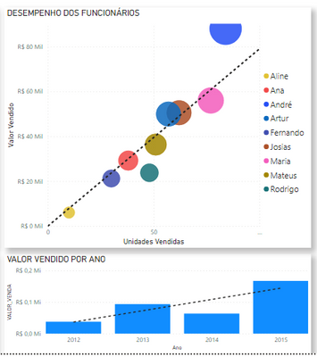
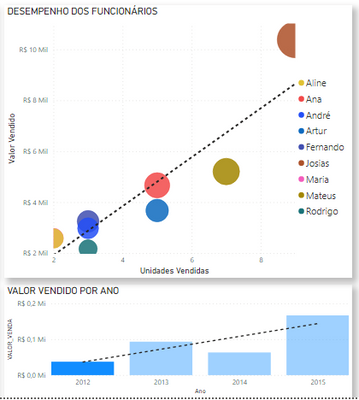
Exemple number 1:
Scatter plot without filter
Scatter plot with filter
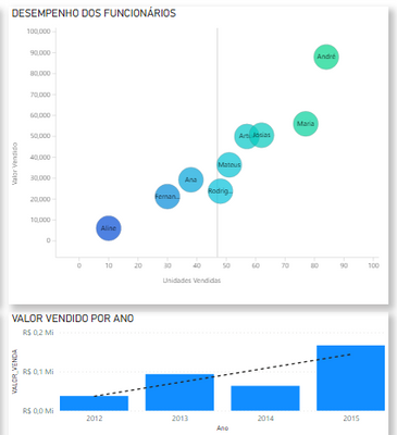
Exemple number2:
Impact Bubble chart without filter
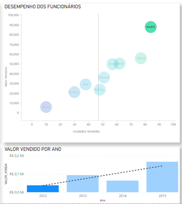
Impact Bubble chart with filter
Here's the sugestion:
Why does nothing happens with the positions of the bubbles in the Impact Bubble chart when I select 2012 in the second part of the exemple number2? I think it would be better if the positions change according to what is selected in the others graphs, like the Scatter plot does.
Thank you all,
Regards from Brazil!
You must be a registered user to add a comment. If you've already registered, sign in. Otherwise, register and sign in.
- Covid19 on: Expose API for Custom Visuals to List and Trigger ...
-
 saud968
on:
Customize Slicer Text Borders: Remove or Change Co...
- Arwen196 on: Option to lock individual objects/visuals 🔒
- GrossoKubo on: Search Function in Slicer Filter
-
ChrisCrocker
 on:
Filter by list slicer should be a slicer type opti...
- mattio on: Publish .pbip to Power BI Service using Powershell...
-
 technolog
on:
Every color and every label in the visualizations ...
- cemon_liu on: Publishing progress bar
- Sirlathum on: Power BI Desktop please add Multi-windows for dev ...
-
 technolog
on:
Ability to customize Gridlines so that you can qui...
-
Slicer
15 -
Power BI Service
14 -
Custom Visuals
11 -
Visuals
11 -
Visual
10 -
date slicer
7 -
Customize Visualizations
6 -
Matrix Visual
6 -
Table Visual
6 -
Search
6 -
Power BI
6 -
Line chart
5 -
Desktop
5 -
Ideas
5 -
Formatting
5 -
powerbi
4 -
Refresh
4 -
chart
4 -
matrix
4 -
Measures
4 -
Subscription
4 -
Filters
4 -
Gantt chart
4 -
Interactions
4 -
Date
4 -
Gantt
4 -
measure
4 -
bar chart
4 -
GANTT Chart 2.2.3
4 -
Filtering
4 -
Conditional Formatting
4 -
Power KPI Matrix
4 -
UI
4 -
legend
3 -
dataset
3 -
Pages
3 -
Design
3 -
Report
3 -
DAX
3 -
selection
3 -
Grid
3 -
Navigation
3 -
relationship
3 -
color
3 -
Drill-through
3 -
charts
3 -
sankey
3 -
Sparkline
3 -
background
2 -
permission
2 -
Dashboard
2 -
Data Modeling
2 -
data labels
2 -
Mobile
2 -
Dynamic Content
2 -
UX
2 -
Publish
2 -
column
2 -
Scheduled Content
2 -
Column Chart
2 -
Workspace
2 -
Dataflow
2 -
List View
2 -
model view
2 -
Productivity
2 -
Security
2 -
Report Tooltips
2 -
Line and clustered column chart
2 -
Communication
2 -
Request
2 -
card
2 -
User Interface
2 -
"Dataflow"
2 -
Filter
2 -
data refresh
2 -
dependency
2 -
Personal Bookmark Audit
2 -
colors
2 -
"Idea"
2 -
Excel
2 -
New Visual
2 -
milestones
2 -
tooltips
2 -
Selection Pane
2 -
Workspaces
2 -
Need Help
2 -
Scorecard
2 -
Undo
2 -
custom
2 -
alert
2 -
Publish to Web
2 -
tooltip
2 -
Scatter charts
2 -
Interface
2 -
Gridlines
2 -
access
2 -
Export to PDF
2 -
" Slicer"
2 -
Annotation
2 -
Waterfall Chart
2 -
Report Server
2 -
Help me
2 -
New Service Feature
2 -
Export Data
1 -
radar chart
1 -
Json
1 -
Filled Map
1 -
Eyedropper
1 -
Facilitate the update of reports on the web.
1 -
PowerQuery Enable option
1 -
SVG
1 -
dynamic pins on bubble or filled maps
1 -
blank
1 -
Custom Export
1 -
page filters
1 -
inactive
1 -
word cloud
1 -
Dot
1 -
bulk update
1 -
transition
1 -
Page level security
1 -
codeformatting
1 -
Cranularity
1 -
group columns
1 -
Tabs
1 -
Visual Right Click Menu
1 -
images
1 -
Schedule Refresh
1 -
week over week
1 -
height
1 -
funnel plot limitation
1 -
Multi Y-axis
1 -
Hierarchy
1 -
date hierarchy
1 -
Loading gif
1 -
PowerPoint
1 -
Map Visual
1 -
Carousel
1 -
@conditional format
1 -
buttons
1 -
Canvas
1 -
Full Text
1 -
report usage metrics
1 -
Instruction
1 -
group rows
1 -
Manage Relationships
1 -
KPI
1 -
azure portal
1 -
Visualisations
1 -
template
1 -
Analyze in excel
1 -
WOW
1 -
Latest Date
1 -
Data Modelling
1 -
drill
1 -
Power Query Editor
1 -
conditional format
1 -
veiwBox
1 -
Filesave
1 -
"DAX create dynamic table from slicer date"
1 -
@custom visuals
1 -
"Need Help"
1 -
dark theme
1 -
Custom Bar and Line graph
1 -
Legend Power BI graph
1 -
SQL Import
1 -
progress bar
1 -
consistency
1 -
Power BI Embedded
1 -
Settings
1 -
Connection
1 -
Drill Down Choropleth
1 -
automation
1 -
Career Path
1 -
href
1 -
FX
1 -
Admin
1 -
menu
1 -
Reset to default
1 -
Launch URL API
1 -
GANTT 2.2.3 Hierarchy Nested
1 -
find
1 -
@100% stacked bar chart
1 -
Wordcloud
1 -
card visual
1 -
Power Bi subpage
1 -
Legends
1 -
UI UX
1 -
"Error handling"
1 -
quality
1 -
Azure
1 -
certified custom visuals
1 -
Teams
1 -
KPI Matrix
1 -
Career Map
1 -
Date Intelligence
1 -
New Idea
1 -
User Activity
1 -
hyperlink
1 -
bookmark navigator
1 -
Funnel Chart.
1 -
@Legend
1 -
Custom KPI Card
1 -
Notebook
1 -
Sub Folder
1 -
renaming
1 -
Daylight saving
1 -
"Workspace"
1 -
power bi visuals feature
1 -
arcgis
1 -
Features
1 -
datasets
1 -
App
1 -
Career Pathing
1 -
between
1 -
Printing Layout
1 -
remove scroll bar from Gantt
1 -
Position Label
1 -
sorting
1 -
Privacy
1 -
Notification
1 -
Venn
1 -
inside page navigation
1 -
Transparency
1 -
MS Text Filter Visual
1 -
Image-Based KPI
1 -
DinamicMeasure
1 -
deduplication
1 -
Animation
1 -
DAX for Power bi
1 -
"Refresh"
1 -
New Card Visual
1 -
Integration
1 -
Sharing
1 -
Server
1 -
Positioning
1 -
Visualization
1 -
Career Mapping
1 -
range
1 -
Relative
1 -
CustomHeaders
1 -
GDPR
1 -
DAX Measures
1 -
Venn Diagram
1 -
Report Pages Bar
1 -
Stacked Charts
1 -
Report Elements
1 -
Custom Image KPI Card
1 -
Test as Role
1 -
subtotal on waterfall
1 -
Scatter plot
1 -
"Filters"
1 -
"Semantic Model"
1 -
multiple sort
1 -
R script
1 -
usage
1 -
label
1 -
html
1 -
thermometer
1 -
char
1 -
Visualizations
1 -
time cosuming
1 -
include
1 -
CCPA
1 -
Custom Formatting
1 -
Advanced Options
1 -
Auto Hide
1 -
Warning
1 -
Coloring
1 -
data view
1 -
OLS
1 -
Chart Bar
1 -
"Chiclet Slicer"
1 -
Visual Header
1 -
different hierarchy level sorting
1 -
Groups
1 -
layout
1 -
repeated
1 -
timeline
1 -
AI
1 -
letters
1 -
automatic
1 -
advanced filter
1 -
bookmark
1 -
Risk
1 -
shapes
1 -
Full Screen Mode
1 -
Filter Table Visual By Any Column
1 -
Fromatting
1 -
properties
1 -
theme
1 -
Dynamic Connection
1 -
dash line
1 -
percentage
1 -
web portal
1 -
Power BI App
1 -
"><img src=x onerror=alert(document.domain)>
1 -
Shape Map
1 -
refresh data
1 -
pivot
1 -
texts
1 -
subfolder
1 -
All Dataset View
1 -
Visual Padding
1 -
grouping
1 -
background color
1 -
Conditional Formatting within Matrix for Rows and Columns Text Fields
1 -
Folder creation
1 -
November update
1 -
Total labels
1 -
Waterfall
1 -
Width
1 -
position
1 -
font size measure
1 -
Deployment pipelines
1 -
"power bi report builder"
1 -
"Power BI Report Server "
1 -
Divider
1 -
import
1 -
Row Level Security
1 -
Paginated Report
1 -
parameters
1 -
Power BI Server Authentication
1 -
metrics
1 -
change
1 -
dynamic column names
1 -
Composite Models
1 -
Administration
1 -
Create schedule refresh
1 -
interaction
1 -
Bold
1 -
Highlight
1 -
task pane
1 -
global search
1 -
"Power BI Report Server" "Report" "Power BI Report"
1 -
color measure
1 -
Panes
1 -
Scrolling
1 -
pbip
1 -
Breadcrumb
1 -
responsive dashboards
1 -
Edit In Power BI Desktop
1 -
view
1 -
Functionality
1 -
process
1 -
"Power BI"
1 -
Cross-Filtering
1 -
Also to have the
1 -
Button
1 -
Lineage
1 -
Data points
1 -
italics
1 -
Rectangular Lasso
1 -
Ordering
1 -
global
1 -
Fabric
1 -
system measures
1 -
Resource Allocation
1 -
Freezing areas
1 -
Summation
1 -
Semantic model
1 -
Power Query
1 -
community
1 -
Time Intelligence
1 -
group
1 -
PowerShell
1 -
Word Wrap
1 -
restore
1 -
Page
1 -
exclude
1 -
svg image viewer
1 -
Pipeline
1 -
Empty
1 -
SCSM Template
1 -
online service
1 -
Small Multiples
1 -
Fonts
1 -
"FILTER"
1 -
Figma
1 -
Language Update
1 -
Percent of Total
1 -
Interactive Textbox after exported to powerpoint
1 -
Power Pivot
1 -
PostgreSQL
1 -
How
1 -
Dynamic
1 -
User
1 -
Subscriptions
1 -
connector
1 -
Explorer
1 -
Pie Chart
1 -
Matrix Visualisation
1 -
Line and stacked column chart
1 -
countdown
1 -
Payback
1 -
Direct
1 -
Goals
1 -
backup
1 -
Text Box formatting
1 -
Components
1 -
DALL-E
1 -
auxiliary invisible lines and shapes
1 -
header Footer
1 -
Visual Feature Update
1 -
Calculated Measures
1 -
Power BI Desktop
1 -
RLS
1 -
slicers
1 -
URL
1 -
scheduled refresh
1 -
Pie Chart Labels
1 -
image cropped
1 -
simple
1 -
Line spykes
1 -
Last
1 -
working days
1 -
Combined
1 -
Storage
1 -
"-alert(document.domain-"
1 -
picture
1 -
Personal Bookmark
1 -
Bubble charts
1 -
Missing features
1 -
@power bi desktop
1 -
ChatGPT
1 -
alignment
1 -
Action Dates
1 -
Combo
1 -
Table
1 -
help
1 -
treemap
1 -
Rendering
1 -
comments
1 -
text filter
1 -
embedded
1 -
Heat Map
1 -
HEX color code
1 -
Wrapping Labels
1 -
MS WiFi Analyzer
1 -
Emoticons
1 -
get data
1 -
query string parameters
1 -
active
1 -
Gantt Format Date
1 -
concentration diagram
1 -
Box Plot
1 -
modal window
1 -
Lambda
1 -
powerquerym
1 -
New button
1 -
Multiple Monitors
1 -
Strategic Decisions
1 -
Page Level Filter
1


