Idea Options
- Subscribe to RSS Feed
- Mark as New
- Mark as Read
- Bookmark
- Subscribe
- Printer Friendly Page
- Report Inappropriate Content
Bubble or scatter plot charts with colors AND shapes
Submitted by
TimSavage
 on
03-03-2023
08:45 AM
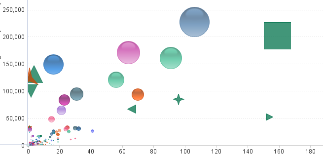
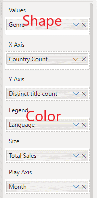
It would be great if Power BI's bubble/scatter plot charts would offer different shapes to represent the Values. SAP's Business Objects already does this as shown in this example. Here, we can see information conveyed by the X-axis, Y-axis, bubble size, bubble color--and bubble shape. Currently, the Legend supplies the bubble color, but the Values isn't supported graphically (so far as I can tell).
Thanks for your consideration!
See more ideas labeled with:
You must be a registered user to add a comment. If you've already registered, sign in. Otherwise, register and sign in.
Latest Comments
- Covid19 on: Expose API for Custom Visuals to List and Trigger ...
-
 saud968
on:
Customize Slicer Text Borders: Remove or Change Co...
- Arwen196 on: Option to lock individual objects/visuals 🔒
- GrossoKubo on: Search Function in Slicer Filter
-
ChrisCrocker
 on:
Filter by list slicer should be a slicer type opti...
- mattio on: Publish .pbip to Power BI Service using Powershell...
-
 technolog
on:
Every color and every label in the visualizations ...
- cemon_liu on: Publishing progress bar
- Sirlathum on: Power BI Desktop please add Multi-windows for dev ...
-
 technolog
on:
Ability to customize Gridlines so that you can qui...
-
Slicer
15 -
Power BI Service
14 -
Custom Visuals
11 -
Visuals
11 -
Visual
10 -
date slicer
7 -
Power BI
6 -
Customize Visualizations
6 -
Matrix Visual
6 -
Table Visual
6 -
Search
6 -
Formatting
5 -
Line chart
5 -
Desktop
5 -
Ideas
5 -
Filtering
4 -
Conditional Formatting
4 -
Power KPI Matrix
4 -
UI
4 -
powerbi
4 -
Refresh
4 -
chart
4 -
matrix
4 -
Measures
4 -
Subscription
4 -
Filters
4 -
Gantt chart
4 -
Interactions
4 -
Date
4 -
Gantt
4 -
measure
4 -
bar chart
4 -
GANTT Chart 2.2.3
4 -
Drill-through
3 -
charts
3 -
sankey
3 -
Sparkline
3 -
legend
3 -
dataset
3 -
Pages
3 -
Design
3 -
Report
3 -
DAX
3 -
selection
3 -
Grid
3 -
Navigation
3 -
relationship
3 -
color
3 -
Publish to Web
2 -
tooltip
2 -
Scatter charts
2 -
Interface
2 -
Gridlines
2 -
access
2 -
Export to PDF
2 -
" Slicer"
2 -
Annotation
2 -
Waterfall Chart
2 -
Report Server
2 -
Help me
2 -
New Service Feature
2 -
background
2 -
permission
2 -
Dashboard
2 -
Data Modeling
2 -
data labels
2 -
Mobile
2 -
Dynamic Content
2 -
UX
2 -
Publish
2 -
column
2 -
Scheduled Content
2 -
Column Chart
2 -
Workspace
2 -
Dataflow
2 -
List View
2 -
model view
2 -
Productivity
2 -
Security
2 -
Report Tooltips
2 -
Line and clustered column chart
2 -
Communication
2 -
Request
2 -
card
2 -
User Interface
2 -
"Dataflow"
2 -
Filter
2 -
data refresh
2 -
dependency
2 -
Personal Bookmark Audit
2 -
colors
2 -
"Idea"
2 -
Excel
2 -
New Visual
2 -
milestones
2 -
tooltips
2 -
Selection Pane
2 -
Workspaces
2 -
Need Help
2 -
Scorecard
2 -
Undo
2 -
custom
2 -
alert
2 -
Power Query
1 -
community
1 -
Time Intelligence
1 -
group
1 -
PowerShell
1 -
Word Wrap
1 -
restore
1 -
Page
1 -
exclude
1 -
svg image viewer
1 -
Pipeline
1 -
Empty
1 -
SCSM Template
1 -
online service
1 -
Small Multiples
1 -
Fonts
1 -
"FILTER"
1 -
Figma
1 -
Language Update
1 -
Percent of Total
1 -
Interactive Textbox after exported to powerpoint
1 -
Power Pivot
1 -
PostgreSQL
1 -
How
1 -
Dynamic
1 -
User
1 -
Subscriptions
1 -
connector
1 -
Explorer
1 -
Pie Chart
1 -
Matrix Visualisation
1 -
Line and stacked column chart
1 -
countdown
1 -
Payback
1 -
Direct
1 -
Goals
1 -
backup
1 -
Text Box formatting
1 -
Components
1 -
DALL-E
1 -
auxiliary invisible lines and shapes
1 -
header Footer
1 -
Visual Feature Update
1 -
Calculated Measures
1 -
Power BI Desktop
1 -
RLS
1 -
slicers
1 -
URL
1 -
scheduled refresh
1 -
Pie Chart Labels
1 -
image cropped
1 -
simple
1 -
Line spykes
1 -
Last
1 -
working days
1 -
Combined
1 -
Storage
1 -
"-alert(document.domain-"
1 -
picture
1 -
Personal Bookmark
1 -
Bubble charts
1 -
Missing features
1 -
@power bi desktop
1 -
ChatGPT
1 -
alignment
1 -
Action Dates
1 -
Combo
1 -
Table
1 -
help
1 -
treemap
1 -
Rendering
1 -
comments
1 -
text filter
1 -
embedded
1 -
Heat Map
1 -
HEX color code
1 -
Wrapping Labels
1 -
MS WiFi Analyzer
1 -
Emoticons
1 -
get data
1 -
query string parameters
1 -
active
1 -
Gantt Format Date
1 -
concentration diagram
1 -
Box Plot
1 -
modal window
1 -
Lambda
1 -
powerquerym
1 -
New button
1 -
Multiple Monitors
1 -
Strategic Decisions
1 -
Page Level Filter
1 -
Export Data
1 -
radar chart
1 -
Json
1 -
Filled Map
1 -
Eyedropper
1 -
Facilitate the update of reports on the web.
1 -
PowerQuery Enable option
1 -
SVG
1 -
dynamic pins on bubble or filled maps
1 -
blank
1 -
Custom Export
1 -
page filters
1 -
inactive
1 -
word cloud
1 -
Dot
1 -
bulk update
1 -
transition
1 -
Page level security
1 -
codeformatting
1 -
Cranularity
1 -
group columns
1 -
Tabs
1 -
Visual Right Click Menu
1 -
images
1 -
Schedule Refresh
1 -
week over week
1 -
height
1 -
funnel plot limitation
1 -
Multi Y-axis
1 -
Hierarchy
1 -
date hierarchy
1 -
Loading gif
1 -
PowerPoint
1 -
Map Visual
1 -
Carousel
1 -
@conditional format
1 -
buttons
1 -
Canvas
1 -
Full Text
1 -
report usage metrics
1 -
Instruction
1 -
group rows
1 -
Manage Relationships
1 -
KPI
1 -
azure portal
1 -
Visualisations
1 -
template
1 -
Analyze in excel
1 -
WOW
1 -
Latest Date
1 -
Data Modelling
1 -
drill
1 -
Power Query Editor
1 -
conditional format
1 -
veiwBox
1 -
Filesave
1 -
"DAX create dynamic table from slicer date"
1 -
@custom visuals
1 -
"Need Help"
1 -
dark theme
1 -
Custom Bar and Line graph
1 -
Legend Power BI graph
1 -
SQL Import
1 -
progress bar
1 -
consistency
1 -
Power BI Embedded
1 -
Settings
1 -
Connection
1 -
Drill Down Choropleth
1 -
automation
1 -
Career Path
1 -
href
1 -
FX
1 -
Admin
1 -
menu
1 -
Reset to default
1 -
Launch URL API
1 -
GANTT 2.2.3 Hierarchy Nested
1 -
find
1 -
@100% stacked bar chart
1 -
Wordcloud
1 -
card visual
1 -
Power Bi subpage
1 -
Legends
1 -
UI UX
1 -
"Error handling"
1 -
quality
1 -
Azure
1 -
certified custom visuals
1 -
Teams
1 -
KPI Matrix
1 -
Career Map
1 -
Date Intelligence
1 -
New Idea
1 -
User Activity
1 -
hyperlink
1 -
bookmark navigator
1 -
Funnel Chart.
1 -
@Legend
1 -
Custom KPI Card
1 -
Notebook
1 -
Sub Folder
1 -
renaming
1 -
Daylight saving
1 -
"Workspace"
1 -
power bi visuals feature
1 -
arcgis
1 -
Features
1 -
datasets
1 -
App
1 -
Career Pathing
1 -
between
1 -
Printing Layout
1 -
remove scroll bar from Gantt
1 -
Position Label
1 -
sorting
1 -
Privacy
1 -
Notification
1 -
Venn
1 -
inside page navigation
1 -
Transparency
1 -
MS Text Filter Visual
1 -
Image-Based KPI
1 -
DinamicMeasure
1 -
deduplication
1 -
Animation
1 -
DAX for Power bi
1 -
"Refresh"
1 -
New Card Visual
1 -
Integration
1 -
Sharing
1 -
Server
1 -
Positioning
1 -
Visualization
1 -
Career Mapping
1 -
range
1 -
Relative
1 -
CustomHeaders
1 -
GDPR
1 -
DAX Measures
1 -
Venn Diagram
1 -
Report Pages Bar
1 -
Stacked Charts
1 -
Report Elements
1 -
Custom Image KPI Card
1 -
Test as Role
1 -
subtotal on waterfall
1 -
Scatter plot
1 -
"Filters"
1 -
"Semantic Model"
1 -
multiple sort
1 -
R script
1 -
usage
1 -
label
1 -
html
1 -
thermometer
1 -
char
1 -
Visualizations
1 -
time cosuming
1 -
include
1 -
CCPA
1 -
Custom Formatting
1 -
Advanced Options
1 -
Auto Hide
1 -
Warning
1 -
Coloring
1 -
data view
1 -
OLS
1 -
Chart Bar
1 -
"Chiclet Slicer"
1 -
Visual Header
1 -
different hierarchy level sorting
1 -
Groups
1 -
layout
1 -
repeated
1 -
timeline
1 -
AI
1 -
letters
1 -
automatic
1 -
advanced filter
1 -
bookmark
1 -
Risk
1 -
shapes
1 -
Full Screen Mode
1 -
Filter Table Visual By Any Column
1 -
Fromatting
1 -
properties
1 -
theme
1 -
Dynamic Connection
1 -
dash line
1 -
percentage
1 -
web portal
1 -
Power BI App
1 -
"><img src=x onerror=alert(document.domain)>
1 -
Shape Map
1 -
refresh data
1 -
pivot
1 -
texts
1 -
subfolder
1 -
All Dataset View
1 -
Visual Padding
1 -
grouping
1 -
background color
1 -
Conditional Formatting within Matrix for Rows and Columns Text Fields
1 -
Folder creation
1 -
November update
1 -
Total labels
1 -
Waterfall
1 -
Width
1 -
position
1 -
font size measure
1 -
Deployment pipelines
1 -
"power bi report builder"
1 -
"Power BI Report Server "
1 -
Divider
1 -
import
1 -
Row Level Security
1 -
Paginated Report
1 -
parameters
1 -
Power BI Server Authentication
1 -
metrics
1 -
change
1 -
dynamic column names
1 -
Composite Models
1 -
Administration
1 -
Create schedule refresh
1 -
interaction
1 -
Bold
1 -
Highlight
1 -
task pane
1 -
global search
1 -
"Power BI Report Server" "Report" "Power BI Report"
1 -
color measure
1 -
Panes
1 -
Scrolling
1 -
pbip
1 -
Breadcrumb
1 -
responsive dashboards
1 -
Edit In Power BI Desktop
1 -
view
1 -
Functionality
1 -
process
1 -
"Power BI"
1 -
Cross-Filtering
1 -
Also to have the
1 -
Button
1 -
Lineage
1 -
Data points
1 -
italics
1 -
Rectangular Lasso
1 -
Ordering
1 -
global
1 -
Fabric
1 -
system measures
1 -
Resource Allocation
1 -
Freezing areas
1 -
Summation
1 -
Semantic model
1
