- Subscribe to RSS Feed
- Mark Topic as New
- Mark Topic as Read
- Float this Topic for Current User
- Bookmark
- Subscribe
- Printer Friendly Page
- Mark as New
- Bookmark
- Subscribe
- Mute
- Subscribe to RSS Feed
- Permalink
- Report Inappropriate Content
Stacked Column Chart in Power BI
Hello all,
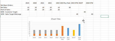
I am working on development in a project. May i know is there another possible to do the graph in Power BI as per the excel shown in below? Hope to hear from you.
Solved! Go to Solution.
- Mark as New
- Bookmark
- Subscribe
- Mute
- Subscribe to RSS Feed
- Permalink
- Report Inappropriate Content
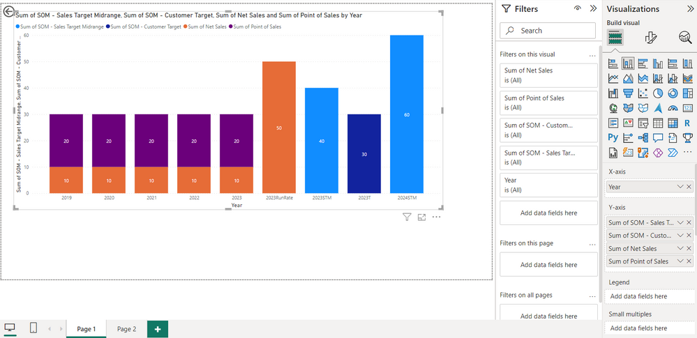
@Anonymous This should provide the correct information. Inverse the row and column data.
This should look like the way you intended, i.e,
- Mark as New
- Bookmark
- Subscribe
- Mute
- Subscribe to RSS Feed
- Permalink
- Report Inappropriate Content
- Mark as New
- Bookmark
- Subscribe
- Mute
- Subscribe to RSS Feed
- Permalink
- Report Inappropriate Content
Hello @Anonymous,
This should be fairly simple task to complete as PowerBI gives the option for 100% stacked column chart.
Thank you, hope this resolves your doubt.
If it resolves, mark it as solution.
- Mark as New
- Bookmark
- Subscribe
- Mute
- Subscribe to RSS Feed
- Permalink
- Report Inappropriate Content
@ChiragGarg2512 Thank you for reply. I have tried but it doesn't work. My raw data table |Status (Run Rate,STM, T)|Year (2019, 2020, 2021, 2022,2023). Appreciate your advice.
- Mark as New
- Bookmark
- Subscribe
- Mute
- Subscribe to RSS Feed
- Permalink
- Report Inappropriate Content
@Anonymous This should provide the correct information. Inverse the row and column data.
This should look like the way you intended, i.e,
Helpful resources
| User | Count |
|---|---|
| 2 | |
| 2 | |
| 1 | |
| 1 | |
| 1 |


