- Subscribe to RSS Feed
- Mark Topic as New
- Mark Topic as Read
- Float this Topic for Current User
- Bookmark
- Subscribe
- Printer Friendly Page
- Mark as New
- Bookmark
- Subscribe
- Mute
- Subscribe to RSS Feed
- Permalink
- Report Inappropriate Content
Power BI Custom Visuals' Community
Welcome to Power BI Custom Visuals Community!
Power BI custom visuals is all about community. We are very excited to announce that custom visuals now have a special place in the Power BI community site, to share knowledge, ideas and news!
- Custom visuals development discussion – Ask questions and share knowledge about developing custom visuals.
- Custom visuals ideas – Share your ideas, ask for features, propose new custom visuals.
- Custom visuals community blog – Community news and announcements for new custom visuals available, new APIs released, tips & tricks from developers and users.
Power BI custom visuals useful links for developers
- Developer documents - find here all documents you need
- Step-by-step tutorial
- Looking for advanced tutorial? Find it here
- Visit also our github
- Find here Power BI visuals' Samples
- Custom visual's webinar
- For technichal questions and help please reach out pbicvsupport@microsoft.com
- Mark as New
- Bookmark
- Subscribe
- Mute
- Subscribe to RSS Feed
- Permalink
- Report Inappropriate Content
Hi,
I am using Chicklet Slicer in my report. I have almost every element accessible using the keyboard, but I cannot get inside the chicklet slicer by pressing the Enter key. I have updated its code such that the Keypress selects the next option available and it works when I click on the visual (get inside of it). When I use the TAB key to roam around the report it only selects the visual. Need help figuring out how can I get inside of the visual using the Enter key so that I can get my Keypress function working.
- Mark as New
- Bookmark
- Subscribe
- Mute
- Subscribe to RSS Feed
- Permalink
- Report Inappropriate Content
Hi
Did you see the article: https://learn.microsoft.com/en-us/power-bi/developer/visuals/supportskeyboardfocus-feature
Thanks
Ranin
- Mark as New
- Bookmark
- Subscribe
- Mute
- Subscribe to RSS Feed
- Permalink
- Report Inappropriate Content
Hi,
I am using the "Timeline Slicer" visual and on 04/09 it does not show me data. There is a way to force them to show. (Understanding that this date is a holiday in the US)
- Mark as New
- Bookmark
- Subscribe
- Mute
- Subscribe to RSS Feed
- Permalink
- Report Inappropriate Content
Hi,
I've built a solution to show the actual and the target. These numbers are in %. Then, the visual calculates the KPI status comparasion doing the percentage between both values but not the differente.
For example:
Value: 80%
Target: 90%
Expected comparision value: 80%-90%=-10%
Here how the dashboard does the calculation: (80-90) / 90 = -11%
Do you know if the calculation method can be changed?
Thanks
- Mark as New
- Bookmark
- Subscribe
- Mute
- Subscribe to RSS Feed
- Permalink
- Report Inappropriate Content
Hi everybody,
I've recently created a custom visual that displays revenue produced over a 5 year period segregated by a certain company's assets.
The visual shows the variance year over year as well as the overall trend of revenue.
- Mark as New
- Bookmark
- Subscribe
- Mute
- Subscribe to RSS Feed
- Permalink
- Report Inappropriate Content
I'm using Drilldown Choropleth Custom map visual by Microsoft. I'm adding state value in it but it's not showing anything, even in format section of visual I'm getting only General section. Can anyone help in this?
- Mark as New
- Bookmark
- Subscribe
- Mute
- Subscribe to RSS Feed
- Permalink
- Report Inappropriate Content
Hi everyone,
i just started my carrier as junior developer.
Having doubts in powerbi visual development. i am developing the dhtmlx gantt chart as powerbi visual.
can anyone help me on this?
- Mark as New
- Bookmark
- Subscribe
- Mute
- Subscribe to RSS Feed
- Permalink
- Report Inappropriate Content
Hi,
I created a dashboard that utilizes the chiclet slicer v1.6.3. I have it deployed on a PBI Service environment and I just noticed that when I hover over the slicers it now shows a tooltip? However I don't see any way to actually configure a tooltip in the visual settings. Am I missing something here?
Thanks
- Mark as New
- Bookmark
- Subscribe
- Mute
- Subscribe to RSS Feed
- Permalink
- Report Inappropriate Content
Seems to be resolved now as I no longer see the tooltip 🙂
- Mark as New
- Bookmark
- Subscribe
- Mute
- Subscribe to RSS Feed
- Permalink
- Report Inappropriate Content
I am working on a power BI project that requires the network navigator visual, I have about 3000 nodes and whenever I reach the 1000 mark the dashboard stops updating. I updated the Max nodes in the layout accordingly and I can also see the hard limit set in the github repo has been increased to 30000. I was wondering if I could get some help on this. Is it possible that the visual on the microsoft store has not been updated to accept the new value of 30000. Thanks
- Mark as New
- Bookmark
- Subscribe
- Mute
- Subscribe to RSS Feed
- Permalink
- Report Inappropriate Content
Hi Community / @Ranin ,
Lately we encounter issues with the Text Filter Visual from Microsoft. You need to type in twice the text you are searching for before it actually works. Is this a known bug that is being looked at?
- Mark as New
- Bookmark
- Subscribe
- Mute
- Subscribe to RSS Feed
- Permalink
- Report Inappropriate Content
Hi, indeed the first time I type in text, it empties itself.
Changing the text afterward however works fine.
Other issue, I'm merging multiple related PBI into one.
I use "Text Filter" in multiple pages, each using their own query. For some reason the search seems broken now, always returning the full dataset. That visualization doesn't have any "Sync slicer" options, so this seems very weird.
Do you know of any alternative visual?
- Mark as New
- Bookmark
- Subscribe
- Mute
- Subscribe to RSS Feed
- Permalink
- Report Inappropriate Content
OK I did some more troubleshooting
It seems that copy/pasting between Power BI's broke the field config, simply removing it and selecting back the same field fixed it. 😑
- Mark as New
- Bookmark
- Subscribe
- Mute
- Subscribe to RSS Feed
- Permalink
- Report Inappropriate Content
Hi Ranin,
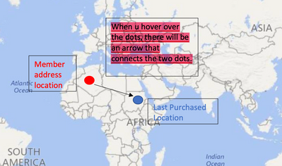
I would like to request for your advice on creating a custom visuals with details shown in the cut_out image shown below. I was wondering if there are any visuals which is able to produce the kind of visuals as shown.
Note: Any other ways or ideas are welcomed.
Regards,
Jo.
- Mark as New
- Bookmark
- Subscribe
- Mute
- Subscribe to RSS Feed
- Permalink
- Report Inappropriate Content
Hi Team,
I am Anshika & have just started working with deneb for creating custom visuals, I wanted to know if deneb is not helpful around bigger size dataset ,more specifically if the column has bigger number of unique values to create custom visuals with or they can be included to create something meaning with the help of deneb.
pls help if anybody could be able to.
Thanks!!
- Mark as New
- Bookmark
- Subscribe
- Mute
- Subscribe to RSS Feed
- Permalink
- Report Inappropriate Content
Good Afternoon,
I have one problem wiht the "table" graphs. For exemple:
From the table "costs" i have one cloumn called "Proyecto".
From the table "Lecturas", I also have a column called "Proyecto".
The problem is: When I select the proyecto at the first "graph" (Alibar in this exemple), the second graph still showing all the projects. Can somewone help me please?
- Mark as New
- Bookmark
- Subscribe
- Mute
- Subscribe to RSS Feed
- Permalink
- Report Inappropriate Content
Do you have a relationship created between those two tables? If one has unique values, you can create 1:m relationship. Or maybe you have a separate table with the 'Proyecto' unique items which you can use as a dimension and create relationships to the other two tables..
- Mark as New
- Bookmark
- Subscribe
- Mute
- Subscribe to RSS Feed
- Permalink
- Report Inappropriate Content
I want to format the Timeline 2.4.0 in my themes.json file and import that theme in my other reports too. The problem is I don't know the properties of this custom visual. I don't want to format this timeline control with the visual level formatting options since there will be a lot of repetition to reproduce the same effect in other reports. Can somebody help me with that?
Here is the link of that custom visual: https://appsource.microsoft.com/en-us/product/power-bi-visuals/wa104380786?tab=overview&exp=...
- Mark as New
- Bookmark
- Subscribe
- Mute
- Subscribe to RSS Feed
- Permalink
- Report Inappropriate Content
I am trying to modify the enhanced scatter open source to create a matrix with a bubble with 2 categorical data as x and y-axis, and one measure as bubble size. Could anyone please suggest how to deal it with?
https://github.com/microsoft/powerbi-visuals-enhancedscatter
Thanks!
- Mark as New
- Bookmark
- Subscribe
- Mute
- Subscribe to RSS Feed
- Permalink
- Report Inappropriate Content
Hi community,
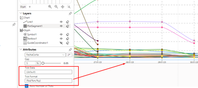
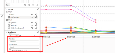
I need to modify the format of the date in the charticulator like dd/mm/yy.
I already change the Tick format in Data as {%d/%m/%y}
but when I SAVE the graph the Tick format is deleted and all date change to old format like this
Do you have what I have to do to fix this ?
Thanks
- Mark as New
- Bookmark
- Subscribe
- Mute
- Subscribe to RSS Feed
- Permalink
- Report Inappropriate Content
Hello!
I'd like to use Gantt 2.2.3, but I have miltiple levels in my projects' catalogue so I need a tree of projects. If I understant this correctly, this type of diargam allow to use only two levels: a child and one parent. Is it possible to add more than one parent to the diagram? How?
Thank you!
Helpful resources

Power BI Monthly Update - July 2025
Check out the July 2025 Power BI update to learn about new features.

| User | Count |
|---|---|
| 2 | |
| 2 | |
| 1 | |
| 1 | |
| 1 |


