Reply
Topic Options
- Subscribe to RSS Feed
- Mark Topic as New
- Mark Topic as Read
- Float this Topic for Current User
- Bookmark
- Subscribe
- Printer Friendly Page
- Mark as New
- Bookmark
- Subscribe
- Mute
- Subscribe to RSS Feed
- Permalink
- Report Inappropriate Content
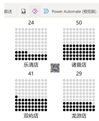
McKinsey‘s waffle chart by DAX
09-21-2022
06:31 PM
Mark this measure as ImageURL and put it in table or matrix
Waffle =
VAR t =
GENERATESERIES ( 1, 10 )
VAR tPlus =
GENERATE ( SELECTCOLUMNS ( t, "Value1", [Value] ), t )
VAR tPlusPlus =
ADDCOLUMNS ( tPlus, "Index", RANKX ( tPlus, [Value] + [Value1] / 100,, ASC ) )
VAR tWaffle =
ADDCOLUMNS (
tPlusPlus,
"circle",
"<circle cx='" & [Value] * 10 + 15 & "' cy='" & [Value1] * 10 + 15 & "' r='4' fill='"
& IF ( [Index] <= ROUND ( [percent] * 100, 0 ), "Black", "LightGrey" ) & "' />"
)
VAR Chart =
"data:image/svg+xml;utf8," & "
<svg xmlns='http://www.w3.org/2000/svg' width='150' height='150'>" & "
<g transform='rotate(-90,75,75)'>"
& CONCATENATEX ( tWaffle, [circle] ) & "
</g>
<text x='70' y='20' font-size='15' text-anchor='middle' >"
& ROUND ( [percent] * 100, 0 ) & "</text>
<text x='70' y='148' font-size='15' text-anchor='middle' >"
& SELECTEDVALUE ( 'table'[store] ) & "</text>
</svg> "
RETURN
IF ( HASONEVALUE ( 'table'[store] ), Chart, BLANK () )
1 REPLY 1
- Mark as New
- Bookmark
- Subscribe
- Mute
- Subscribe to RSS Feed
- Permalink
- Report Inappropriate Content
05-16-2023
06:50 AM
This was exactly what I needed - thank you!!!!
Helpful resources
Recommendations
| Subject | Author | Posted | |
|---|---|---|---|
| 05-12-2016 02:17 AM | |||
| 05-15-2025 05:59 AM | |||
| 10-22-2018 06:05 AM | |||
| 05-08-2017 03:14 AM | |||
| 02-13-2021 03:50 PM |
Top Kudoed Authors (Last Month)
| User | Count |
|---|---|
| 2 | |
| 1 | |
| 1 | |
| 1 | |
| 1 |


