- Power BI forums
- Updates
- News & Announcements
- Get Help with Power BI
- Desktop
- Service
- Report Server
- Power Query
- Mobile Apps
- Developer
- DAX Commands and Tips
- Custom Visuals Development Discussion
- Health and Life Sciences
- Power BI Spanish forums
- Translated Spanish Desktop
- Power Platform Integration - Better Together!
- Power Platform Integrations (Read-only)
- Power Platform and Dynamics 365 Integrations (Read-only)
- Training and Consulting
- Instructor Led Training
- Dashboard in a Day for Women, by Women
- Galleries
- Community Connections & How-To Videos
- COVID-19 Data Stories Gallery
- Themes Gallery
- Data Stories Gallery
- R Script Showcase
- Webinars and Video Gallery
- Quick Measures Gallery
- 2021 MSBizAppsSummit Gallery
- 2020 MSBizAppsSummit Gallery
- 2019 MSBizAppsSummit Gallery
- Events
- Ideas
- Custom Visuals Ideas
- Issues
- Issues
- Events
- Upcoming Events
- Community Blog
- Power BI Community Blog
- Custom Visuals Community Blog
- Community Support
- Community Accounts & Registration
- Using the Community
- Community Feedback
Register now to learn Fabric in free live sessions led by the best Microsoft experts. From Apr 16 to May 9, in English and Spanish.
- Power BI forums
- Forums
- Get Help with Power BI
- Custom Visuals Development Discussion
- How to illustrate two groups of measures from one ...
- Subscribe to RSS Feed
- Mark Topic as New
- Mark Topic as Read
- Float this Topic for Current User
- Bookmark
- Subscribe
- Printer Friendly Page
- Mark as New
- Bookmark
- Subscribe
- Mute
- Subscribe to RSS Feed
- Permalink
- Report Inappropriate Content
How to illustrate two groups of measures from one column in an overlay (picture encloses)
Hello,
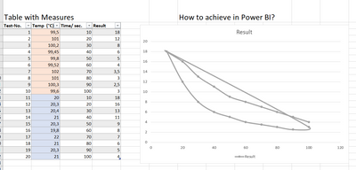
I have a requirement to show measure results depending on different temperatures (ambient temperature about 20 degree and heated temperature above 90 degree). There are several test rows showing the results depending on time and temperature.
For the two temperatures areas (ambient and heated) I want to compare the results as show below, but with different colors per temperature area (ambient and heated) and not connect to eachother as show. My way to show was just limited. Sorry for that.
The goal is t show that I can achieve a better result wih heated or ambient temperature.
Here the data table
| Test-No. | Temp (°C) | Time/ sec | Result |
| 1 | 99,5 | 10 | 18 |
| 2 | 101 | 20 | 12 |
| 3 | 100,2 | 30 | 8 |
| 4 | 99,45 | 40 | 6 |
| 5 | 99,8 | 50 | 5 |
| 6 | 99,52 | 60 | 4 |
| 7 | 102 | 70 | 3,5 |
| 8 | 101 | 80 | 3 |
| 9 | 100,3 | 90 | 2,5 |
| 10 | 99,6 | 100 | 3 |
| 11 | 20 | 10 | 18 |
| 12 | 20,3 | 20 | 16 |
| 13 | 20,4 | 30 | 13 |
| 14 | 21 | 40 | 11 |
| 15 | 20,3 | 50 | 9 |
| 16 | 19,8 | 60 | 8 |
| 17 | 22 | 70 | 7 |
| 18 | 21 | 80 | 6 |
| 19 | 20,3 | 90 | 5 |
| 20 | 21 | 100 | 4 |
Thanks so much in advance.
reg. Klaus
- Mark as New
- Bookmark
- Subscribe
- Mute
- Subscribe to RSS Feed
- Permalink
- Report Inappropriate Content
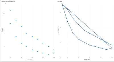
The Deneb visual has examples of scatter plots with joined dots.
Please provide sample data (with sensitive information removed) that covers your issue or question completely, in a usable format (not as a screenshot).
https://community.fabric.microsoft.com/t5/Community-Blog/How-to-provide-sample-data-in-the-Power-BI-...
- Mark as New
- Bookmark
- Subscribe
- Mute
- Subscribe to RSS Feed
- Permalink
- Report Inappropriate Content
Hi,
thanks you so much for your advice. I now added the table with data.
reg. Klaus
- Mark as New
- Bookmark
- Subscribe
- Mute
- Subscribe to RSS Feed
- Permalink
- Report Inappropriate Content
- Mark as New
- Bookmark
- Subscribe
- Mute
- Subscribe to RSS Feed
- Permalink
- Report Inappropriate Content
That look already quiete nice. Thank you so much.
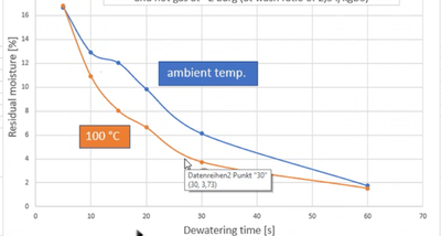
There is only one big issue. I could not make a good example of. I need the illustration like this screenshot with different data. You can see the two groups of data in different colors and not connected.
- Mark as New
- Bookmark
- Subscribe
- Mute
- Subscribe to RSS Feed
- Permalink
- Report Inappropriate Content
- Mark as New
- Bookmark
- Subscribe
- Mute
- Subscribe to RSS Feed
- Permalink
- Report Inappropriate Content
Viel einfacher als ich dachte. Eine Sache der Methodik. Guter Workaround mit der extra Spalte. Das geht dann auch mal manuell. Vielen Dank.
TipTop!
🙏
Viele Grüße aus Sonthofen.
Klaus
Helpful resources

Microsoft Fabric Learn Together
Covering the world! 9:00-10:30 AM Sydney, 4:00-5:30 PM CET (Paris/Berlin), 7:00-8:30 PM Mexico City

Power BI Monthly Update - April 2024
Check out the April 2024 Power BI update to learn about new features.

| User | Count |
|---|---|
| 6 | |
| 1 | |
| 1 | |
| 1 | |
| 1 |


