storytelling
6 TopicsArt with Data
An artistic exploration of Bob Ross data using a variety of data visualisation tools such as Deneb In "Art with Data", Kerry will explore the beautiful synergy of art and data using Bob Ross's artistic data as our canvas. Kerry will demonstrate the potential of Deneb, a custom visual tool in Power BI that allows creative data visualization with Vega Lite language. Join us for this unique blend of art and data, and discover how to tell engaging stories with your data visuals. No matter your Power BI proficiency, this session promises to inspire and enhance your skills. Let's create 'Art with Data' together! About Speaker: Kerry is a data visualization consultant hailing from Adelaide, South Australia. With a background in psychology and the social sciences and over ten years reporting experience across a range of industries, Kerry brings a considered and creative edge to BI and data visualization. Keen to learn and explore new techniques, she shares her findings at kerrykolosko.com 𝙋𝙚𝙧𝙨𝙞𝙖𝙣 𝙋𝘽𝙄𝙐𝙂- 𝙈𝙞𝙘𝙧𝙤𝙨𝙤𝙛𝙩 𝘾𝙤𝙢𝙢𝙪𝙣𝙞𝙩𝙮: https://bit.ly/3IAg7xT 𝙇𝙞𝙣𝙠𝙚𝙙𝙄𝙣: https://bit.ly/32tGkif 𝙏𝙚𝙡𝙚𝙜𝙧𝙖𝙢 𝘾𝙝𝙖𝙣𝙣𝙚𝙡: https://t.me/PersianPBIUG 𝙔𝙤𝙪𝙏𝙪𝙗𝙚: https://bit.ly/3hk20RL Language: English157Views0likes0CommentsData Visualization and Data Storytelling Best Practices
Want to present? Click here! SESSION TOPIC: Data Visualization and Data Storytelling Best Practices [More Details to Follow] HIGH LEVEL AGENDA: #1. Settle in & Intros #2: Updates #3. Session Topic #4. Q&A / Close LEARNING OBJECTIVES: [Coming Soon]
Designing with Purpose: How To Balance Aesthetics and Usability in Power BI
Designing with Purpose: How To Balance Aesthetics and Usability in Power BI is a hands-on session that explores the art and science of building visually engaging yet highly functional dashboards. Whether you're a beginner or an experienced Power BI user, this event will help you transform your reports from data-heavy to insight-driven. By the end of the session, you'll walk away with actionable tips, design frameworks, and real-world examples that will help you design Power BI dashboards that are not only beautiful but also drive decision-making. Who Should Attend: Data Analysts and BI Professionals Dashboard Designers and Report Creators Anyone looking to improve the usability and visual appeal of their Power BI reports556Views0likes3CommentsDesigning with Purpose: How To Balance Aesthetics and Usability in Power BI
Designing with Purpose: How To Balance Aesthetics and Usability in Power BI is a hands-on session that explores the art and science of building visually engaging yet highly functional dashboards. Whether you're a beginner or an experienced Power BI user, this event will help you transform your reports from data-heavy to insight-driven. By the end of the session, you'll walk away with actionable tips, design frameworks, and real-world examples that will help you design Power BI dashboards that are not only beautiful but also drive decision-making. Who Should Attend: Data Analysts and BI Professionals Dashboard Designers and Report Creators Anyone looking to improve the usability and visual appeal of their Power BI reports480Views0likes0CommentsTips de Storytelling para Transformar Datos en Decisiones
Los dashboards muestran datos, pero rara vez cuentan una historia por sí solos. En esta sesión descubrirás cómo aplicar técnicas de storytelling para darles voz, conectar métricas con contexto y transformar información en decisiones estratégicas. Aprenderás a diseñar narrativas visuales que guíen a tu audiencia.126Views0likes0Comments[Interactive HTML Visual in Power BI] — Highlighted at the DataViz World Championships
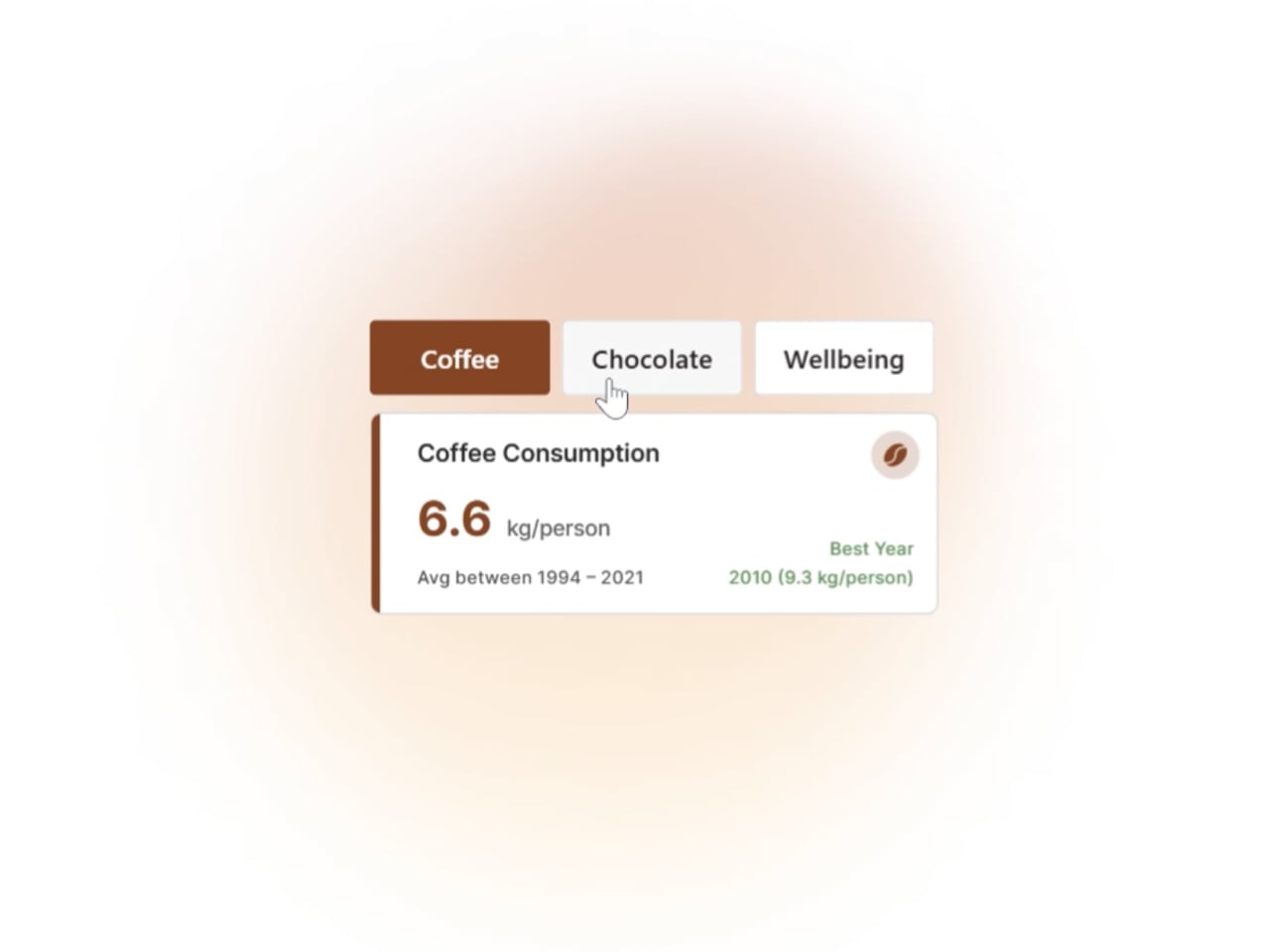
Hi everyone, I’d like to share one of the visuals that received great feedback from the Power BI community during the Power BI DataViz World Championships: an interactive HTML card that dynamically adapts to the selected parameter — changing colors, data, text, tooltips, and visual style, all within Power BI. This kind of solution is part of my regular workflow, especially when the goal is to enhance storytelling, accessibility, and user experience. It’s a way to make data consumption more intuitive and engaging, without compromising clarity or performance. The card was featured in a thematic report exploring coffee, chocolate, and wellbeing across Europe, and it stood out for its flexibility and visual impact. I’m considering starting a series of posts to share more examples, techniques, and practical tips for those interested in pushing the boundaries of HTML, CSS, and advanced interactivity in Power BI. If this type of content interests you, feel free to comment or reach out! I’d love to exchange ideas and learn from others in the community. Feel free to connect on Linkedin http://linkedin.com/in/paulogrijo