- Power BI forums
- Updates
- News & Announcements
- Get Help with Power BI
- Desktop
- Service
- Report Server
- Power Query
- Mobile Apps
- Developer
- DAX Commands and Tips
- Custom Visuals Development Discussion
- Health and Life Sciences
- Power BI Spanish forums
- Translated Spanish Desktop
- Power Platform Integration - Better Together!
- Power Platform Integrations (Read-only)
- Power Platform and Dynamics 365 Integrations (Read-only)
- Training and Consulting
- Instructor Led Training
- Dashboard in a Day for Women, by Women
- Galleries
- Community Connections & How-To Videos
- COVID-19 Data Stories Gallery
- Themes Gallery
- Data Stories Gallery
- R Script Showcase
- Webinars and Video Gallery
- Quick Measures Gallery
- 2021 MSBizAppsSummit Gallery
- 2020 MSBizAppsSummit Gallery
- 2019 MSBizAppsSummit Gallery
- Events
- Ideas
- Custom Visuals Ideas
- Issues
- Issues
- Events
- Upcoming Events
- Community Blog
- Power BI Community Blog
- Custom Visuals Community Blog
- Community Support
- Community Accounts & Registration
- Using the Community
- Community Feedback
Register now to learn Fabric in free live sessions led by the best Microsoft experts. From Apr 16 to May 9, in English and Spanish.
- Power BI forums
- Galleries
- Themes Gallery
- Re: COVID-19 Around the World
- Mark as New
- Bookmark
- Subscribe
- Mute
- Subscribe to RSS Feed
- Permalink
- Report Inappropriate Content
COVID-19 Around the World
COVID-19 Around the World
Hi,
Build an Interactive COVID-19 Dashboard.
In this Dashboard i am trying to visualize that how COVID-19 is spreading all around the world.
How many cases as per continent, country, on daily basis or weekly basis.
How many deaths as per continent, country,
Vaccinations as per continent, country.
Mainly i have focused on total confirmed cases, deaths, deaths rate and vaccinations
Thanks,
eyJrIjoiZGVlM2RkMzEtOTEzYS00ZDk0LWIyNzQtY2UyMDNhZDA2ZTc3IiwidCI6ImQ4ZTFiMDVlLTcwYWEtNGVmNy1iODc4LTQ2NmI2ODhmOTUyZiJ9&pageName=ReportSection
- Mark as New
- Bookmark
- Subscribe
- Mute
- Subscribe to RSS Feed
- Permalink
- Report Inappropriate Content
Hello,
Can you share/send me the pbix file ?
silverwolf0754@gmail.com
Thank you
- Mark as New
- Bookmark
- Subscribe
- Mute
- Subscribe to RSS Feed
- Permalink
- Report Inappropriate Content
Hi Ahmad,
The reports looks cool. Could you share me the list of visuals or custom visuals that you have used in this report?
I wonder how you created the visual of map with color scales?
- Mark as New
- Bookmark
- Subscribe
- Mute
- Subscribe to RSS Feed
- Permalink
- Report Inappropriate Content
Hi @vissvess
Thanks,
i used custom visual for map then set it with color as per user selection.
it shows different color as per user selection.
Thanks,
- Mark as New
- Bookmark
- Subscribe
- Mute
- Subscribe to RSS Feed
- Permalink
- Report Inappropriate Content
and the color scale legend below the map.!
- Mark as New
- Bookmark
- Subscribe
- Mute
- Subscribe to RSS Feed
- Permalink
- Report Inappropriate Content
for color scale i used custom visual from power bi.
- Mark as New
- Bookmark
- Subscribe
- Mute
- Subscribe to RSS Feed
- Permalink
- Report Inappropriate Content
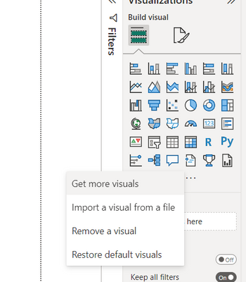
Thanks Ahmad for sharing. Could you please elaborate on the custom visual.?
Have you used charticulator? or is that is available OoB under 'Get More Visual'?
- Mark as New
- Bookmark
- Subscribe
- Mute
- Subscribe to RSS Feed
- Permalink
- Report Inappropriate Content
HI.. @vissvess
regarding legend i have used custom visual from 'Get More Visual'
- Mark as New
- Bookmark
- Subscribe
- Mute
- Subscribe to RSS Feed
- Permalink
- Report Inappropriate Content
- Mark as New
- Bookmark
- Subscribe
- Mute
- Subscribe to RSS Feed
- Permalink
- Report Inappropriate Content
Hi, thanks for getting back to me, how do I contact you privetly, can you whatsapp me please!
- Mark as New
- Bookmark
- Subscribe
- Mute
- Subscribe to RSS Feed
- Permalink
- Report Inappropriate Content
Kindly send invitation on linkdin i will reply over there.
- Mark as New
- Bookmark
- Subscribe
- Mute
- Subscribe to RSS Feed
- Permalink
- Report Inappropriate Content
- Mark as New
- Bookmark
- Subscribe
- Mute
- Subscribe to RSS Feed
- Permalink
- Report Inappropriate Content
Hi, I have a project and was browsing for ideas and came across your report. Would you be able if you can help creating a very powerful sensitivity analysis for a project we are working on.


