- Power BI forums
- Updates
- News & Announcements
- Get Help with Power BI
- Desktop
- Service
- Report Server
- Power Query
- Mobile Apps
- Developer
- DAX Commands and Tips
- Custom Visuals Development Discussion
- Health and Life Sciences
- Power BI Spanish forums
- Translated Spanish Desktop
- Power Platform Integration - Better Together!
- Power Platform Integrations (Read-only)
- Power Platform and Dynamics 365 Integrations (Read-only)
- Training and Consulting
- Instructor Led Training
- Dashboard in a Day for Women, by Women
- Galleries
- Community Connections & How-To Videos
- COVID-19 Data Stories Gallery
- Themes Gallery
- Data Stories Gallery
- R Script Showcase
- Webinars and Video Gallery
- Quick Measures Gallery
- 2021 MSBizAppsSummit Gallery
- 2020 MSBizAppsSummit Gallery
- 2019 MSBizAppsSummit Gallery
- Events
- Ideas
- Custom Visuals Ideas
- Issues
- Issues
- Events
- Upcoming Events
- Community Blog
- Power BI Community Blog
- Custom Visuals Community Blog
- Community Support
- Community Accounts & Registration
- Using the Community
- Community Feedback
Register now to learn Fabric in free live sessions led by the best Microsoft experts. From Apr 16 to May 9, in English and Spanish.
- Power BI forums
- Forums
- Get Help with Power BI
- Service
- Y axis labels cut off
- Subscribe to RSS Feed
- Mark Topic as New
- Mark Topic as Read
- Float this Topic for Current User
- Bookmark
- Subscribe
- Printer Friendly Page
- Mark as New
- Bookmark
- Subscribe
- Mute
- Subscribe to RSS Feed
- Permalink
- Report Inappropriate Content
Y axis labels cut off
Hello,
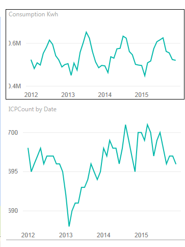
I'm using the December 2015 version of the desktop and have just created a report. Uploaded to the service and viewed in IE 11, the Y axis labels are cut off. I've tried all the variants from the View dropdown, but each view cuts off the labels. I've added a border to the upper chart to illustrate. There is nothing overlapping the charts. Any ideas?
Solved! Go to Solution.
- Mark as New
- Bookmark
- Subscribe
- Mute
- Subscribe to RSS Feed
- Permalink
- Report Inappropriate Content
Found the fix.
I'm not sure what my company's GPO settings are doing to my laptop's IE 11. Maybe there are some kind of Enterprise Mode settings in place. This may sound weird but after I added powerbi.com to the list of sites in the Compatibility View settings, the report and dashboard now renders correctly.
This is reproducable. If I remove powerbi.com from the Compatibility View, the labels are big and cut off again, and legend labels in visualizations have blue font. Once I add powerbi.com to the Compatibility View, labels are fine and legend labels are back to normal.
- Mark as New
- Bookmark
- Subscribe
- Mute
- Subscribe to RSS Feed
- Permalink
- Report Inappropriate Content
Is this IE only? i.e. can you reproduce it in another browser?
Definitely submit a bug report if you can reliably reproduce this behavior. You can do so by goint to http://support.powerbi.com and choosing "Contact Us" in the bottom right.
- Mark as New
- Bookmark
- Subscribe
- Mute
- Subscribe to RSS Feed
- Permalink
- Report Inappropriate Content
Hmmm, seems to happen only on that machine. Maybe IE settings are wonky.
- Mark as New
- Bookmark
- Subscribe
- Mute
- Subscribe to RSS Feed
- Permalink
- Report Inappropriate Content
Found the fix.
I'm not sure what my company's GPO settings are doing to my laptop's IE 11. Maybe there are some kind of Enterprise Mode settings in place. This may sound weird but after I added powerbi.com to the list of sites in the Compatibility View settings, the report and dashboard now renders correctly.
This is reproducable. If I remove powerbi.com from the Compatibility View, the labels are big and cut off again, and legend labels in visualizations have blue font. Once I add powerbi.com to the Compatibility View, labels are fine and legend labels are back to normal.
- Mark as New
- Bookmark
- Subscribe
- Mute
- Subscribe to RSS Feed
- Permalink
- Report Inappropriate Content
I may have spoken too soon. Today, with powerbi.com still in the list of sites for Compatibility View, the labels were big and cut off again. I had to remove powerbi.com and then re-add it to the list to see the labels correctly.
What is causing this?
Helpful resources

Microsoft Fabric Learn Together
Covering the world! 9:00-10:30 AM Sydney, 4:00-5:30 PM CET (Paris/Berlin), 7:00-8:30 PM Mexico City

Power BI Monthly Update - April 2024
Check out the April 2024 Power BI update to learn about new features.


