- Power BI forums
- Updates
- News & Announcements
- Get Help with Power BI
- Desktop
- Service
- Report Server
- Power Query
- Mobile Apps
- Developer
- DAX Commands and Tips
- Custom Visuals Development Discussion
- Health and Life Sciences
- Power BI Spanish forums
- Translated Spanish Desktop
- Power Platform Integration - Better Together!
- Power Platform Integrations (Read-only)
- Power Platform and Dynamics 365 Integrations (Read-only)
- Training and Consulting
- Instructor Led Training
- Dashboard in a Day for Women, by Women
- Galleries
- Community Connections & How-To Videos
- COVID-19 Data Stories Gallery
- Themes Gallery
- Data Stories Gallery
- R Script Showcase
- Webinars and Video Gallery
- Quick Measures Gallery
- 2021 MSBizAppsSummit Gallery
- 2020 MSBizAppsSummit Gallery
- 2019 MSBizAppsSummit Gallery
- Events
- Ideas
- Custom Visuals Ideas
- Issues
- Issues
- Events
- Upcoming Events
- Community Blog
- Power BI Community Blog
- Custom Visuals Community Blog
- Community Support
- Community Accounts & Registration
- Using the Community
- Community Feedback
Register now to learn Fabric in free live sessions led by the best Microsoft experts. From Apr 16 to May 9, in English and Spanish.
- Power BI forums
- Forums
- Get Help with Power BI
- Service
- Re: Slicer/Filter by colour in Visual Chart
- Subscribe to RSS Feed
- Mark Topic as New
- Mark Topic as Read
- Float this Topic for Current User
- Bookmark
- Subscribe
- Printer Friendly Page
- Mark as New
- Bookmark
- Subscribe
- Mute
- Subscribe to RSS Feed
- Permalink
- Report Inappropriate Content
Slicer/Filter by colour in Visual Chart
Hello,
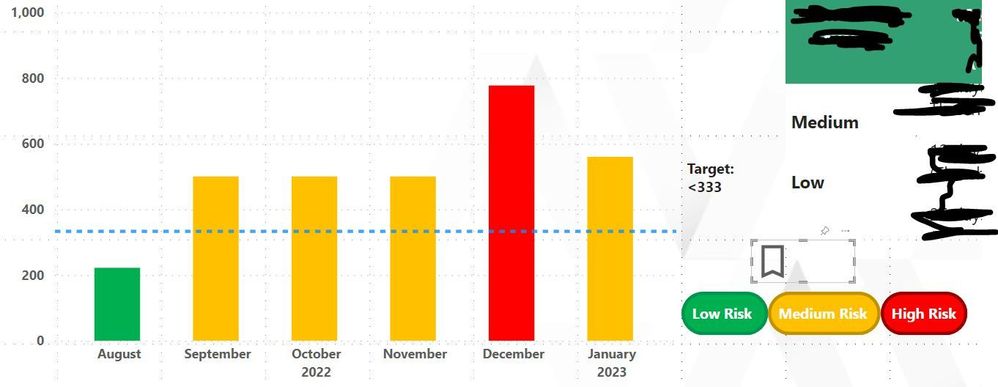
Something I've been trying to find an answer to is if I creat a bar chart and assigned 3 colours based on a conditional format. For instance, if below 333 the bar is to be green, between 334-666, amber and 667-1000 red is there a way that you can create a legend for those 3 colours and if you click on either one it will display those bars only. So if I click on green all other bars a faded out (like when you normally click on something in a visual).
I thought this would be baked into the visuals but I've yet to find how to set this up. I've tried creating a table with the colours assigned to a cell and using a slicer but that certainly did not work. lol.
- Mark as New
- Bookmark
- Subscribe
- Mute
- Subscribe to RSS Feed
- Permalink
- Report Inappropriate Content
Not directly. The colors aren't part of the report layer like that. What you could do:
- Manually create buttons that were just those colors.
- Create bookmarks to filter the data by each color.
- Assign those bookmarks to the respective buttons
Did I answer your question? Mark my post as a solution!
Did my answers help arrive at a solution? Give it a kudos by clicking the Thumbs Up!
DAX is for Analysis. Power Query is for Data Modeling
Proud to be a Super User!
MCSA: BI Reporting- Mark as New
- Bookmark
- Subscribe
- Mute
- Subscribe to RSS Feed
- Permalink
- Report Inappropriate Content
Morning @edhans thank you for your response.
The buttons I'm creating, would these simulate the bar graph? So the report I'm creating will be updated monthly based on the numbers from that month and the colours are based on whether there is low risk, medium risk and high risk.
I've already conditional formating for the bar graph so when next months data is added it'll adjust and apply the colour depeding on the range of the number such as if its below 333 it'll be green, if its between 334-666 amber and between 667 -1000 red.
I've attached an image to help with my terrible explaination. 😄
Helpful resources

Microsoft Fabric Learn Together
Covering the world! 9:00-10:30 AM Sydney, 4:00-5:30 PM CET (Paris/Berlin), 7:00-8:30 PM Mexico City

Power BI Monthly Update - April 2024
Check out the April 2024 Power BI update to learn about new features.


