Get certified for free when you join Fabric Data Days 2026 and dive into Fabric, Power BI, SQL, AI, and other essential data skills.
Join nowJuly 7 - July 17 | Round 2 of the Power BI Dataviz World Championships. Don't miss your chance! Learn more
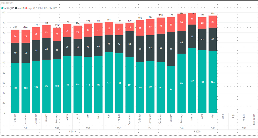
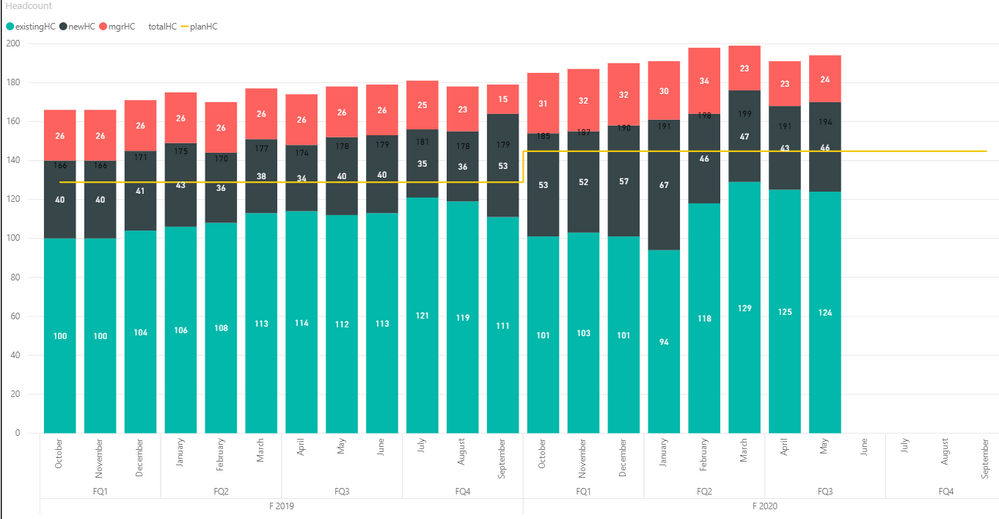
Hey all - I'm having an issue where a chart is rendering differently in the Power BI online portal than it is in the desktop app.
I have a combo stacked bar chart with a line (line represents a goal value). In desktop, the line renders properly, close to the top of the bars, while the online portal renders the line closer to the middle and throws off the visualization. I was thinking when it publishes to PBI online that maybe it is rendering the line on a secondary axis, but I'm not sure how to troubleshoot that.
Any help would be appreciated. Thanks in advance!
Hi @Anonymous ,
According to your screenshots, it seems the value of planHC display incorrectly in Power BI Service... This is a fact field from the table or a measure? If it is a measure, please provide its formulas. And please provide some source data which display on combo stacked bar chart (exclude sensitive data). Thank you.
Best Regards
Rena
Hi @Anonymous
This sounds like a bug. Please check the Issues site to see if you can get status on this and if others are experiencing same thing. If not, try searching the Support site to see if this is a known issue. If not, submit a bug through the Support site.
HTH
Michele
Join us in Barcelona for FabCon and SQLCon, the Fabric, Power BI, SQL, and AI community event. Save €200 with code FABCMTY200.
Check out the July 2026 Power BI update to learn about new features.
Join Data Days 2026: 60 days of free live/on-demand sessions, challenges, study groups, and certification opportunities.