- Power BI forums
- Updates
- News & Announcements
- Get Help with Power BI
- Desktop
- Service
- Report Server
- Power Query
- Mobile Apps
- Developer
- DAX Commands and Tips
- Custom Visuals Development Discussion
- Health and Life Sciences
- Power BI Spanish forums
- Translated Spanish Desktop
- Power Platform Integration - Better Together!
- Power Platform Integrations (Read-only)
- Power Platform and Dynamics 365 Integrations (Read-only)
- Training and Consulting
- Instructor Led Training
- Dashboard in a Day for Women, by Women
- Galleries
- Community Connections & How-To Videos
- COVID-19 Data Stories Gallery
- Themes Gallery
- Data Stories Gallery
- R Script Showcase
- Webinars and Video Gallery
- Quick Measures Gallery
- 2021 MSBizAppsSummit Gallery
- 2020 MSBizAppsSummit Gallery
- 2019 MSBizAppsSummit Gallery
- Events
- Ideas
- Custom Visuals Ideas
- Issues
- Issues
- Events
- Upcoming Events
- Community Blog
- Power BI Community Blog
- Custom Visuals Community Blog
- Community Support
- Community Accounts & Registration
- Using the Community
- Community Feedback
Register now to learn Fabric in free live sessions led by the best Microsoft experts. From Apr 16 to May 9, in English and Spanish.
- Power BI forums
- Forums
- Get Help with Power BI
- Service
- Re: Lines Chart Dots Disappear When Published
- Subscribe to RSS Feed
- Mark Topic as New
- Mark Topic as Read
- Float this Topic for Current User
- Bookmark
- Subscribe
- Printer Friendly Page
- Mark as New
- Bookmark
- Subscribe
- Mute
- Subscribe to RSS Feed
- Permalink
- Report Inappropriate Content
Lines Chart Dots Disappear When Published
Hello All,
Firstly, apologies if I get the terminology wrong, I'm a fairly new Power BI user having crossed over from Qlik.
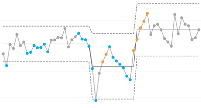
We've just started to get this strange issue when publishing a report. We're using a line chart that was developed for us to give a special type of statistical analysis. It uses a number of different fields in the y-axis to give different lines, three of these fields are value, value_orange and value blue, the colours signifying a statistical rule break. The value always has a number in the field, the value_orange and value_blue only have a number if there is a rule break and are otherwise empty. This first image shows the graph working perfectly in the Power BI Desktop app...
Desktop chart:
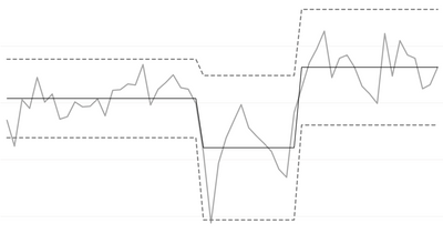
However, when we publish the report in a workspace, the dots all disappear, as per the below image. This has been previously working without any issues for about a year but suddenly stopped last week a some point. If you hover over the points then the dots do still appear.
Published chart:
Important to mention, that the dots are created in ( visualizations > format visual > visual > lines ) using a round join type and with the value field also having a line to creat the grey lines between the dots, couple of small screenshots below.
We can get around this by turning on markers but we've got thousands of charts like this across hundreds of reprots and it would take a very long time to fix everything. In the meantime it's making our products useless to the end users.
Does anyone have any ideas why this might be happening? or experienced similar? We don't want to start changing everything by turning on markers if this is just a temporary bug. Any help would be greatly appreciated.
- Mark as New
- Bookmark
- Subscribe
- Mute
- Subscribe to RSS Feed
- Permalink
- Report Inappropriate Content
Sorry for the delay in response! We've identified a regression in behavior that shows series-specific markers if the top-level toggle is off, which is the case you're both describing. This change was related to the upcoming contextual formatting work. As a temporary workaround, you can enable that top-level toggle and manually shut off markers on specific line series you don't want markers to show.
However, a fix will be deployed to the Service over the next week (week of Dec 12) and shipped as part of December's Desktop release. If you opt to not follow the workaround above, the reports will revert to the previous behavior above. Cheers
- Mark as New
- Bookmark
- Subscribe
- Mute
- Subscribe to RSS Feed
- Permalink
- Report Inappropriate Content
Good Afternoon, could you confirm if this fix took place, as I have just returned from Xmas leave and am still experiencing the same issues?
- Mark as New
- Bookmark
- Subscribe
- Mute
- Subscribe to RSS Feed
- Permalink
- Report Inappropriate Content
We have the exact same issue. We are creating SPC charts exactly like you are.
- Mark as New
- Bookmark
- Subscribe
- Mute
- Subscribe to RSS Feed
- Permalink
- Report Inappropriate Content
Hi @asmith6uk
There is no similar known issue. I tried to restore the scenario you described, but failed. Can you provide us with your pbix file(sensitive info) for testing?
Best Regards,
Community Support Team _ Ailsa Tao
If this post helps, then please consider Accept it as the solution to help the other members find it more quickly.
Helpful resources

Microsoft Fabric Learn Together
Covering the world! 9:00-10:30 AM Sydney, 4:00-5:30 PM CET (Paris/Berlin), 7:00-8:30 PM Mexico City

Power BI Monthly Update - April 2024
Check out the April 2024 Power BI update to learn about new features.


