- Power BI forums
- Updates
- News & Announcements
- Get Help with Power BI
- Desktop
- Service
- Report Server
- Power Query
- Mobile Apps
- Developer
- DAX Commands and Tips
- Custom Visuals Development Discussion
- Health and Life Sciences
- Power BI Spanish forums
- Translated Spanish Desktop
- Power Platform Integration - Better Together!
- Power Platform Integrations (Read-only)
- Power Platform and Dynamics 365 Integrations (Read-only)
- Training and Consulting
- Instructor Led Training
- Dashboard in a Day for Women, by Women
- Galleries
- Community Connections & How-To Videos
- COVID-19 Data Stories Gallery
- Themes Gallery
- Data Stories Gallery
- R Script Showcase
- Webinars and Video Gallery
- Quick Measures Gallery
- 2021 MSBizAppsSummit Gallery
- 2020 MSBizAppsSummit Gallery
- 2019 MSBizAppsSummit Gallery
- Events
- Ideas
- Custom Visuals Ideas
- Issues
- Issues
- Events
- Upcoming Events
- Community Blog
- Power BI Community Blog
- Custom Visuals Community Blog
- Community Support
- Community Accounts & Registration
- Using the Community
- Community Feedback
Register now to learn Fabric in free live sessions led by the best Microsoft experts. From Apr 16 to May 9, in English and Spanish.
- Power BI forums
- Forums
- Get Help with Power BI
- Service
- Re: Combo Charts in Power BI
- Subscribe to RSS Feed
- Mark Topic as New
- Mark Topic as Read
- Float this Topic for Current User
- Bookmark
- Subscribe
- Printer Friendly Page
- Mark as New
- Bookmark
- Subscribe
- Mute
- Subscribe to RSS Feed
- Permalink
- Report Inappropriate Content
Combo Charts in Power BI
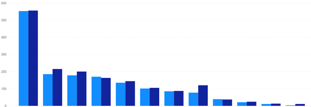
Everyone has been great in the past in providing assistance and I would appreciate assistance again. I have a Power BI bar chart where data for one client greatly exceeds other clients. I can change the outlier client appearance to a line graph when creating a combo chart. I have chosen a combo chart in Power BI and checked the second Y-axis but cannot find how the change the one bar to a line.
Thank you in advance for your recommendations/solutions.
Solved! Go to Solution.
- Mark as New
- Bookmark
- Subscribe
- Mute
- Subscribe to RSS Feed
- Permalink
- Report Inappropriate Content
@stuart765 ,
You can create a calculated measure for that particular location and then put that measure in Column Y-Axis
Example of such calculated measure:
Location1 Sales = CALCULATE(SUM(Sales), 'Table_Name'[Location] = "Location1")
 |
Give a Thumbs Up if this post helped you in any way and Mark This Post as Solution if it solved your query !!! Proud To Be a Super User !!! |
- Mark as New
- Bookmark
- Subscribe
- Mute
- Subscribe to RSS Feed
- Permalink
- Report Inappropriate Content
My data consists of multiple locations. In Excel, I can create a combo chart and choose which location I want to appear as a line graph so the other locations do not appear skewed. Does Power BI allow switching one data element in a chart to a line vs. bar? I do not want to create a new table with just one location to create a combo chart. Thank yoy.
- Mark as New
- Bookmark
- Subscribe
- Mute
- Subscribe to RSS Feed
- Permalink
- Report Inappropriate Content
@stuart765 ,
You can create a calculated measure for that particular location and then put that measure in Column Y-Axis
Example of such calculated measure:
Location1 Sales = CALCULATE(SUM(Sales), 'Table_Name'[Location] = "Location1")
 |
Give a Thumbs Up if this post helped you in any way and Mark This Post as Solution if it solved your query !!! Proud To Be a Super User !!! |
- Mark as New
- Bookmark
- Subscribe
- Mute
- Subscribe to RSS Feed
- Permalink
- Report Inappropriate Content
I created the chart from tables/data already in Power BI. I've included two pictures (screen shots).


- Mark as New
- Bookmark
- Subscribe
- Mute
- Subscribe to RSS Feed
- Permalink
- Report Inappropriate Content
@stuart765 ,
Whatever you need in the bar chart comparison will go in "Column Y-Axis". Whatever you need in the line chart will go into "Line Y-Axis".
Please refer below image:
 |
Give a Thumbs Up if this post helped you in any way and Mark This Post as Solution if it solved your query !!! Proud To Be a Super User !!! |
- Mark as New
- Bookmark
- Subscribe
- Mute
- Subscribe to RSS Feed
- Permalink
- Report Inappropriate Content
Hi @stuart765 ,
Which combo chart are you using? What is the exact name of visualization? Is it some visual imported from app source?
 |
Give a Thumbs Up if this post helped you in any way and Mark This Post as Solution if it solved your query !!! Proud To Be a Super User !!! |
Helpful resources

Microsoft Fabric Learn Together
Covering the world! 9:00-10:30 AM Sydney, 4:00-5:30 PM CET (Paris/Berlin), 7:00-8:30 PM Mexico City

Power BI Monthly Update - April 2024
Check out the April 2024 Power BI update to learn about new features.


