FabCon is coming to Atlanta
Join us at FabCon Atlanta from March 16 - 20, 2026, for the ultimate Fabric, Power BI, AI and SQL community-led event. Save $200 with code FABCOMM.
Register now!- Power BI forums
- Get Help with Power BI
- Desktop
- Service
- Report Server
- Power Query
- Mobile Apps
- Developer
- DAX Commands and Tips
- Custom Visuals Development Discussion
- Health and Life Sciences
- Power BI Spanish forums
- Translated Spanish Desktop
- Training and Consulting
- Instructor Led Training
- Dashboard in a Day for Women, by Women
- Galleries
- Data Stories Gallery
- Themes Gallery
- Contests Gallery
- QuickViz Gallery
- Quick Measures Gallery
- Visual Calculations Gallery
- Notebook Gallery
- Translytical Task Flow Gallery
- TMDL Gallery
- R Script Showcase
- Webinars and Video Gallery
- Ideas
- Custom Visuals Ideas (read-only)
- Issues
- Issues
- Events
- Upcoming Events
View all the Fabric Data Days sessions on demand. View schedule
- Power BI forums
- Forums
- Get Help with Power BI
- Report Server
- Dynamic axis Report Builder Power BI
- Subscribe to RSS Feed
- Mark Topic as New
- Mark Topic as Read
- Float this Topic for Current User
- Bookmark
- Subscribe
- Printer Friendly Page
- Mark as New
- Bookmark
- Subscribe
- Mute
- Subscribe to RSS Feed
- Permalink
- Report Inappropriate Content
Dynamic axis Report Builder Power BI
Hi everybody! Can you help me out with dynamic axis in Power BI report builder?
For a report I am building in Power BI report builder, I am creating bar charts and column charts.
As you know, charts are dynamic, which causes the issue that sometimes there is not enough room to place the datalabels outside. To solve this matter, I want to create a dynamic axis.
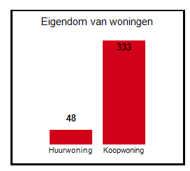
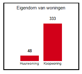
The below graph is an example of what I want to achieve.
For this graph, everything worked fine.
I was able to get the result by the following expression for the MAX value: for my y-axis:
=Max(Count(Fields!Matchkey.Value))*1.1
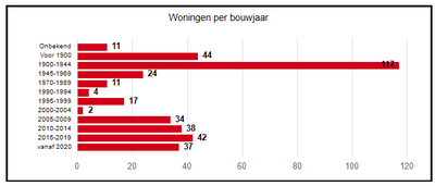
I now want to achieve the same result for a bar chart:
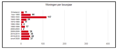
But, if I use the same formula to determine the max value for my x-axis, I get the following result:
I have two parameters in my report. After selecting the parameter values and running the report, the total Matchkeys in this particular selection is 381.
However, it should pick in this case the 117 (= the max value for this graph) and multiply this with 1.1 to create a margin so that the labels fit next to the bar, but it is picking up the total Matchkeys, instead of the Max matchkey count for this selection.
Does anyone know how to solve this matter?
Formula's I have tried already, are:
=MAX(Fields!Matchkey.Value)*1.1
=MAX(Fields!Matchkey.Value)*2
=Count(Fields!Matchkey.Value)
=MAX(Count(Fields!Matchkey.Value))
=MAX(Count(Fields!Matchkey.Value)) *1.1
ChatGPT is not helpful unfortunately.
As a suggestion it's giving me to create a calculated field that calculates the max value, and then use that in my expression to determine the max value.
I could not do that as it gives me the error that you cannot use an aggregate function in a calculated field (COUNT and MAX).
It appears the report processes the axes for bar charts differently then for column charts.
Does anyone know what I should do? Help is very much appreciated!
- Mark as New
- Bookmark
- Subscribe
- Mute
- Subscribe to RSS Feed
- Permalink
- Report Inappropriate Content
Hello everyone.
So I thought my solution looked very promising. However, I noticed it is still not working properly because my dataset has large differences in it, and when I tested it further I noticed that it is also picking the max matchkey count for the column chart, I was just very lucky with the example that it worked out.
So, any help is welcome!!
Helpful resources

Power BI Monthly Update - November 2025
Check out the November 2025 Power BI update to learn about new features.

Fabric Data Days
Advance your Data & AI career with 50 days of live learning, contests, hands-on challenges, study groups & certifications and more!

| User | Count |
|---|---|
| 8 | |
| 2 | |
| 2 | |
| 2 | |
| 1 |
| User | Count |
|---|---|
| 17 | |
| 6 | |
| 4 | |
| 3 | |
| 2 |


