Get Fabric or SQL Certified for Free.
Get certified for free when you join Fabric Data Days 2026 and dive into Fabric, Power BI, SQL, AI, and other essential data skills.
Join nowGo To
- Power BI forums
- Get Help with Power BI
- Desktop
- Service
- Report Server
- Power Query
- Mobile Apps
- Developer
- DAX Commands and Tips
- Custom Visuals Development Discussion
- Health and Life Sciences
- Power BI Spanish forums
- Translated Spanish Desktop
- Training and Consulting
- Instructor Led Training
- Dashboard in a Day for Women, by Women
- Galleries
- Data Stories Gallery
- Themes Gallery
- Contests Gallery
- QuickViz Gallery
- Quick Measures Gallery
- Visual Calculations Gallery
- Notebook Gallery
- Translytical Task Flow Gallery
- TMDL Gallery
- R Script Showcase
- Webinars and Video Gallery
- Ideas
- Custom Visuals Ideas (read-only)
- Issues
- Issues
- Events
- Upcoming Events
Turn on suggestions
Auto-suggest helps you quickly narrow down your search results by suggesting possible matches as you type.
Showing results for
July 7 - July 17 | Round 2 of the Power BI Dataviz World Championships. Don't miss your chance! Learn more
- Power BI forums
- Galleries
- R Script Showcase
- Dumbbell Chart by MAQ Software
Your file has been submitted successfully. We’re processing it now - please check back in a few minutes to view your report.


- Mark as New
- Bookmark
- Subscribe
- Mute
- Subscribe to RSS Feed
- Permalink
- Report Inappropriate Content
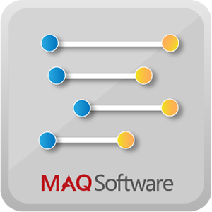
Dumbbell Chart by MAQ Software
12-21-2017
07:12 AM
Dumbbell Chart helps users analyze changes in critical data. This visual is an excellent choice for illustrating the change between two data points and comparing the distances between them. Dumbbell Chart gets its name thanks to its resemblance to a gym weight. The visual consists of a dual-axis combination chart, where one axis is marked by a circle and the other is marked by a line that spans data points provided by the user. Key features include: · The ability to display the performance of multiple indicators. · The ability to compare the growth or loss of indicators across various categories. · Easy interaction with many data points using the zoom functionality. · Quick downloading of an image of the chart with the capture image widget. R package dependencies (auto installed): plotly and ggplot2
- Mark as New
- Bookmark
- Subscribe
- Mute
- Subscribe to RSS Feed
- Permalink
- Report Inappropriate Content
01-09-2018
05:20 PM
Good day.
Is the dumbbell chart available in the store? Great example !!