Get Fabric or SQL Certified for Free.
Get certified for free when you join Fabric Data Days 2026 and dive into Fabric, Power BI, SQL, AI, and other essential data skills.
Join now- Power BI forums
- Get Help with Power BI
- Desktop
- Service
- Report Server
- Power Query
- Mobile Apps
- Developer
- DAX Commands and Tips
- Custom Visuals Development Discussion
- Health and Life Sciences
- Power BI Spanish forums
- Translated Spanish Desktop
- Training and Consulting
- Instructor Led Training
- Dashboard in a Day for Women, by Women
- Galleries
- Data Stories Gallery
- Themes Gallery
- Contests Gallery
- QuickViz Gallery
- Quick Measures Gallery
- Visual Calculations Gallery
- Notebook Gallery
- Translytical Task Flow Gallery
- TMDL Gallery
- R Script Showcase
- Webinars and Video Gallery
- Ideas
- Custom Visuals Ideas (read-only)
- Issues
- Issues
- Events
- Upcoming Events
July 7 - July 17 | Round 2 of the Power BI Dataviz World Championships. Don't miss your chance! Learn more
- Power BI forums
- Galleries
- R Script Showcase
- Combined Line and Area chart in R
Your file has been submitted successfully. We’re processing it now - please check back in a few minutes to view your report.


- Mark as New
- Bookmark
- Subscribe
- Mute
- Subscribe to RSS Feed
- Permalink
- Report Inappropriate Content
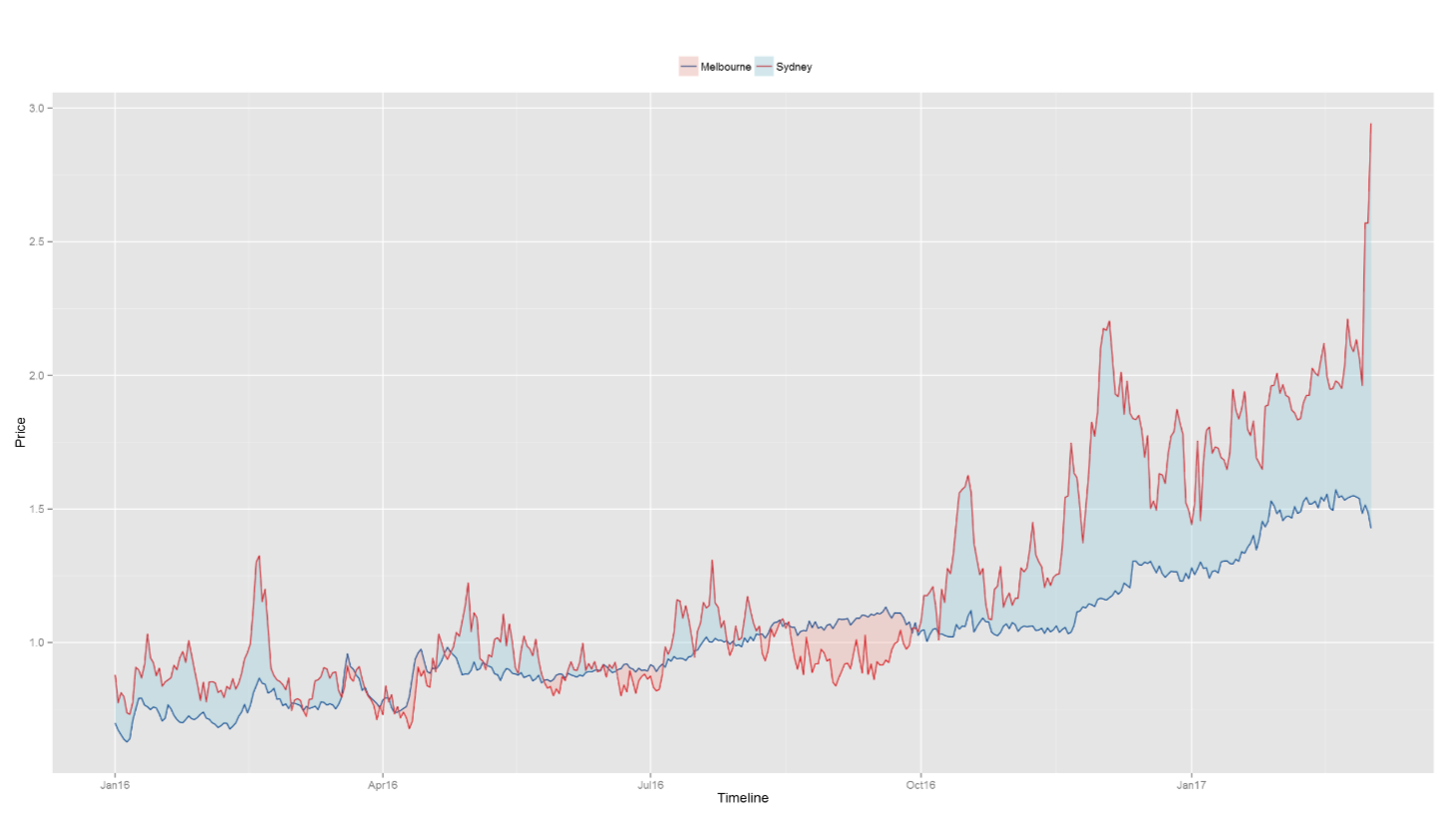
Combined Line and Area chart in R
Description
This visual uses ggplot2, reshape2 and scales packages to draw two lines, color them and color area between two lines. Using sample price data for cities of Melbourne and Sydney this visual provides easy way to plot two variables over time series making it easy to compare and analyse.
Prerequisites (The sample .pbix files won't work without installing the following)
1. Install R Engine
Power BI does not include the R engine. Therefore, a seperate installation is required to install R on your local computer.
Required R Packages
ggplot2
reshape2
scales
Tested on
MRO 3.3.1, CRAN 3.3.1