FabCon is coming to Atlanta
Join us at FabCon Atlanta from March 16 - 20, 2026, for the ultimate Fabric, Power BI, AI and SQL community-led event. Save $200 with code FABCOMM.
Register now!- Power BI forums
- Get Help with Power BI
- Desktop
- Service
- Report Server
- Power Query
- Mobile Apps
- Developer
- DAX Commands and Tips
- Custom Visuals Development Discussion
- Health and Life Sciences
- Power BI Spanish forums
- Translated Spanish Desktop
- Training and Consulting
- Instructor Led Training
- Dashboard in a Day for Women, by Women
- Galleries
- Data Stories Gallery
- Themes Gallery
- Contests Gallery
- Quick Measures Gallery
- Notebook Gallery
- Translytical Task Flow Gallery
- TMDL Gallery
- R Script Showcase
- Webinars and Video Gallery
- Ideas
- Custom Visuals Ideas (read-only)
- Issues
- Issues
- Events
- Upcoming Events
To celebrate FabCon Vienna, we are offering 50% off select exams. Ends October 3rd. Request your discount now.
- Power BI forums
- Issues
- Issues
- Tooltip limited to 10 rows
- Subscribe to RSS Feed
- Mark as New
- Mark as Read
- Bookmark
- Subscribe
- Printer Friendly Page
- Report Inappropriate Content
Tooltip limited to 10 rows
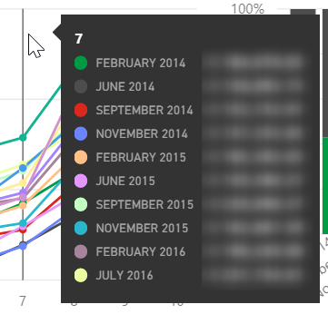
Currently (Sept 2017) the chart tooltip has a limit of about 10 rows.
Check out the screenshot below, there are 15+ lines in the chart, but the tooltip is only showing 10 items!
Of course it would be very nice to have more options to customize the tooltip (e.g. size), and I've supported this "idea" about that.
Pending the release of those new options, please add a visual indication in the tooltip that data is being truncated to x rows!
In my opinion the current implementation is not okay and I can't explain to my customers why values are missing.
You must be a registered user to add a comment. If you've already registered, sign in. Otherwise, register and sign in.
- Pig1838 on: DirectQuery not available anymore in Incremental r...
- DataMindedLLC on: 'Refresh Preview' gone from Home Menu Bar in Aug 2...
- qutnd on: Issue with giving Power BI App access to new users
- Sree9100822653 on: undefinedHow to send daily RLS-based Power BI repo...
- Bart_Berg on: Export Data to Excel from powerbi embed reports | ...
- annelebel on: August 2025 Update Changed DirectQuery so each tab...
- manu_panizi on: Direct Query Mode Missing
- Jstukenborg on: Data on Power BI desktop is not refreshing
- noahfox on: Fabric 'Deploy Stage Content' API fails when user ...
- erpfau on: Fields Parameter w. hierarchies: provide option to...
- New 8,109
- Needs Info 3,502
- Investigating 3,602
- Accepted 2,088
- Declined 38
- Delivered 3,970
-
Reports
10,274 -
Data Modeling
4,157 -
Dashboards
4,124 -
Gateways
2,120 -
Report Server
2,120 -
APIS and Embedding
1,972 -
Custom Visuals
1,795 -
Content Packs
527 -
Mobile
354 -
Need Help
11 -
Show and Tell
3 -
General Comment
2 -
Tips and Tricks
1 -
Power BI Desktop
1
