Party with Power BI’s own Guy in a Cube
Power BI is turning 10! Tune in for a special live episode on July 24 with behind-the-scenes stories, product evolution highlights, and a sneak peek at what’s in store for the future.
Save the date- Power BI forums
- Get Help with Power BI
- Desktop
- Service
- Report Server
- Power Query
- Mobile Apps
- Developer
- DAX Commands and Tips
- Custom Visuals Development Discussion
- Health and Life Sciences
- Power BI Spanish forums
- Translated Spanish Desktop
- Training and Consulting
- Instructor Led Training
- Dashboard in a Day for Women, by Women
- Galleries
- Webinars and Video Gallery
- Data Stories Gallery
- Themes Gallery
- Contests Gallery
- Quick Measures Gallery
- Notebook Gallery
- Translytical Task Flow Gallery
- R Script Showcase
- Ideas
- Custom Visuals Ideas (read-only)
- Issues
- Issues
- Events
- Upcoming Events
Enhance your career with this limited time 50% discount on Fabric and Power BI exams. Ends August 31st. Request your voucher.
- Power BI forums
- Issues
- Issues
- Line chart data label placement
- Subscribe to RSS Feed
- Mark as New
- Mark as Read
- Bookmark
- Subscribe
- Printer Friendly Page
- Report Inappropriate Content
Line chart data label placement
I found this post from a few days ago.
https://community.powerbi.com/t5/Desktop/Data-Labels-Miaplacement-in-LIne-Chart/m-p/409429#M187751
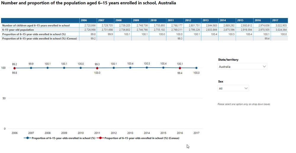
We have the same problem in displaying a line chart with multiple series.
At the first data point, the value displayed above the line (99.2%) is the lower of the two values. This value pertains to the series displayed in Red, such that the first two values for the Red series are displayed above the line and the last one is displayed below the line. Therefore, the logic behind the label placement has little to do with the series or the value of the point.
As Cherry points out in the response to the post above, there is no current mechanism to control the data label placement, nor can the labels be individually coloured. This is clearly a bug, due to the seemingly random placement of labels.
Given that a basic line chart comparing series may be one of the most common (and most simply understood) charts in existence, can I suggest that this bug be given priority to be fixed, as the only option is to turn the data labels off - they are simply misleading.
Steve
You must be a registered user to add a comment. If you've already registered, sign in. Otherwise, register and sign in.
- stipa on: Error "[403.12–403.30] The name 'Lakehouse.Content...
- MaAl on: "The import PowerPlatform.Dataflows matches no exp...
-
NikNithiy
 on:
URGENT!! Paginated Report not loading on Mozilla F...
- duarte on: Unable to sort months in PowerBI
- zsombor on: Matrix Visual doesn't work with Field Parameters ...
-
 mattlee
on:
“Add Value” in Textbox Not Visible in Dark Theme
- mattin on: Report Server Permissions Jan/May 2025
-
bhalicki
 on:
Bi Crashes on launch with (AS Process PID=XXXXXX H...
- stanteitelbaum on: authenticator wont trigger after purchase of new p...
-
Stinkys
 on:
Fix the Date function in DAX
- New 8,040
- Needs Info 3,502
- Investigating 3,602
- Accepted 2,088
- Declined 38
- Delivered 3,970
-
Reports
10,240 -
Data Modeling
4,134 -
Dashboards
4,114 -
Report Server
2,116 -
Gateways
2,114 -
APIS and Embedding
1,965 -
Custom Visuals
1,790 -
Content Packs
525 -
Mobile
354 -
Need Help
11 -
Show and Tell
3 -
General Comment
2 -
Tips and Tricks
1 -
Power BI Desktop
1
