FabCon is coming to Atlanta
Join us at FabCon Atlanta from March 16 - 20, 2026, for the ultimate Fabric, Power BI, AI and SQL community-led event. Save $200 with code FABCOMM.
Register now!- Power BI forums
- Get Help with Power BI
- Desktop
- Service
- Report Server
- Power Query
- Mobile Apps
- Developer
- DAX Commands and Tips
- Custom Visuals Development Discussion
- Health and Life Sciences
- Power BI Spanish forums
- Translated Spanish Desktop
- Training and Consulting
- Instructor Led Training
- Dashboard in a Day for Women, by Women
- Galleries
- Data Stories Gallery
- Themes Gallery
- Contests Gallery
- QuickViz Gallery
- Quick Measures Gallery
- Visual Calculations Gallery
- Notebook Gallery
- Translytical Task Flow Gallery
- TMDL Gallery
- R Script Showcase
- Webinars and Video Gallery
- Ideas
- Custom Visuals Ideas (read-only)
- Issues
- Issues
- Events
- Upcoming Events
Get Fabric Certified for FREE during Fabric Data Days. Don't miss your chance! Request now
- Power BI forums
- Issues
- Issues
- Bug with Bing Maps for defined USA counties
- Subscribe to RSS Feed
- Mark as New
- Mark as Read
- Bookmark
- Subscribe
- Printer Friendly Page
- Report Inappropriate Content
Bug with Bing Maps for defined USA counties
Hello together,
I would like to visualize a kind of heatmap for the unemployment rate of all US states and counties.
Source for US Unemployment Rate States: https://www.bls.gov/web/laus/laumstrk.htm
Source for US Unemployment Rate Counties (just the latest): https://www.bls.gov/web/metro/laucntycur14.txt
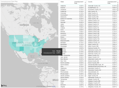
With the states everything is fine, like this: (data category = "state or province")
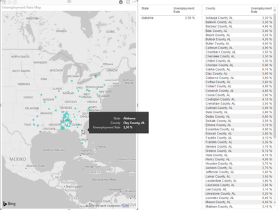
But with the counties it looks like this: (data category = "county", all counties named like "Anderson County, SC"
I've already tried to describe the county rows like this: "<County>, County, <State Code>", but there's no other result.
Could help me someone or is this a Bug with Bing/Microsoft?
Thank you very much!
BG,
Sven
You must be a registered user to add a comment. If you've already registered, sign in. Otherwise, register and sign in.
-
acig
 on:
Issue with new card visual - reference labels spac...
- catsamson on: Issues with new card visual displaying an URL imag...
- catsamson on: Image in New Card Visual (incorrect size)
-
 mattlee
on:
Issue with new card visual after publishing to PBI...
- tejaswi_464 on: DataFormat.Error: There were more columns in the r...
-
Ian_Stuart_Rupe
 on:
Issue with Card Visual Layout After November Power...
- Murzao on: Bug Report: Unable to send dataflow refresh failur...
- mb123_ on: Bug in sorting - Gantt 3.4.2.0 from Microsoft
-
DNMAF
 on:
Adding a measure or column as a tooltip to an Azur...
- Kevin_Wells81 on: Measure creation in Power BI Desktop is extremely ...
- New 8,208
- Needs Info 3,502
- Investigating 3,602
- Accepted 2,089
- Declined 38
- Delivered 3,976
-
Reports
10,334 -
Data Modeling
4,186 -
Dashboards
4,141 -
Gateways
2,127 -
Report Server
2,126 -
APIS and Embedding
1,978 -
Custom Visuals
1,806 -
Content Packs
527 -
Mobile
355 -
Need Help
11 -
General Comment
5 -
Show and Tell
3 -
Tips and Tricks
1 -
Power BI Desktop
1

