- Power BI forums
- Updates
- News & Announcements
- Get Help with Power BI
- Desktop
- Service
- Report Server
- Power Query
- Mobile Apps
- Developer
- DAX Commands and Tips
- Custom Visuals Development Discussion
- Health and Life Sciences
- Power BI Spanish forums
- Translated Spanish Desktop
- Power Platform Integration - Better Together!
- Power Platform Integrations (Read-only)
- Power Platform and Dynamics 365 Integrations (Read-only)
- Training and Consulting
- Instructor Led Training
- Dashboard in a Day for Women, by Women
- Galleries
- Community Connections & How-To Videos
- COVID-19 Data Stories Gallery
- Themes Gallery
- Data Stories Gallery
- R Script Showcase
- Webinars and Video Gallery
- Quick Measures Gallery
- 2021 MSBizAppsSummit Gallery
- 2020 MSBizAppsSummit Gallery
- 2019 MSBizAppsSummit Gallery
- Events
- Ideas
- Custom Visuals Ideas
- Issues
- Issues
- Events
- Upcoming Events
- Community Blog
- Power BI Community Blog
- Custom Visuals Community Blog
- Community Support
- Community Accounts & Registration
- Using the Community
- Community Feedback
Register now to learn Fabric in free live sessions led by the best Microsoft experts. From Apr 16 to May 9, in English and Spanish.
- Power BI forums
- Forums
- Get Help with Power BI
- Developer
- Re: does the r or python visuals of power bi appea...
- Subscribe to RSS Feed
- Mark Topic as New
- Mark Topic as Read
- Float this Topic for Current User
- Bookmark
- Subscribe
- Printer Friendly Page
- Mark as New
- Bookmark
- Subscribe
- Mute
- Subscribe to RSS Feed
- Permalink
- Report Inappropriate Content
does the r or python visuals of power bi appear in the power point extract?
does the r or python visuals of power bi appear in the power point extract?
Solved! Go to Solution.
- Mark as New
- Bookmark
- Subscribe
- Mute
- Subscribe to RSS Feed
- Permalink
- Report Inappropriate Content
I just read your question about the 2D box plot and have provided a potential solution for you. Hopefully this may give you some opportunities for solving the corellation plot in a similar manner.
Good luck,
Daniel
Did I answer your question? Mark my post as a solution!
Proud to be a Super User!
My course: Introduction to Developing Power BI Visuals
On how to ask a technical question, if you really want an answer (courtesy of SQLBI)
- Mark as New
- Bookmark
- Subscribe
- Mute
- Subscribe to RSS Feed
- Permalink
- Report Inappropriate Content
Give it a try yourself. Is this on the desktop or in the service?
- Mark as New
- Bookmark
- Subscribe
- Mute
- Subscribe to RSS Feed
- Permalink
- Report Inappropriate Content
I work on desktop but the goal is to deploy it on service. If somebody can answer it it will help me a lot.
- Mark as New
- Bookmark
- Subscribe
- Mute
- Subscribe to RSS Feed
- Permalink
- Report Inappropriate Content
Hi @JimmyCruyp,
If you're talking about exporting a report to PowerPoint when in the service, the documentation lists the limitations for you. R & Python visuals will not display in this export.
Regards,
Daniel
Did I answer your question? Mark my post as a solution!
Proud to be a Super User!
My course: Introduction to Developing Power BI Visuals
On how to ask a technical question, if you really want an answer (courtesy of SQLBI)
- Mark as New
- Bookmark
- Subscribe
- Mute
- Subscribe to RSS Feed
- Permalink
- Report Inappropriate Content
Thank you very much Daniel. That's what I thought. Is there a possibility to create a graph in R or Python and save it on the market place so that it can then appear on the power point?
- Mark as New
- Bookmark
- Subscribe
- Mute
- Subscribe to RSS Feed
- Permalink
- Report Inappropriate Content
You're not able to submit Python visuals to AppSource. There is limited support for R-based visuals through the TypeScript SDK and you're therefore possible to submit an AppSource visual, but the limitations are the same due to how R runs in the Service.
Regarding AppSource visuals and PowerPoint export, only certified AppSource visuals work here (also mentioned in linked doc), so this is a lot of effort to go to for a specific use case. You will need to request for it be certified and ensure that all requirements are met before MS will award that status. It's totally achievable (I've done it with 3 visuals) but not something that takes a few hours to sort out.
Stepping back a sec, why specifically do you need R and/or Python visuals to solve your current challenge? Is there anything that these options are offering you that cannot be achieved using the existing core or custom visuals (or even certified bespoke visual designers like Charticulator, Deneb or PlotlyJS)?
Did I answer your question? Mark my post as a solution!
Proud to be a Super User!
My course: Introduction to Developing Power BI Visuals
On how to ask a technical question, if you really want an answer (courtesy of SQLBI)
- Mark as New
- Bookmark
- Subscribe
- Mute
- Subscribe to RSS Feed
- Permalink
- Report Inappropriate Content
Thank you very much. You saved me a lot of time. I need the double box plot.
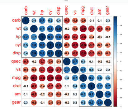
I didn't find it anywhere. I even asked the question on the forum to know how to create it or if someone knew if it existed but for the moment no answer. And later I will need the graph correlation. Which according to me before was on the market place but has disappeared. So maybe I'll have to create it in R and run it through the process you described. Hoping I get there...
- Mark as New
- Bookmark
- Subscribe
- Mute
- Subscribe to RSS Feed
- Permalink
- Report Inappropriate Content
I just read your question about the 2D box plot and have provided a potential solution for you. Hopefully this may give you some opportunities for solving the corellation plot in a similar manner.
Good luck,
Daniel
Did I answer your question? Mark my post as a solution!
Proud to be a Super User!
My course: Introduction to Developing Power BI Visuals
On how to ask a technical question, if you really want an answer (courtesy of SQLBI)
Helpful resources

Microsoft Fabric Learn Together
Covering the world! 9:00-10:30 AM Sydney, 4:00-5:30 PM CET (Paris/Berlin), 7:00-8:30 PM Mexico City

Power BI Monthly Update - April 2024
Check out the April 2024 Power BI update to learn about new features.

| User | Count |
|---|---|
| 14 | |
| 2 | |
| 2 | |
| 1 | |
| 1 |


