Forum Discussion
Sorting X and Y axis in Charticulator
Hi everyone,
Need your help.
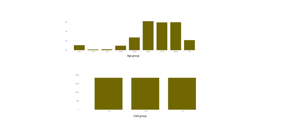
I created a Chart visual in Charticulator, which is looking fine in charticulator. This visual is a kind of Dot plot where X and Y axis show categorical data. But when i import this visual in Power BI , X and Y axis do not come as sorted.
Please advise.
Thanks
- Anonymous5 years ago
Hi Anonymous ,
Actually, Power BI sort the text type values based on normal alphabetical order, so you would find age group 5-12 is after 30-49 and calls group 11+ is before 6-10... You can refer the content in the following links to make a custom order by creating a order table:
Sort a Column with a Custom Order in Power BI
Best Regards
5 Replies
- AnonymousNot applicable
Hi Anonymous ,
Could you please provide the related screenshots of chart visual display in Charticulator and Power BI separately? And please provide the sorting rules if it is possible. Thank you.
Best Regards
- AnonymousNot applicable
Hi Anonymous
Many thanks for your reply.Here are the screenshots.
The dataset was exported from a Power BI table visual as .csv file. This table has three columns
1. Age group - This group is created in Power BI and a sort column was created to order it
2. Calls group - This group is created in Power BI and a sort column was created to order it
3. No. of calls (Power BI DAX measure)
These groups are showing up as expected in the Power BI default visuals like matrix. Showing up as sorted.
*Note - i tried to sort X and Y axis in Charticualtor which allows you to chanage the order of the X and Y axes labels. I manually reordered them with a drag-and-drop interaction.
- AnonymousNot applicable
Hi Anonymous ,
Actually, Power BI sort the text type values based on normal alphabetical order, so you would find age group 5-12 is after 30-49 and calls group 11+ is before 6-10... You can refer the content in the following links to make a custom order by creating a order table:
Sort a Column with a Custom Order in Power BI
Best Regards