Party with Power BI’s own Guy in a Cube
Power BI is turning 10! Tune in for a special live episode on July 24 with behind-the-scenes stories, product evolution highlights, and a sneak peek at what’s in store for the future.
Save the date- Power BI forums
- Get Help with Power BI
- Desktop
- Service
- Report Server
- Power Query
- Mobile Apps
- Developer
- DAX Commands and Tips
- Custom Visuals Development Discussion
- Health and Life Sciences
- Power BI Spanish forums
- Translated Spanish Desktop
- Training and Consulting
- Instructor Led Training
- Dashboard in a Day for Women, by Women
- Galleries
- Data Stories Gallery
- Themes Gallery
- Contests Gallery
- Quick Measures Gallery
- Notebook Gallery
- Translytical Task Flow Gallery
- TMDL Gallery
- R Script Showcase
- Webinars and Video Gallery
- Ideas
- Custom Visuals Ideas (read-only)
- Issues
- Issues
- Events
- Upcoming Events
Enhance your career with this limited time 50% discount on Fabric and Power BI exams. Ends August 31st. Request your voucher.
- Power BI forums
- Forums
- Get Help with Power BI
- Developer
- Re: How to draw a linear line by using a given slo...
- Subscribe to RSS Feed
- Mark Topic as New
- Mark Topic as Read
- Float this Topic for Current User
- Bookmark
- Subscribe
- Printer Friendly Page


- Mark as New
- Bookmark
- Subscribe
- Mute
- Subscribe to RSS Feed
- Permalink
- Report Inappropriate Content
How to draw a linear line by using a given slope
Hello there, i have an urgent problem here that i cant solve...
I'm trying to draw a linear line in a scatter plot to visualize a given slope-value.
First of all, this is how i calculate my "slope" by simply dividing each value from the x-axis with each value of the y-axis.
-> Btw: This will only change the color-values of the datapoints, not the actual datapoint-positions <-
function visualTransform(...) {

...

for (let i = 0; i < myCategory.values.length; i++) {

   if((xAxisValues[i]/yAxisValues[i]>0.2){

	   colorVal = 'blue';

   } else {

	   colorVal = 'yellow';

   }

}

...

}
For example, this is how the scatter plot looks like with a slope of 0.2 in comparison with a slope of 1

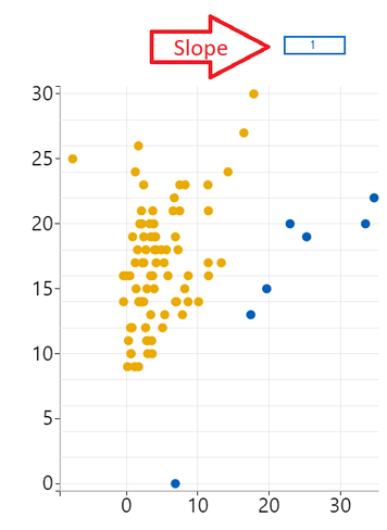
Now im looking for a solution for how to draw a linear line by using a given slope.
I tried that of course by creating a svg element and just rotating it by converting the slope-value in to degrees, like in this function (-> a slope of 0.2 is about 11.3 degrees)
var angleRad = Math.atan(ay/ax);
var angleDeg = angleRad * 180 / Math.PI;
return(angleDeg);
// if the slope is 0.2, this will be about 78.69 deg. But we have to subtract it from 90 as the line is in a 90 deg position, which makes 11.3
}
...
// Drawing the linear line:
             let sLine = this.g
                .append('g')
                .append('rect')
                .classed('sLine', true)
                .attr('x', x(0))
                .attr('y', y(30))
                .attr('width', 2)
                .attr('height', gHeight)
                .attr('transform', 'rotate(' + (getAngleDeg(0.2,1)) + ',' + x(0) + ',' + y(30) + ')')
                .style('fill-opacity', viewModel.settings.generalView.opacity/100);
But unfortunately this only works partial for me.
As you can see in the picture, at a certain point it works fine:
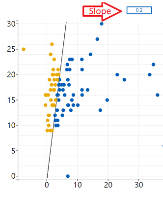
But as i scale the visual smaller it looks totally wrong, because the datapoints begin to compress more and more. The line is not affected however:
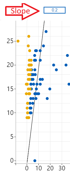
I dont know how to fix this... My next idea was to subtract the degree-value by using a multiplier as the visual-sandbox size changes. Didnt worked either.
There must be an easier way!
Does anyone has a solution?
Solved! Go to Solution.


- Mark as New
- Bookmark
- Subscribe
- Mute
- Subscribe to RSS Feed
- Permalink
- Report Inappropriate Content
The width and height are not supported by a line element.
It seems you should apply a color to this line.
Ignat Vilesov,
Software Engineer
Microsoft Power BI Custom Visuals
- Mark as New
- Bookmark
- Subscribe
- Mute
- Subscribe to RSS Feed
- Permalink
- Report Inappropriate Content
Thanks this worked for me:
               let sLine = this.g
               .append('g')
               .append('line')
               .classed('sLine', true)
               .attr('x1', x(0))
               .attr('y1', y(0))
               .attr('x2', x(viewModel.dataMax * this.slopeVal[0]))
               .attr('y2', y(viewModel.dataMax))
               .attr('stroke', 'red');
- Mark as New
- Bookmark
- Subscribe
- Mute
- Subscribe to RSS Feed
- Permalink
- Report Inappropriate Content
The line is always rendered at the same position as you use fixed coordinates (.attr('x', x(0)) .attr('y', y(30))).
We'd recommned to use dynamic coordinates instead.
Ignat Vilesov,
Software Engineer
Microsoft Power BI Custom Visuals
- Mark as New
- Bookmark
- Subscribe
- Mute
- Subscribe to RSS Feed
- Permalink
- Report Inappropriate Content
Thanks for your answer, i believe this is true but i dont have any idea how to define the coordinates dynamically.
Which variables i can use to realize this?
Any suggestions?
- Mark as New
- Bookmark
- Subscribe
- Mute
- Subscribe to RSS Feed
- Permalink
- Report Inappropriate Content
I guess you would need to get a coordinate by point's value.
Ignat Vilesov,
Software Engineer
Microsoft Power BI Custom Visuals
- Mark as New
- Bookmark
- Subscribe
- Mute
- Subscribe to RSS Feed
- Permalink
- Report Inappropriate Content
Well, i can set the y-axis by using the datapoints-value like so:
          let sLine = this.g
                .append('g')
                .append('rect')
                .classed('sLine', true)
                .attr('x', x(0))
                .attr('y', y(d3.max(viewModel.dataPoints, function(d) { return <number>d.yAxisValues; })))
                .attr('width', d3.min([height, width]) * BarChart.Config.weightMultiplier)
                .attr('height', (gHeight))
                .attr('transform', 'rotate(' + (7) + ',' + x(0) + ',' + y((d3.max(viewModel.dataPoints, function(d) { return <number>d.yAxisValues; }))) + ')')
                .style('fill-opacity', viewModel.settings.generalView.opacity/100);
But thats still not solving the issue like in the pictures i showed before.
The x-axis needs to be always 0, because the linear line should only rotate from 0
Im getting so frustated on this 🙂
- Mark as New
- Bookmark
- Subscribe
- Mute
- Subscribe to RSS Feed
- Permalink
- Report Inappropriate Content
I think there're no need to use scaling to draw a line. You might use 0 instead of x(0).
Have you already tried such solution?
Ignat Vilesov,
Software Engineer
Microsoft Power BI Custom Visuals
- Mark as New
- Bookmark
- Subscribe
- Mute
- Subscribe to RSS Feed
- Permalink
- Report Inappropriate Content
Thanks for your help Ignat,
the x-scale is needed because we also have negative values on the x-axis. When i set 0 instead of x(0) it will draw the line on the smallest value (-7 or so). It also doesnt solve the main problem unfortunately,
Do you want to check out my code so you will get a better picture of it? I uploaded my randomized dataset, my project folder and also the .pbix file for you and commented it as far as i could: https://drive.google.com/open?id=1g4u6AaQw-X8fdQqOT5Ela55HTJWzONlN
I would be glad if we can solve this problem together, im stuck on this final part for my visual.
- Mark as New
- Bookmark
- Subscribe
- Mute
- Subscribe to RSS Feed
- Permalink
- Report Inappropriate Content
It seems this issue is related to scaling the main chart if we resize a visual.
I'm not sure what part of code applies scaling but it must be applied to the line as well.
Ignat Vilesov,
Software Engineer
Microsoft Power BI Custom Visuals
- Mark as New
- Bookmark
- Subscribe
- Mute
- Subscribe to RSS Feed
- Permalink
- Report Inappropriate Content
This is what i thought about too earlier, but thats already the case! 🙂
The scaling is achieved by the x and y variables. Since the range is always the width/height of the sandbox (subtracted by margins).
So that means if i resize the graph it will call the update() method again and calculate the new x/y-scale by using the new width/height-values of the graph:
This is how the scaling works.
But i think the problem has something to do with the rotation of the line:
 // Create a SVG-Element (linear line)
            let sLine = this.g
                .append('g')
                .append('rect')
                .classed('sLine', true)
                .attr('x', x(0))
                .attr('y', y(d3.max(viewModel.dataPoints, function(d) { return <number>d.anzahlKostenstellen; }) + meanAnzahlKostenstellen))
                .attr('width', d3.min([height, width]) * BarChart.Config.weightMultiplier)
                .attr('height', (gHeight - (meanGesamtKosten * 2)))
                .attr('transform', 'rotate(' + (7) + ',' + x(0) + ',' + y((d3.min(viewModel.dataPoints, function(d) { return <number>d.anzahlKostenstellen; }) - meanAnzahlKostenstellen)) + ')')
                .style('fill-opacity', viewModel.settings.generalView.opacity/100);
You can test it like this:
change the line to 0deg:
.attr('transform', 'rotate(' + (0) + ',' + x(0) + ',' + y((d3.min(viewModel.dataPoints, function(d) { return <number>d.anzahlKostenstellen; }) - meanAnzahlKostenstellen)) + ')')
Now when you scale the graph, the line stays where it should be. The datapoints arent moving behind the line anymore.
Try it for yourself if you want.
EDIT: I changed from 0 degree to x(d3.min(xAxisValues))*0.2 (multiplied by slope-value):
.attr('transform', 'rotate(' + (x((d3.min(viewModel.dataPoints, function(d) { return <number>d.gesamtKosten; }))+meanGesamtKosten)*0.2) + ',' + x(0) + ',' + y((d3.min(viewModel.dataPoints, function(d) { return <number>d.anzahlKostenstellen; }) - meanAnzahlKostenstellen)) + ')')Now it looks a little bit better. BUT only when i resize the graphs-width. When i resize the graph to its height, im still getting the same problem.
I tried playing with the y-scale, but couldnt figure it out much how to solve this.
I dont get it how a simple line can cause such big problems 🙂
- Mark as New
- Bookmark
- Subscribe
- Mute
- Subscribe to RSS Feed
- Permalink
- Report Inappropriate Content
Do you really have to rotate a line (rect element)?
Have you tried to use line element isntead?
Ignat Vilesov,
Software Engineer
Microsoft Power BI Custom Visuals
- Mark as New
- Bookmark
- Subscribe
- Mute
- Subscribe to RSS Feed
- Permalink
- Report Inappropriate Content
I tried that but i think line is not supported because nothing shows up at all
               let sLine = this.g
               .append('g')
               .append('line') // rect and circle works, but line doesnt however
               .classed('sLine', true)
               .attr('x1', x(0))
               .attr('y1', y(5))
               .attr('x2', x(10))
               .attr('y2', y(20))
               .attr('width', 2)
               .attr('height', 500);
- Mark as New
- Bookmark
- Subscribe
- Mute
- Subscribe to RSS Feed
- Permalink
- Report Inappropriate Content
The width and height are not supported by a line element.
It seems you should apply a color to this line.
Ignat Vilesov,
Software Engineer
Microsoft Power BI Custom Visuals
- Mark as New
- Bookmark
- Subscribe
- Mute
- Subscribe to RSS Feed
- Permalink
- Report Inappropriate Content
Thanks this worked for me:
               let sLine = this.g
               .append('g')
               .append('line')
               .classed('sLine', true)
               .attr('x1', x(0))
               .attr('y1', y(0))
               .attr('x2', x(viewModel.dataMax * this.slopeVal[0]))
               .attr('y2', y(viewModel.dataMax))
               .attr('stroke', 'red');

Helpful resources

Fabric Community Update - July 2025
Find out what's new and trending in the Fabric community.

Power BI Monthly Update - July 2025
Check out the July 2025 Power BI update to learn about new features.

| User | Count |
|---|---|
| 5 | |
| 4 | |
| 3 | |
| 2 | |
| 2 |


| User | Count |
|---|---|
| 8 | |
| 6 | |
| 4 | |
| 4 | |
| 4 |


