Join us at the 2025 Microsoft Fabric Community Conference
March 31 - April 2, 2025, in Las Vegas, Nevada. Use code MSCUST for a $150 discount! Early bird discount ends December 31.
Register Now- Power BI forums
- Get Help with Power BI
- Desktop
- Service
- Report Server
- Power Query
- Mobile Apps
- Developer
- DAX Commands and Tips
- Custom Visuals Development Discussion
- Health and Life Sciences
- Power BI Spanish forums
- Translated Spanish Desktop
- Training and Consulting
- Instructor Led Training
- Dashboard in a Day for Women, by Women
- Galleries
- Community Connections & How-To Videos
- COVID-19 Data Stories Gallery
- Themes Gallery
- Data Stories Gallery
- R Script Showcase
- Webinars and Video Gallery
- Quick Measures Gallery
- 2021 MSBizAppsSummit Gallery
- 2020 MSBizAppsSummit Gallery
- 2019 MSBizAppsSummit Gallery
- Events
- Ideas
- Custom Visuals Ideas
- Issues
- Issues
- Events
- Upcoming Events
Be one of the first to start using Fabric Databases. View on-demand sessions with database experts and the Microsoft product team to learn just how easy it is to get started. Watch now
- Power BI forums
- Forums
- Get Help with Power BI
- Desktop
- visual element Group option is greyed out
- Subscribe to RSS Feed
- Mark Topic as New
- Mark Topic as Read
- Float this Topic for Current User
- Bookmark
- Subscribe
- Printer Friendly Page
- Mark as New
- Bookmark
- Subscribe
- Mute
- Subscribe to RSS Feed
- Permalink
- Report Inappropriate Content
visual element Group option is greyed out
I'm trying to do this with a published dataset
I'm trying to create a stacked column chart but the number of items in the legend is too large so I want to bin them.
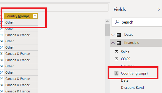
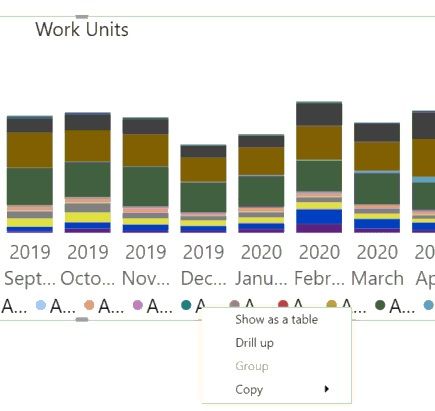
when I click the legend field dropdown there is no group option. Nor if I rt-click the field in the fields pane. When I right click on the legend in the visualization the group option is greyed out.
under options->report settings->visual options "use modern visual header with updated styling options" is checked.
I'm using the July 2020 power bi desktop version
how to I enable grouping in this visual?
Solved! Go to Solution.
- Mark as New
- Bookmark
- Subscribe
- Mute
- Subscribe to RSS Feed
- Permalink
- Report Inappropriate Content
Hi @bsheffer ,
I am using a published dataset so I am not allowed to create new calculated columns or tables.
If you create a new group, it will generate a column in your data table. But live connection mode isn't supported to create calculated columns. So, creating new group is not supported in Live connection mode.
It is suggested to contact the dataset owner, ask him to create new groups and then re-publish the report.
Best regards
Icey
If this post helps, then consider Accepting it as the solution to help other members find it more quickly.
- Mark as New
- Bookmark
- Subscribe
- Mute
- Subscribe to RSS Feed
- Permalink
- Report Inappropriate Content
@bsheffer , Not very clear to me.
But if you need binning refer these
https://www.daxpatterns.com/dynamic-segmentation/
https://www.daxpatterns.com/static-segmentation/
https://www.poweredsolutions.co/2020/01/11/dax-vs-power-query-static-segmentation-in-power-bi-dax-po...
https://radacad.com/grouping-and-binning-step-towards-better-data-visualization
https://radacad.com/dynamic-banding-or-grouping-in-power-bi-using-dax-measures-choose-the-size-of-bi...
https://www.credera.com/blog/technology-solutions/creating-aging-report-using-a-user-selected-date-i...
At the Microsoft Analytics Community Conference, global leaders and influential voices are stepping up to share their knowledge and help you master the latest in Microsoft Fabric, Copilot, and Purview. ✨
️ November 12th-14th, 2024
Online Event
Register Here
- Mark as New
- Bookmark
- Subscribe
- Mute
- Subscribe to RSS Feed
- Permalink
- Report Inappropriate Content
when I rt-click on the legend line of the visual I can see group but it is greyed out. I need to enable this so I can group these elements for my stacked bar chart. If I put the same field in values axis instead I get the same results.
I've looked at the links you sent and none of these options are available to me as far as I can see. I am using a published dataset so I am not allowed to create new calculated columns or tables. I don't see group as an option in the visualization field plane or the dataset fields pane.
- Mark as New
- Bookmark
- Subscribe
- Mute
- Subscribe to RSS Feed
- Permalink
- Report Inappropriate Content
Hi @bsheffer ,
I am using a published dataset so I am not allowed to create new calculated columns or tables.
If you create a new group, it will generate a column in your data table. But live connection mode isn't supported to create calculated columns. So, creating new group is not supported in Live connection mode.
It is suggested to contact the dataset owner, ask him to create new groups and then re-publish the report.
Best regards
Icey
If this post helps, then consider Accepting it as the solution to help other members find it more quickly.
Helpful resources

Join us at the Microsoft Fabric Community Conference
March 31 - April 2, 2025, in Las Vegas, Nevada. Use code MSCUST for a $150 discount!

We want your feedback!
Your insights matter. That’s why we created a quick survey to learn about your experience finding answers to technical questions.

Microsoft Fabric Community Conference 2025
Arun Ulag shares exciting details about the Microsoft Fabric Conference 2025, which will be held in Las Vegas, NV.

| User | Count |
|---|---|
| 129 | |
| 90 | |
| 75 | |
| 58 | |
| 53 |
| User | Count |
|---|---|
| 200 | |
| 104 | |
| 101 | |
| 67 | |
| 55 |


