FabCon is coming to Atlanta
Join us at FabCon Atlanta from March 16 - 20, 2026, for the ultimate Fabric, Power BI, AI and SQL community-led event. Save $200 with code FABCOMM.
Register now!- Power BI forums
- Get Help with Power BI
- Desktop
- Service
- Report Server
- Power Query
- Mobile Apps
- Developer
- DAX Commands and Tips
- Custom Visuals Development Discussion
- Health and Life Sciences
- Power BI Spanish forums
- Translated Spanish Desktop
- Training and Consulting
- Instructor Led Training
- Dashboard in a Day for Women, by Women
- Galleries
- Data Stories Gallery
- Themes Gallery
- Contests Gallery
- QuickViz Gallery
- Quick Measures Gallery
- Visual Calculations Gallery
- Notebook Gallery
- Translytical Task Flow Gallery
- TMDL Gallery
- R Script Showcase
- Webinars and Video Gallery
- Ideas
- Custom Visuals Ideas (read-only)
- Issues
- Issues
- Events
- Upcoming Events
Get Fabric Certified for FREE during Fabric Data Days. Don't miss your chance! Request now
- Power BI forums
- Forums
- Get Help with Power BI
- Desktop
- suitable graph to visualize shift wise ordinal dat...
- Subscribe to RSS Feed
- Mark Topic as New
- Mark Topic as Read
- Float this Topic for Current User
- Bookmark
- Subscribe
- Printer Friendly Page
- Mark as New
- Bookmark
- Subscribe
- Mute
- Subscribe to RSS Feed
- Permalink
- Report Inappropriate Content
suitable graph to visualize shift wise ordinal data
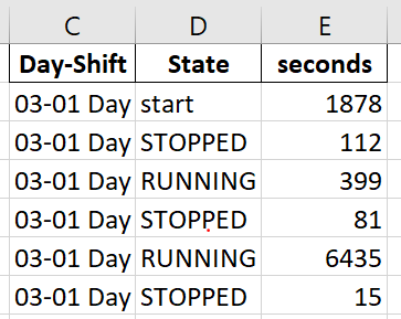
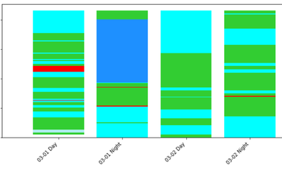
Need to plot chart for Shift-wise state change data. I plot the stack bar chart using python Jupyter.
Sample dataset and output from jupyter is shown below.
Output:
But when I'm going to plot this using powerbi Stack bar chart. It shows aggregates ,instead of real values.
Ex: 03-01 Day First START >STOPPED> RUNNING>STOPPED and goes on...... In powerBi stack bar shows STOPPED,RUNNING and other states' (aggregate values(summations) instead of real values with order). Is there any way to get the same output as i have got from jupyter notebook.?
- Mark as New
- Bookmark
- Subscribe
- Mute
- Subscribe to RSS Feed
- Permalink
- Report Inappropriate Content
Hi @Anonymous ,
One question regarding you data does the several States by one days have a limit or can this be a big number of values?
Using the legend by state the chart has you refer groups the information together by the same states so not giving you the expected result.
One option I can see is to have a column that you make unique ID by status and sort number so that you can use in the leggend however with this option you would need to change all the colours of the datapoints by hand and if they are a lot it will hard work.
Regards
Miguel Félix
Did I answer your question? Mark my post as a solution!
Proud to be a Super User!
Check out my blog: Power BI em PortuguêsHelpful resources

Power BI Monthly Update - November 2025
Check out the November 2025 Power BI update to learn about new features.

Fabric Data Days
Advance your Data & AI career with 50 days of live learning, contests, hands-on challenges, study groups & certifications and more!


