Join us at the 2025 Microsoft Fabric Community Conference
March 31 - April 2, 2025, in Las Vegas, Nevada. Use code MSCUST for a $150 discount! Early bird discount ends December 31.
Register Now- Power BI forums
- Get Help with Power BI
- Desktop
- Service
- Report Server
- Power Query
- Mobile Apps
- Developer
- DAX Commands and Tips
- Custom Visuals Development Discussion
- Health and Life Sciences
- Power BI Spanish forums
- Translated Spanish Desktop
- Training and Consulting
- Instructor Led Training
- Dashboard in a Day for Women, by Women
- Galleries
- Community Connections & How-To Videos
- COVID-19 Data Stories Gallery
- Themes Gallery
- Data Stories Gallery
- R Script Showcase
- Webinars and Video Gallery
- Quick Measures Gallery
- 2021 MSBizAppsSummit Gallery
- 2020 MSBizAppsSummit Gallery
- 2019 MSBizAppsSummit Gallery
- Events
- Ideas
- Custom Visuals Ideas
- Issues
- Issues
- Events
- Upcoming Events
Be one of the first to start using Fabric Databases. View on-demand sessions with database experts and the Microsoft product team to learn just how easy it is to get started. Watch now
- Power BI forums
- Forums
- Get Help with Power BI
- Desktop
- stacked column chart
- Subscribe to RSS Feed
- Mark Topic as New
- Mark Topic as Read
- Float this Topic for Current User
- Bookmark
- Subscribe
- Printer Friendly Page
- Mark as New
- Bookmark
- Subscribe
- Mute
- Subscribe to RSS Feed
- Permalink
- Report Inappropriate Content
stacked column chart
Hi,
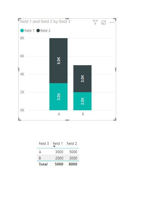
I am using the stacked column chart as follow
I placed two fields (Field1, Field2) in value and Field3 into Axis
Field1 value is 3Millions and Field2 is 5Million
At present as standard, Field2 sits over the top of Field1 as a column
For example, Field1 starts from 0M and goes up to 3M in chart, then on top of Field1 value, Field2 starts and goes up a further 5M, i.e. it goes to the 8M y axis. Which is the standard look of stacked column chart.
Question:
I would like Field1 and Field2 to overlap each-other instead of Field2 starting from the tip of Field1
so that both start from 0M. Field1 goes up to 3M as it is now but Field2 value to start from 0M and go up to 5M
I guess what I am after is clustered column chart bu overlapping not next to each other bars for every occurance of teh value in X axis
Hoe you know what i mean.
Thank you
- Mark as New
- Bookmark
- Subscribe
- Mute
- Subscribe to RSS Feed
- Permalink
- Report Inappropriate Content
Hi @Anonymous
This is standard look of stacked column chart.
The clustered column chart is possible.
Best Regards
Maggie
Community Support Team _ Maggie Li
If this post helps, then please consider Accept it as the solution to help the other members find it more quickly.
- Mark as New
- Bookmark
- Subscribe
- Mute
- Subscribe to RSS Feed
- Permalink
- Report Inappropriate Content
Hey @Anonymous ,
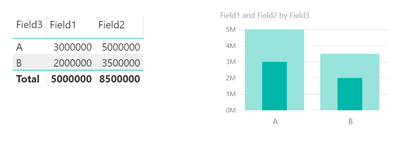
maybe you want to use the custom visual "Bullet Chart by OKViz" from the marketplace, that's available free of charge.
I created this
From the formatting options of the visul I
- switched orientation to vertical, available in the General band
- switched the states to off
Hopefully this is what you are looking for.
Regards,
Tom
Did I answer your question? Mark my post as a solution, this will help others!
Proud to be a Super User!
I accept Kudos 😉
Hamburg, Germany
- Mark as New
- Bookmark
- Subscribe
- Mute
- Subscribe to RSS Feed
- Permalink
- Report Inappropriate Content
Hello,
This looks better, however, I would like to have the width of the vertical bars to be the same
thank you
Helpful resources

Join us at the Microsoft Fabric Community Conference
March 31 - April 2, 2025, in Las Vegas, Nevada. Use code MSCUST for a $150 discount!

We want your feedback!
Your insights matter. That’s why we created a quick survey to learn about your experience finding answers to technical questions.

Microsoft Fabric Community Conference 2025
Arun Ulag shares exciting details about the Microsoft Fabric Conference 2025, which will be held in Las Vegas, NV.

| User | Count |
|---|---|
| 124 | |
| 89 | |
| 84 | |
| 70 | |
| 51 |
| User | Count |
|---|---|
| 206 | |
| 143 | |
| 97 | |
| 79 | |
| 68 |


