- Power BI forums
- Updates
- News & Announcements
- Get Help with Power BI
- Desktop
- Service
- Report Server
- Power Query
- Mobile Apps
- Developer
- DAX Commands and Tips
- Custom Visuals Development Discussion
- Health and Life Sciences
- Power BI Spanish forums
- Translated Spanish Desktop
- Power Platform Integration - Better Together!
- Power Platform Integrations (Read-only)
- Power Platform and Dynamics 365 Integrations (Read-only)
- Training and Consulting
- Instructor Led Training
- Dashboard in a Day for Women, by Women
- Galleries
- Community Connections & How-To Videos
- COVID-19 Data Stories Gallery
- Themes Gallery
- Data Stories Gallery
- R Script Showcase
- Webinars and Video Gallery
- Quick Measures Gallery
- 2021 MSBizAppsSummit Gallery
- 2020 MSBizAppsSummit Gallery
- 2019 MSBizAppsSummit Gallery
- Events
- Ideas
- Custom Visuals Ideas
- Issues
- Issues
- Events
- Upcoming Events
- Community Blog
- Power BI Community Blog
- Custom Visuals Community Blog
- Community Support
- Community Accounts & Registration
- Using the Community
- Community Feedback
Register now to learn Fabric in free live sessions led by the best Microsoft experts. From Apr 16 to May 9, in English and Spanish.
- Power BI forums
- Forums
- Get Help with Power BI
- Desktop
- Re: "Show items with no data" within a date range
- Subscribe to RSS Feed
- Mark Topic as New
- Mark Topic as Read
- Float this Topic for Current User
- Bookmark
- Subscribe
- Printer Friendly Page
- Mark as New
- Bookmark
- Subscribe
- Mute
- Subscribe to RSS Feed
- Permalink
- Report Inappropriate Content
"Show items with no data" within a date range
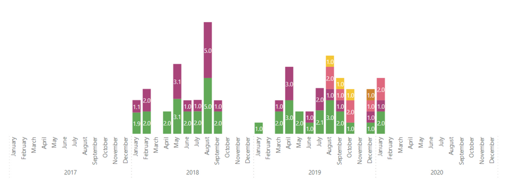
I'm trying to show sales quantity over time. Some months there are no sales, but I want those x-axis headers to show for those months. By checking the option to "show items with no data," it works as intended, except the range of dates it's showing no data is ridiculous. It shows all of 2017 and all of 2020, but I want it to only show items with no data within the min and max months of the visible data.
- Mark as New
- Bookmark
- Subscribe
- Mute
- Subscribe to RSS Feed
- Permalink
- Report Inappropriate Content
Hi,
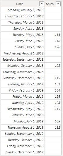
According to your description, i create a simple sample to test:
Please try to create a new calculated table:
X-axis Table =
SELECTCOLUMNS (
    FILTER (
        'Table',
        'Table'[Date]
            >= CALCULATE (
                MIN ( 'Table'[Date] ),
                FILTER ( 'Table', 'Table'[Sales] <> BLANK () )
            )
            && 'Table'[Date]
                <= CALCULATE (
                    MAX ( 'Table'[Date] ),
                    FILTER ( 'Table', 'Table'[Sales] <> BLANK () )
                )
    ),
    "Date", 'Table'[Date]
)
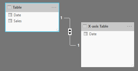
Then create relationship between two tables:
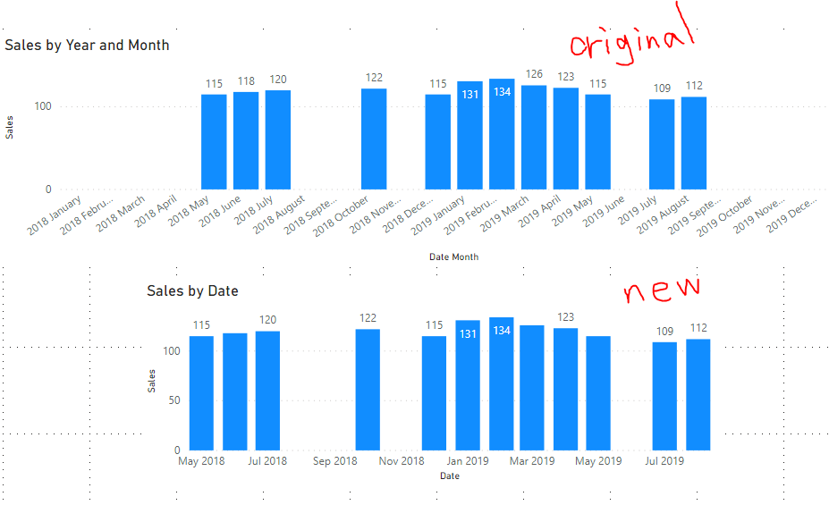
Choose this table's [Date] column as column chart visual's X-axis, the result shows:
Hope this helps.
Best Regards,
Giotto Zhi
- Mark as New
- Bookmark
- Subscribe
- Mute
- Subscribe to RSS Feed
- Permalink
- Report Inappropriate Content
Try
Min Max 1=
var _min = minx(sales,sales[sales date])
var _max = maxx(sales,sales[sales date])
return
CALCULATE(sum(sales[Value]),Date[date]<=_max ,Date[date]>=_min )


Min Max 1=
var _min = minx(sales,sales[sales date])
var _max = maxx(sales,sales[sales date])
return
CALCULATE(sum(sales[Value]),filter(all(Date),Date[date]<=_max ,Date[date]>=_min ))
Appreciate your Kudos. In case, this is the solution you are looking for, mark it as the Solution.
In case it does not help, please provide additional information and mark me with @
Thanks. My Recent Blogs -Decoding Direct Query - Time Intelligence, Winner Coloring on MAP, HR Analytics, Power BI Working with Non-Standard TimeAnd Comparing Data Across Date Ranges
Proud to be a Datanaut Connect on Linkedin
Microsoft Power BI Learning Resources, 2023 !!
Learn Power BI - Full Course with Dec-2022, with Window, Index, Offset, 100+ Topics !!
Did I answer your question? Mark my post as a solution! Appreciate your Kudos !! Proud to be a Super User! !!
- Mark as New
- Bookmark
- Subscribe
- Mute
- Subscribe to RSS Feed
- Permalink
- Report Inappropriate Content
Thank you Amitchandak.
I had to modify for my use case, posting here as may be helpful to others:
Housekeeping values (KPI) =
//Shows full reporting range in KPI cards
//shows 0 for dates without data (as zero data is not recorded in source)

VAR MinDate = MIN ( 'Report Date'[ExtractDate] )
VAR MaxDate = MAX ( 'Report Date'[ExtractDate] )
RETURN
    CALCULATE (
        [Avg Value],
        'Report Date'[ExtractDate] <= MaxDate,
        'Report Date'[ExtractDate] >= MinDate
) + 0- Mark as New
- Bookmark
- Subscribe
- Mute
- Subscribe to RSS Feed
- Permalink
- Report Inappropriate Content
Will your code show 0 or a blank when value is 0? How would you edit it to show 0 for blank months if I wanted that?
- Mark as New
- Bookmark
- Subscribe
- Mute
- Subscribe to RSS Feed
- Permalink
- Report Inappropriate Content
This is just not working for me and i dont know why. I'm using a column chart and it's still showing the x-axis for ranges where data exists, but outside of the filter. I have no idea what Im doing wrong.
here is the measure:
- Mark as New
- Bookmark
- Subscribe
- Mute
- Subscribe to RSS Feed
- Permalink
- Report Inappropriate Content
I'm not familiar with creating variables like this. Can you walk me through how I would set that up?
- Mark as New
- Bookmark
- Subscribe
- Mute
- Subscribe to RSS Feed
- Permalink
- Report Inappropriate Content
Hi,
The formula i provided last time was to create a specific column in order to replace the original X-axis.
I am sorry i haven't shared my test pbix file with you.
Here is my file:
Best Regards,
Giotto Zhi
- Mark as New
- Bookmark
- Subscribe
- Mute
- Subscribe to RSS Feed
- Permalink
- Report Inappropriate Content
How have you tried to limit the visual to data between your min and max months ?
Did this post answer your question? Mark it as a solution so others can find it!
Help when you know. Ask when you don't!
Join the conversation at We Talk BI find out more about me at Slow BI
- Mark as New
- Bookmark
- Subscribe
- Mute
- Subscribe to RSS Feed
- Permalink
- Report Inappropriate Content
I tried, but it doesn't restrict the range of no item months.
Helpful resources

Microsoft Fabric Learn Together
Covering the world! 9:00-10:30 AM Sydney, 4:00-5:30 PM CET (Paris/Berlin), 7:00-8:30 PM Mexico City

Power BI Monthly Update - April 2024
Check out the April 2024 Power BI update to learn about new features.

| User | Count |
|---|---|
| 110 | |
| 94 | |
| 82 | |
| 66 | |
| 58 |
| User | Count |
|---|---|
| 151 | |
| 121 | |
| 104 | |
| 87 | |
| 67 |


