New Offer! Become a Certified Fabric Data Engineer
Check your eligibility for this 50% exam voucher offer and join us for free live learning sessions to get prepared for Exam DP-700.
Get Started- Power BI forums
- Get Help with Power BI
- Desktop
- Service
- Report Server
- Power Query
- Mobile Apps
- Developer
- DAX Commands and Tips
- Custom Visuals Development Discussion
- Health and Life Sciences
- Power BI Spanish forums
- Translated Spanish Desktop
- Training and Consulting
- Instructor Led Training
- Dashboard in a Day for Women, by Women
- Galleries
- Community Connections & How-To Videos
- COVID-19 Data Stories Gallery
- Themes Gallery
- Data Stories Gallery
- R Script Showcase
- Webinars and Video Gallery
- Quick Measures Gallery
- 2021 MSBizAppsSummit Gallery
- 2020 MSBizAppsSummit Gallery
- 2019 MSBizAppsSummit Gallery
- Events
- Ideas
- Custom Visuals Ideas
- Issues
- Issues
- Events
- Upcoming Events
Don't miss out! 2025 Microsoft Fabric Community Conference, March 31 - April 2, Las Vegas, Nevada. Use code MSCUST for a $150 discount. Prices go up February 11th. Register now.
- Power BI forums
- Forums
- Get Help with Power BI
- Desktop
- plot date for year and quarter without add up all ...
- Subscribe to RSS Feed
- Mark Topic as New
- Mark Topic as Read
- Float this Topic for Current User
- Bookmark
- Subscribe
- Printer Friendly Page
- Mark as New
- Bookmark
- Subscribe
- Mute
- Subscribe to RSS Feed
- Permalink
- Report Inappropriate Content
plot date for year and quarter without add up all values
Hi,
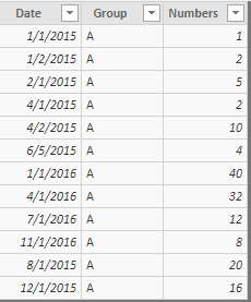
I have a data and want to plot the line chart with year and quarter on x-axis.
There is a column called "date".
I create a measure and want to plot this measure.
REALWANT =
VAR MINYR = CALCULATE(MIN(dt[date].[Year]),ALLEXCEPT(dt,dt[Group]))
VAR MINQR = CALCULATE(MIN(dt[date].[QuarterNo]),ALLEXCEPT(dt,dt[Group]))
VAR NEW= CALCULATE(SUM(dt[Numbers]), FILTER(ALLEXCEPT(dt,dt[Group]), dt[date].[Year] = MINYR && dt[date].[QuarterNo] = MINQR))
VAR WANTDenominator = IF(MAX(dt[Numbers]) = Blank(), Blank(), [NEW])
VAR WANTNominator = CALCULATE(SUM(dt[Numbers]), ALLEXCEPT(dt,dt[Group],dt[date].[Year],dt[date].[QuarterNo]))
Return
WANTNominator/WANTDenominator
Now, I click on the Line Chart in the report tab and put this measure on y-axis, Group on legend, and date hierarchy (only year and quarter) on x-axis.
However, the line plot showd inappropriately. On the x-axis, it only showed year so that it automatically added up measure for all quarters in each year by group.
Even I create a new column as below:
yq = dt[date].[Year] & dt[date].[QuarterNo]
And plot again, the x-axis on plot displays weired. It did not display as order.
How can I figure out this?
Also, is it possible to create a filter for Group and when I filter values in that, the plot will change. I think I need to add something like SELECTEDVALUE. Not sure.
Solved! Go to Solution.
- Mark as New
- Bookmark
- Subscribe
- Mute
- Subscribe to RSS Feed
- Permalink
- Report Inappropriate Content
Hi @PeterChen ,
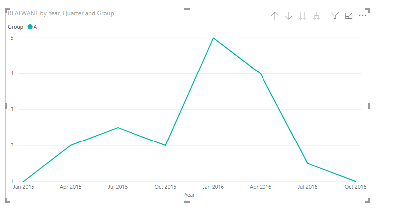
Based on my test, I got this output, Then what is your excepted result?
If this post helps, then please consider Accept it as the solution to help the others find it more quickly.
- Mark as New
- Bookmark
- Subscribe
- Mute
- Subscribe to RSS Feed
- Permalink
- Report Inappropriate Content
@v-frfei-msft wrote:Hi @PeterChen ,
Based on my test, I got this output, Then what is your excepted result?
The order is weird if I create a new column with year and quarter.
Moreover, if I plot like your way using original date column and select hierarchy for year and quarter, the x-axis on line chart only shows year rather year and quarter.
In addition, if I copy your plot and then change the axis, legend, and values to my data, it works. Not sure why it works in copy and paste....
Helpful resources

Join us at the Microsoft Fabric Community Conference
March 31 - April 2, 2025, in Las Vegas, Nevada. Use code MSCUST for a $150 discount! Prices go up Feb. 11th.

Power BI Monthly Update - January 2025
Check out the January 2025 Power BI update to learn about new features in Reporting, Modeling, and Data Connectivity.

| User | Count |
|---|---|
| 144 | |
| 85 | |
| 65 | |
| 51 | |
| 45 |
| User | Count |
|---|---|
| 217 | |
| 88 | |
| 81 | |
| 65 | |
| 56 |


