This time we’re going bigger than ever. Fabric, Power BI, SQL, AI and more. We're covering it all. You won't want to miss it.
Learn moreLevel up your Power BI skills this month - build one visual each week and tell better stories with data! Get started
I have 3 columns, a date, stage, and score column.
Best way to present data is with a line and stacked column chart. I use
- date as the shared axis,
- the stage as the column values. I codify each stage to a value, 1-5
- I use the score as the line axis values.
I get:
I want to be able to identify each stage with a different colour, so add stage value to Column Series.
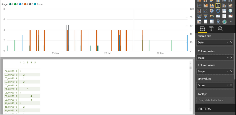
This is nice, but I lose the line values. Any suggestion to how I can have both options (line and coloured columns)
Thanks
@Anonymous,
The latest version of Power BI Desktop seems to work fine for me.
I just updated to Dec version and have the same problem
@Anonymous,
If possible, share a simplified example to reproduce this.
Sign up to receive a private message when registration opens and key events begin.
If you have recently started exploring Fabric, we'd love to hear how it's going. Your feedback can help with product improvements.
| User | Count |
|---|---|
| 30 | |
| 23 | |
| 23 | |
| 20 | |
| 16 |
| User | Count |
|---|---|
| 64 | |
| 41 | |
| 24 | |
| 22 | |
| 22 |