- Power BI forums
- Updates
- News & Announcements
- Get Help with Power BI
- Desktop
- Service
- Report Server
- Power Query
- Mobile Apps
- Developer
- DAX Commands and Tips
- Custom Visuals Development Discussion
- Health and Life Sciences
- Power BI Spanish forums
- Translated Spanish Desktop
- Power Platform Integration - Better Together!
- Power Platform Integrations (Read-only)
- Power Platform and Dynamics 365 Integrations (Read-only)
- Training and Consulting
- Instructor Led Training
- Dashboard in a Day for Women, by Women
- Galleries
- Community Connections & How-To Videos
- COVID-19 Data Stories Gallery
- Themes Gallery
- Data Stories Gallery
- R Script Showcase
- Webinars and Video Gallery
- Quick Measures Gallery
- 2021 MSBizAppsSummit Gallery
- 2020 MSBizAppsSummit Gallery
- 2019 MSBizAppsSummit Gallery
- Events
- Ideas
- Custom Visuals Ideas
- Issues
- Issues
- Events
- Upcoming Events
- Community Blog
- Power BI Community Blog
- Custom Visuals Community Blog
- Community Support
- Community Accounts & Registration
- Using the Community
- Community Feedback
Register now to learn Fabric in free live sessions led by the best Microsoft experts. From Apr 16 to May 9, in English and Spanish.
- Power BI forums
- Forums
- Get Help with Power BI
- Desktop
- compare count of slicer selection group to count i...
- Subscribe to RSS Feed
- Mark Topic as New
- Mark Topic as Read
- Float this Topic for Current User
- Bookmark
- Subscribe
- Printer Friendly Page
- Mark as New
- Bookmark
- Subscribe
- Mute
- Subscribe to RSS Feed
- Permalink
- Report Inappropriate Content
compare count of slicer selection group to count in all groups
Hi I have a dataset which looks something like this:
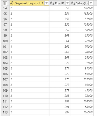
Segment Group 1-6, a unique ID, and a salary range rounded to the nearest 10,000. In my visuals I have created a slicer for segment group where a user can select of the 1,2,3,4,5 or 6.
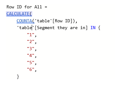
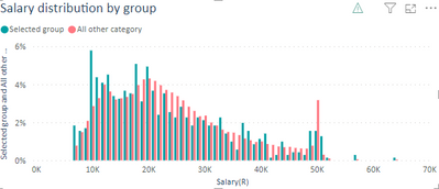
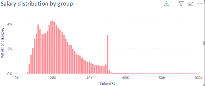
I'd like to be able to create a visual which compares one of the selected groups with all groups, i.e. Group 1 compared to Groups 1+2,+3+4+5+6 where the visual shows the % of Row ID in the table above as a percentage of total. The visual below I have plotted the salary on the X axis and the "selected group" shows Y axis the count of Row ID from the table as a "Percentage of grand total" when you right click the field in the Y axis, the "All other Category" is a measure much like below
I want to compare the % of Row ID from the selected segment (the number of row ID in segment 1 if selected would add up to 100% in all salary categories, for example if there are 100 ID in segment 1, and 20 have a salary of 10k, i want it to show as 20% on the Y axis. I want the all others to do the same, and show a percentage, if there were 1000 row ID in Categories 1-6 I want the 1000 to be 100% and for example if there were 300 count of ID in the salary bracker 20000, I woudl want the Y axis to show 30%.
The problem is that I want the measure to show this in the combined chart above, the chart above is only showing the percentage of the measure, where there is a count for the selected value..... :
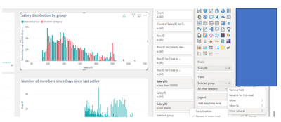
The is a warning triangle to say that show items with no data is no compatible with show value as percentage of grand total.
Any help much appreciated...!!!!
Solved! Go to Solution.
- Mark as New
- Bookmark
- Subscribe
- Mute
- Subscribe to RSS Feed
- Permalink
- Report Inappropriate Content
Hi @Anonymous ,
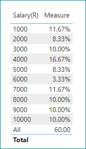
1. For bar charts, it is difficult to achieve this effect because the bar chart needs to format all the values except "All" as a percentage of the text, which is not recognized by the bar chart when it is a value.
But it is possible to do so in the table.
2. Another workaround is to group two charts together.
Please refer to the PBIX file.
Best Regards,
Gao
Community Support Team
If there is any post helps, then please consider Accept it as the solution to help the other members find it more quickly. If I misunderstand your needs or you still have problems on it, please feel free to let us know. Thanks a lot!
How to get your questions answered quickly -- How to provide sample data in the Power BI Forum
- Mark as New
- Bookmark
- Subscribe
- Mute
- Subscribe to RSS Feed
- Permalink
- Report Inappropriate Content
Thank you for taking the time to consider my question. I have managed to find a solution, by adding an addtional table, which removes the "category" and just has the count by age and this seems to be working thank you at @v-cgao-msft much appreciated with your suggested solutions aswell! so I will mark as an accepted solution!
- Mark as New
- Bookmark
- Subscribe
- Mute
- Subscribe to RSS Feed
- Permalink
- Report Inappropriate Content
Hi @Anonymous ,
1. For bar charts, it is difficult to achieve this effect because the bar chart needs to format all the values except "All" as a percentage of the text, which is not recognized by the bar chart when it is a value.
But it is possible to do so in the table.
2. Another workaround is to group two charts together.
Please refer to the PBIX file.
Best Regards,
Gao
Community Support Team
If there is any post helps, then please consider Accept it as the solution to help the other members find it more quickly. If I misunderstand your needs or you still have problems on it, please feel free to let us know. Thanks a lot!
How to get your questions answered quickly -- How to provide sample data in the Power BI Forum
- Mark as New
- Bookmark
- Subscribe
- Mute
- Subscribe to RSS Feed
- Permalink
- Report Inappropriate Content
Thank you for taking the time to consider my question. I have managed to find a solution, by adding an addtional table, which removes the "category" and just has the count by age and this seems to be working thank you at @v-cgao-msft much appreciated with your suggested solutions aswell! so I will mark as an accepted solution!
Helpful resources

Microsoft Fabric Learn Together
Covering the world! 9:00-10:30 AM Sydney, 4:00-5:30 PM CET (Paris/Berlin), 7:00-8:30 PM Mexico City

Power BI Monthly Update - April 2024
Check out the April 2024 Power BI update to learn about new features.

| User | Count |
|---|---|
| 107 | |
| 97 | |
| 75 | |
| 63 | |
| 53 |
| User | Count |
|---|---|
| 139 | |
| 100 | |
| 95 | |
| 85 | |
| 63 |
