- Power BI forums
- Updates
- News & Announcements
- Get Help with Power BI
- Desktop
- Service
- Report Server
- Power Query
- Mobile Apps
- Developer
- DAX Commands and Tips
- Custom Visuals Development Discussion
- Health and Life Sciences
- Power BI Spanish forums
- Translated Spanish Desktop
- Power Platform Integration - Better Together!
- Power Platform Integrations (Read-only)
- Power Platform and Dynamics 365 Integrations (Read-only)
- Training and Consulting
- Instructor Led Training
- Dashboard in a Day for Women, by Women
- Galleries
- Community Connections & How-To Videos
- COVID-19 Data Stories Gallery
- Themes Gallery
- Data Stories Gallery
- R Script Showcase
- Webinars and Video Gallery
- Quick Measures Gallery
- 2021 MSBizAppsSummit Gallery
- 2020 MSBizAppsSummit Gallery
- 2019 MSBizAppsSummit Gallery
- Events
- Ideas
- Custom Visuals Ideas
- Issues
- Issues
- Events
- Upcoming Events
- Community Blog
- Power BI Community Blog
- Custom Visuals Community Blog
- Community Support
- Community Accounts & Registration
- Using the Community
- Community Feedback
Register now to learn Fabric in free live sessions led by the best Microsoft experts. From Apr 16 to May 9, in English and Spanish.
- Power BI forums
- Forums
- Get Help with Power BI
- Desktop
- Re: cannnot show line chart over years
- Subscribe to RSS Feed
- Mark Topic as New
- Mark Topic as Read
- Float this Topic for Current User
- Bookmark
- Subscribe
- Printer Friendly Page
- Mark as New
- Bookmark
- Subscribe
- Mute
- Subscribe to RSS Feed
- Permalink
- Report Inappropriate Content
cannnot show line chart over years
Hi,
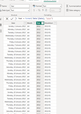
Tried to show line chart year over years but showing separate months.
Below is my data table, generated using
When I did with simple trial (generated all in excel) , I could do what I want. But not sure why it does not work on full data model.

Please advise.
- Mark as New
- Bookmark
- Subscribe
- Mute
- Subscribe to RSS Feed
- Permalink
- Report Inappropriate Content
Update
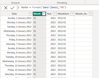
When I changed data format in Month column as below, showing integer (after changing to whole number), not Text format, I now can see gragh i wanted.
However, how can i show x-axis column in Jan, Feb .... Not 1,2 ... ?
- Mark as New
- Bookmark
- Subscribe
- Mute
- Subscribe to RSS Feed
- Permalink
- Report Inappropriate Content
This seems to be very odd if changing your format solves the problem.
I would still create a new column with MMMM format and use your integer month column for sorting by. Just click on a new MMMM and change sort by option.
https://learn.microsoft.com/en-us/power-bi/create-reports/desktop-sort-by-column?tabs=powerbi-deskto...
In case you would still have problems with the X axis, please share some sample or additional printscreens.
If my answer was helpful please give me a Kudos or even accept as a Solution.
Let's connect on LinkedIn!
- Mark as New
- Bookmark
- Subscribe
- Mute
- Subscribe to RSS Feed
- Permalink
- Report Inappropriate Content
Hi @Anonymous ,
Can you also show, which fields you use and how in the visual?
If you want to see the outcome as you have on lowest picture, you need to do following:
1. Put values in Y axis
2. Put Months in X axis
3. Put Year in Legend.
This should work fine.
If my answer was helpful please give me a Kudos or even accept as a Solution.
Let's connect on LinkedIn!
- Mark as New
- Bookmark
- Subscribe
- Mute
- Subscribe to RSS Feed
- Permalink
- Report Inappropriate Content
Thats how i did for both first and second grapshs. But somehow first graph does not show like second one.
Is something wrong with date model ?
Helpful resources

Microsoft Fabric Learn Together
Covering the world! 9:00-10:30 AM Sydney, 4:00-5:30 PM CET (Paris/Berlin), 7:00-8:30 PM Mexico City

Power BI Monthly Update - April 2024
Check out the April 2024 Power BI update to learn about new features.

| User | Count |
|---|---|
| 107 | |
| 93 | |
| 77 | |
| 65 | |
| 53 |
| User | Count |
|---|---|
| 147 | |
| 106 | |
| 104 | |
| 87 | |
| 61 |


