Join us at the 2025 Microsoft Fabric Community Conference
Microsoft Fabric Community Conference 2025, March 31 - April 2, Las Vegas, Nevada. Use code FABINSIDER for a $400 discount.
Register now- Power BI forums
- Get Help with Power BI
- Desktop
- Service
- Report Server
- Power Query
- Mobile Apps
- Developer
- DAX Commands and Tips
- Custom Visuals Development Discussion
- Health and Life Sciences
- Power BI Spanish forums
- Translated Spanish Desktop
- Training and Consulting
- Instructor Led Training
- Dashboard in a Day for Women, by Women
- Galleries
- Webinars and Video Gallery
- Data Stories Gallery
- Themes Gallery
- Power BI DataViz World Championships Gallery
- Quick Measures Gallery
- R Script Showcase
- COVID-19 Data Stories Gallery
- Community Connections & How-To Videos
- 2021 MSBizAppsSummit Gallery
- 2020 MSBizAppsSummit Gallery
- 2019 MSBizAppsSummit Gallery
- Events
- Ideas
- Custom Visuals Ideas
- Issues
- Issues
- Events
- Upcoming Events
The Power BI DataViz World Championships are on! With four chances to enter, you could win a spot in the LIVE Grand Finale in Las Vegas. Show off your skills.
- Power BI forums
- Forums
- Get Help with Power BI
- Desktop
- can i use same field for line and clustered column...
- Subscribe to RSS Feed
- Mark Topic as New
- Mark Topic as Read
- Float this Topic for Current User
- Bookmark
- Subscribe
- Printer Friendly Page
- Mark as New
- Bookmark
- Subscribe
- Mute
- Subscribe to RSS Feed
- Permalink
- Report Inappropriate Content
can i use same field for line and clustered columns?
Hi, everybody
I have an unique field called Net_Change_Actual.
I would like to use this field in the columns and lines depending on some filters.
For example, (KPI_Code is another field in the query).
Use clustered columns with KPI_Code 10,20 y 30
Use line for KPI_Code 40
Any tip?
Thanks
Solved! Go to Solution.
- Mark as New
- Bookmark
- Subscribe
- Mute
- Subscribe to RSS Feed
- Permalink
- Report Inappropriate Content
Hi @Angel,
In this case, create another table to filter the KPI_CODE which doesn’t equal to 40 , and create a calendar table, then set up relationships via Date column between the three tables and create Line and clustered column chart. You can check the result in the following screenshot.
Also you can download the modified PBIX file from this link: https://1drv.ms/u/s!AhsotbnGu1NogWZrbPXvKXsj6mCX .
Thanks,
Lydia Zhang
If this post helps, then please consider Accept it as the solution to help the other members find it more quickly.
- Mark as New
- Bookmark
- Subscribe
- Mute
- Subscribe to RSS Feed
- Permalink
- Report Inappropriate Content
Hi @Angel,
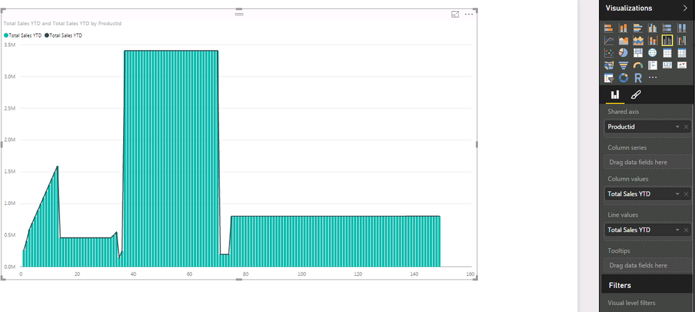
What fields do you intend to put in the Shared axis, Column Values and Line Values of Line and clustered column chart ? It is ok to drag same field to Column Values and Line Values as follows, however, I am afraid the Line and clustered column chart doesn’t fit your scenario.
In the following scenario, it is appropriate to use Line and clustered column chart to display data. You can check this article to get more information.
• when you have a line chart and a column chart with the same X axis.
• to compare multiple measures with different value ranges.
• to illustrate the correlation between two measures in one visualization.
• to check whether one measure meet the target which is defined by another measure
• to conserve canvas space.
In addition, please help to share sample data and describe more details about what you want to display, so that we can recommend the appropriate visual for you.
Thanks,
Lydia Zhang
If this post helps, then please consider Accept it as the solution to help the other members find it more quickly.
- Mark as New
- Bookmark
- Subscribe
- Mute
- Subscribe to RSS Feed
- Permalink
- Report Inappropriate Content
Hi, @Lidia
Thanks for your quick response.
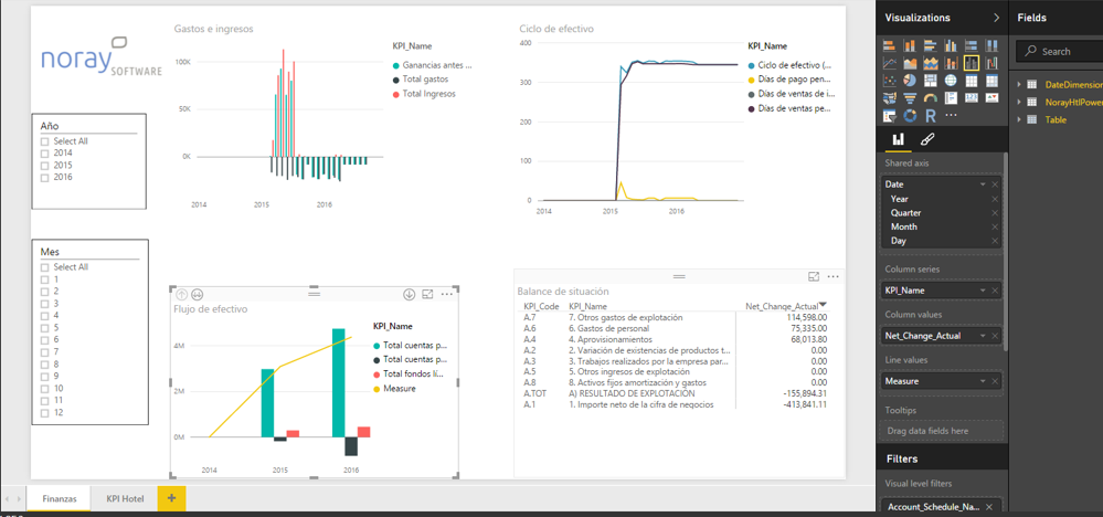
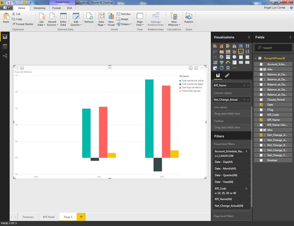
The thing I want to do is to put Total flujo de efectivo in line and the rest of datas in columns charts.
As you can see in the image, all data shares the same field Net_Change_Actual.
The shared axis is not showed in the image, but it's date.
Thanks,
- Mark as New
- Bookmark
- Subscribe
- Mute
- Subscribe to RSS Feed
- Permalink
- Report Inappropriate Content
Hi @Angel,
When you put the Total flujo de efectivo in line , does the visual work as expected? As I am not able to enlarge the screenshot, I will appreciate it if you can share me the PBIX file.
Thanks,
Lydia Zhang
If this post helps, then please consider Accept it as the solution to help the other members find it more quickly.
- Mark as New
- Bookmark
- Subscribe
- Mute
- Subscribe to RSS Feed
- Permalink
- Report Inappropriate Content
Hi, @Lidia
¿How can I can share pbix file in the post?.
Thanks,
- Mark as New
- Bookmark
- Subscribe
- Mute
- Subscribe to RSS Feed
- Permalink
- Report Inappropriate Content
Hi @Angel,
You can upload pbix file to onedrive and post shared link of the file here.
Thanks,
Lydia Zhang
If this post helps, then please consider Accept it as the solution to help the other members find it more quickly.
- Mark as New
- Bookmark
- Subscribe
- Mute
- Subscribe to RSS Feed
- Permalink
- Report Inappropriate Content
Hi, @Lidia
I send you the link..
Thanks
- Mark as New
- Bookmark
- Subscribe
- Mute
- Subscribe to RSS Feed
- Permalink
- Report Inappropriate Content
Hi @Angel,
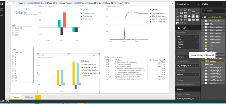
Cretae a measure using the following formula and then drag it into Line Values as shown in below screenshot.
Measure = CALCULATE(sum(NorayHtlPowerBI[Net_Change_Actual]),FILTER(NorayHtlPowerBI,NorayHtlPowerBI[KPI_Code]="40"))
Thanks,
Lydia Zhang
If this post helps, then please consider Accept it as the solution to help the other members find it more quickly.
- Mark as New
- Bookmark
- Subscribe
- Mute
- Subscribe to RSS Feed
- Permalink
- Report Inappropriate Content
Hi, @Lidia
I have tried the measure you have told me and it works.
The problem is if I use the measure for the line, I don't want to show the same data in column chart.
I have tried to filter KPI_CODE not showing value 40, but then neither the column chart and line is showed in the graph.
Any suggestion?.
Many thanks,
Helpful resources

Join us at the Microsoft Fabric Community Conference
March 31 - April 2, 2025, in Las Vegas, Nevada. Use code MSCUST for a $150 discount!

Power BI Monthly Update - February 2025
Check out the February 2025 Power BI update to learn about new features.

Join our Community Sticker Challenge 2025
If you love stickers, then you will definitely want to check out our Community Sticker Challenge!

| User | Count |
|---|---|
| 84 | |
| 69 | |
| 68 | |
| 39 | |
| 39 |


