Fabric Data Days starts November 4th!
Advance your Data & AI career with 50 days of live learning, dataviz contests, hands-on challenges, study groups & certifications and more!
Get registered- Power BI forums
- Get Help with Power BI
- Desktop
- Service
- Report Server
- Power Query
- Mobile Apps
- Developer
- DAX Commands and Tips
- Custom Visuals Development Discussion
- Health and Life Sciences
- Power BI Spanish forums
- Translated Spanish Desktop
- Training and Consulting
- Instructor Led Training
- Dashboard in a Day for Women, by Women
- Galleries
- Data Stories Gallery
- Themes Gallery
- Contests Gallery
- Quick Measures Gallery
- Visual Calculations Gallery
- Notebook Gallery
- Translytical Task Flow Gallery
- TMDL Gallery
- R Script Showcase
- Webinars and Video Gallery
- Ideas
- Custom Visuals Ideas (read-only)
- Issues
- Issues
- Events
- Upcoming Events
Get Fabric Certified for FREE during Fabric Data Days. Don't miss your chance! Learn more
- Power BI forums
- Forums
- Get Help with Power BI
- Desktop
- Re: box and whisker visualisation
- Subscribe to RSS Feed
- Mark Topic as New
- Mark Topic as Read
- Float this Topic for Current User
- Bookmark
- Subscribe
- Printer Friendly Page
- Mark as New
- Bookmark
- Subscribe
- Mute
- Subscribe to RSS Feed
- Permalink
- Report Inappropriate Content
box and whisker visualisation
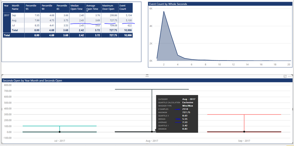
I don't have much experience with box and whisker plots and I am struggling to make the results returned in it to the measures I have created on the same data. I have used MEDIAN and AVERAGE in the functions in the table and based the box and whisker on the same data.
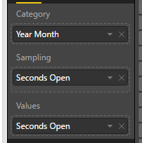
I am not sure what samplng and values are. It is calculating the average median seconds a door is open. Messing around the only way I can get a chart is by the screenshot below. The maximum is correct but the median and average aren't. I presume from the #samples refers to the number of rows being used? Which is lower than the table is using so that I presume is why it is different.
Anyone give me a hint of where I am going wrong?
Solved! Go to Solution.
- Mark as New
- Bookmark
- Subscribe
- Mute
- Subscribe to RSS Feed
- Permalink
- Report Inappropriate Content
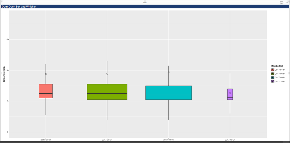
I ended up using the R visualisation and used ggplot2 library using geom_boxplot which after a bit of messing about does the job.
The R plotly library looks to have more featues and allows data labels. I could get it to work in R Studio but it didn't seem to work in power bi very well which was a shame.
- Mark as New
- Bookmark
- Subscribe
- Mute
- Subscribe to RSS Feed
- Permalink
- Report Inappropriate Content
Hi @gooranga1,
Values are the values to evaluate. Sampling is the way to group Values. You can see the numbers behind the visual by click the ellipsis in the upper right and select "see data". You will get the idea soon. I create a visualization that is similar with yours.
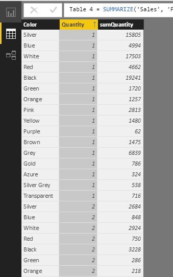
The values are grouped by color first, then are grouped by Quantity members.
Best Regards!
Dale
If this post helps, then please consider Accept it as the solution to help the other members find it more quickly.
- Mark as New
- Bookmark
- Subscribe
- Mute
- Subscribe to RSS Feed
- Permalink
- Report Inappropriate Content
Thanks @v-jiascu-msft
I understamd it a bit better now. I actually didn't want any sampling so I used an index column which worked! ......but!
It made the chart really really slow. So slow it was unusable. I also was unable to change the data colours and because it was taking minutes for each update I had to give up.
Shame really but I think there was to much data for it in this case.
Thanks for your help.
- Mark as New
- Bookmark
- Subscribe
- Mute
- Subscribe to RSS Feed
- Permalink
- Report Inappropriate Content
Hi @gooranga1,
Maybe you can try to summarize the data first, there could be less computing. In my example, I can try to create a new table like this.
Table 4 =
SUMMARIZE (
    'Sales',
    'Product'[Color],
    Sales[Quantity],
    "sumQuantity", SUM ( Sales[Quantity] )
)
Best Regards!
Dale
If this post helps, then please consider Accept it as the solution to help the other members find it more quickly.
- Mark as New
- Bookmark
- Subscribe
- Mute
- Subscribe to RSS Feed
- Permalink
- Report Inappropriate Content
Thanks @v-jiascu-msft
I did have a think how I could summarise the data but not sure I can. We have thousands of doors that can get opended multiple times in a day. We would like to get acurate overview of the opening times of the doors. Not sure how I could summarise that data to get this as I think I need the raw data to get acurate figures. I will keep looking at it though and see If I can find a way to do this.
Cheers
- Mark as New
- Bookmark
- Subscribe
- Mute
- Subscribe to RSS Feed
- Permalink
- Report Inappropriate Content
I ended up using the R visualisation and used ggplot2 library using geom_boxplot which after a bit of messing about does the job.
The R plotly library looks to have more featues and allows data labels. I could get it to work in R Studio but it didn't seem to work in power bi very well which was a shame.
Helpful resources

Fabric Data Days
Advance your Data & AI career with 50 days of live learning, contests, hands-on challenges, study groups & certifications and more!

Power BI Monthly Update - October 2025
Check out the October 2025 Power BI update to learn about new features.


