New Offer! Become a Certified Fabric Data Engineer
Check your eligibility for this 50% exam voucher offer and join us for free live learning sessions to get prepared for Exam DP-700.
Get Started- Power BI forums
- Get Help with Power BI
- Desktop
- Service
- Report Server
- Power Query
- Mobile Apps
- Developer
- DAX Commands and Tips
- Custom Visuals Development Discussion
- Health and Life Sciences
- Power BI Spanish forums
- Translated Spanish Desktop
- Training and Consulting
- Instructor Led Training
- Dashboard in a Day for Women, by Women
- Galleries
- Community Connections & How-To Videos
- COVID-19 Data Stories Gallery
- Themes Gallery
- Data Stories Gallery
- R Script Showcase
- Webinars and Video Gallery
- Quick Measures Gallery
- 2021 MSBizAppsSummit Gallery
- 2020 MSBizAppsSummit Gallery
- 2019 MSBizAppsSummit Gallery
- Events
- Ideas
- Custom Visuals Ideas
- Issues
- Issues
- Events
- Upcoming Events
Don't miss out! 2025 Microsoft Fabric Community Conference, March 31 - April 2, Las Vegas, Nevada. Use code MSCUST for a $150 discount. Prices go up February 11th. Register now.
- Power BI forums
- Forums
- Get Help with Power BI
- Desktop
- arrange of bars as per mnth
- Subscribe to RSS Feed
- Mark Topic as New
- Mark Topic as Read
- Float this Topic for Current User
- Bookmark
- Subscribe
- Printer Friendly Page
- Mark as New
- Bookmark
- Subscribe
- Mute
- Subscribe to RSS Feed
- Permalink
- Report Inappropriate Content
arrange of bars as per mnth
- Mark as New
- Bookmark
- Subscribe
- Mute
- Subscribe to RSS Feed
- Permalink
- Report Inappropriate Content
@Anonymous
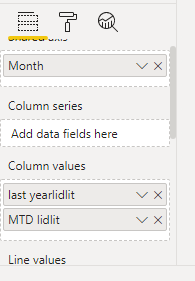
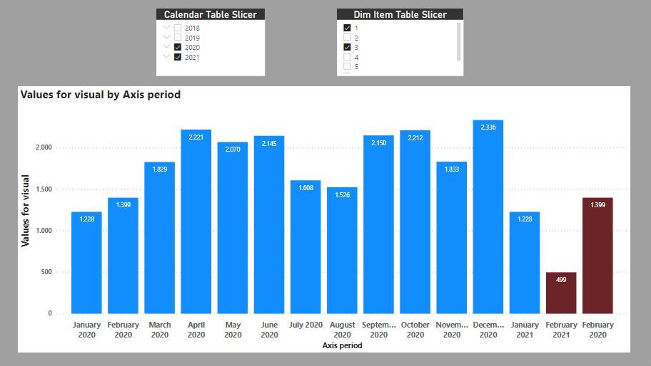
Here is one way of doing this. For this exercise, I'm assuming you wish to see the current month next to the same month of the previous year (so I'm grouping Feb 2021 with Feb 2020).
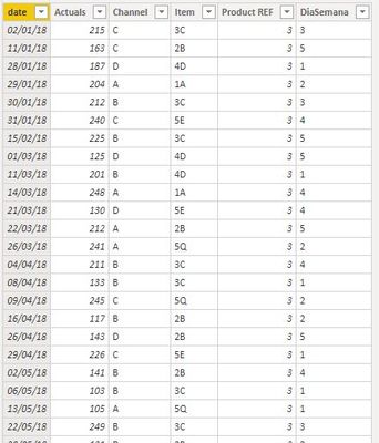
The example is a simple dataset with sales by date, and the model contains a calendar table:
First we need to create a new table including the extra month as a new row (the month you wish to see grouped with its equivalent) to use as the axis of the visual.
To do this we create a new table including the new row (in thes case "Februrary 2021") and all the periods in the calendar table. Since this new row would be the same as a row we already have in the dataset - in effect we are duplicating it - we need to make it's value different to prevent any form of aggregation. In my case, all I have done is include an extra space between the month name and the year. This makes it different from the values in the dataset which only have one space in between.
In this new axis table, we need the yearmonth value, the name we wish to use in the visual ("month" in this example) and a vlue to be able to sort the table to ensure the right order in the visual ("order")
So, the code for the whole table (including the code seen in the image above is):
Axis Table =
VAR CurrentMonth =
    MONTH ( TODAY () )
VAR PrevYear =
    YEAR ( TODAY () ) - 1
VAR PrevYearPeriod =
    ROW (
        "yearmonth",
             ( PrevYear ) * 100 + CurrentMonth,
        "month",
            FORMAT ( TODAY (), "MMMM" ) & "  " & PrevYear,
        "order", 10000000
    )
VAR CalTable =
    SELECTCOLUMNS (
        GROUPBY (
            'Calendar Table',
            'Calendar Table'[Year],
            'Calendar Table'[Month Name],
            'Calendar Table'[YearMonth]
        ),
        "yearmonth", 'Calendar Table'[YearMonth],
        "month",
            'Calendar Table'[Month Name] & " " & 'Calendar Table'[Year],
        "order", 'Calendar Table'[YearMonth]
    )
RETURN
    UNION ( CalTable, PrevYearPeriod )
This creates the following table:
You can ignore the "Axis Period" column: I had to add it because my locale settings are not english and the FORMAT function returns the value in spanish. I added this column to keep the values in english (so ignore it, and just use the Axis table [month] column as the axis for the visual)
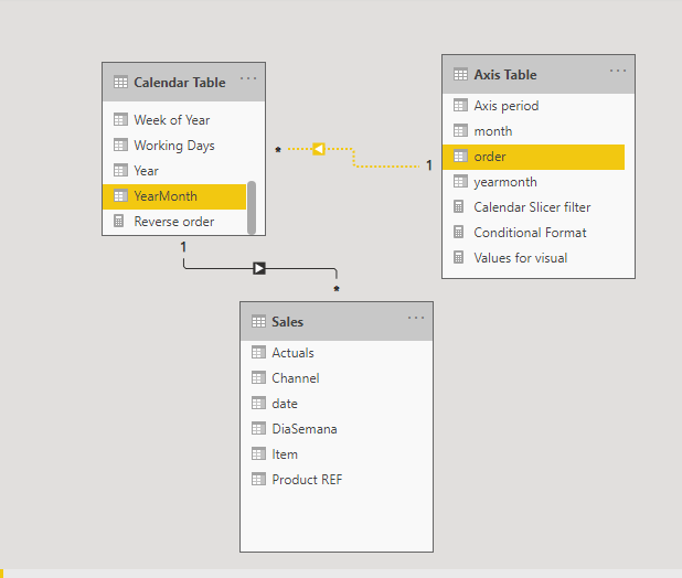
Now we join this Axis table with the calendar table by joining the Axis Table[order] column and the Calendar Table [Yearmonth] column in a one-to-many relationship and make it inactive
We can now write create the measure for the visual (in my case a simple Sum of Sales):
Values for visual =
VAR NewPeriodV =
    CALCULATE (
        [Sum of Sales],
        TREATAS ( VALUES ( 'Axis Table'[yearmonth] ), 'Calendar Table'[YearMonth] )
    )
VAR OtherPeriodV =
    CALCULATE (
        [Sum of Sales],
        USERELATIONSHIP ( 'Axis Table'[order], 'Calendar Table'[YearMonth] )
    )
RETURN
    IF (
        SELECTEDVALUE ( 'Axis Table'[order] ) = 10000000,
        NewPeriodV,
        OtherPeriodV
    )
For the conditional formatting for the colours:
Conditional Format =
VAR lastYearm =
    MAXX (
        FILTER ( ALL ( 'Axis Table' ), 'Axis Table'[order] < 10000000 ),
        'Axis Table'[yearmonth]
    )
VAR Calc =
    IF (
        SELECTEDVALUE ( 'Axis Table'[order] ) = 10000000,
        1,
        IF ( SELECTEDVALUE ( 'Axis Table'[yearmonth] ) = lastYearm, 1 )
    )
RETURN
    Calc
and the following measure to filter the visual. This measure you must add to the "filters on this visual" in the filter pane and set the value to 1:
Calendar Slicer filter =
VAR CalYM = VALUES('Calendar Table'[YearMonth])
VAR AxisTYM = VALUES('Axis Table'[yearmonth])
RETURN
COUNTROWS(
    INTERSECT(CalYM, AxisTYM))
and you get this:
I've attached the sample PBIX file for your reference
Did I answer your question? Mark my post as a solution!
In doing so, you are also helping me. Thank you!
Proud to be a Super User!
Paul on Linkedin.
- Mark as New
- Bookmark
- Subscribe
- Mute
- Subscribe to RSS Feed
- Permalink
- Report Inappropriate Content
Hi,
Depending upon how your data is arranged and what measures you have written, you may want to drag Month and then Years from the Calendar table to the X axis of your visual. This way for every month, you will see 2 columns - one for the current year and another for the previous year.
Regards,
Ashish Mathur
http://www.ashishmathur.com
https://www.linkedin.com/in/excelenthusiasts/
- Mark as New
- Bookmark
- Subscribe
- Mute
- Subscribe to RSS Feed
- Permalink
- Report Inappropriate Content
@Anonymous
Here is one way of doing this. For this exercise, I'm assuming you wish to see the current month next to the same month of the previous year (so I'm grouping Feb 2021 with Feb 2020).
The example is a simple dataset with sales by date, and the model contains a calendar table:
First we need to create a new table including the extra month as a new row (the month you wish to see grouped with its equivalent) to use as the axis of the visual.
To do this we create a new table including the new row (in thes case "Februrary 2021") and all the periods in the calendar table. Since this new row would be the same as a row we already have in the dataset - in effect we are duplicating it - we need to make it's value different to prevent any form of aggregation. In my case, all I have done is include an extra space between the month name and the year. This makes it different from the values in the dataset which only have one space in between.
In this new axis table, we need the yearmonth value, the name we wish to use in the visual ("month" in this example) and a vlue to be able to sort the table to ensure the right order in the visual ("order")
So, the code for the whole table (including the code seen in the image above is):
Axis Table =
VAR CurrentMonth =
    MONTH ( TODAY () )
VAR PrevYear =
    YEAR ( TODAY () ) - 1
VAR PrevYearPeriod =
    ROW (
        "yearmonth",
             ( PrevYear ) * 100 + CurrentMonth,
        "month",
            FORMAT ( TODAY (), "MMMM" ) & "  " & PrevYear,
        "order", 10000000
    )
VAR CalTable =
    SELECTCOLUMNS (
        GROUPBY (
            'Calendar Table',
            'Calendar Table'[Year],
            'Calendar Table'[Month Name],
            'Calendar Table'[YearMonth]
        ),
        "yearmonth", 'Calendar Table'[YearMonth],
        "month",
            'Calendar Table'[Month Name] & " " & 'Calendar Table'[Year],
        "order", 'Calendar Table'[YearMonth]
    )
RETURN
    UNION ( CalTable, PrevYearPeriod )
This creates the following table:
You can ignore the "Axis Period" column: I had to add it because my locale settings are not english and the FORMAT function returns the value in spanish. I added this column to keep the values in english (so ignore it, and just use the Axis table [month] column as the axis for the visual)
Now we join this Axis table with the calendar table by joining the Axis Table[order] column and the Calendar Table [Yearmonth] column in a one-to-many relationship and make it inactive
We can now write create the measure for the visual (in my case a simple Sum of Sales):
Values for visual =
VAR NewPeriodV =
    CALCULATE (
        [Sum of Sales],
        TREATAS ( VALUES ( 'Axis Table'[yearmonth] ), 'Calendar Table'[YearMonth] )
    )
VAR OtherPeriodV =
    CALCULATE (
        [Sum of Sales],
        USERELATIONSHIP ( 'Axis Table'[order], 'Calendar Table'[YearMonth] )
    )
RETURN
    IF (
        SELECTEDVALUE ( 'Axis Table'[order] ) = 10000000,
        NewPeriodV,
        OtherPeriodV
    )
For the conditional formatting for the colours:
Conditional Format =
VAR lastYearm =
    MAXX (
        FILTER ( ALL ( 'Axis Table' ), 'Axis Table'[order] < 10000000 ),
        'Axis Table'[yearmonth]
    )
VAR Calc =
    IF (
        SELECTEDVALUE ( 'Axis Table'[order] ) = 10000000,
        1,
        IF ( SELECTEDVALUE ( 'Axis Table'[yearmonth] ) = lastYearm, 1 )
    )
RETURN
    Calc
and the following measure to filter the visual. This measure you must add to the "filters on this visual" in the filter pane and set the value to 1:
Calendar Slicer filter =
VAR CalYM = VALUES('Calendar Table'[YearMonth])
VAR AxisTYM = VALUES('Axis Table'[yearmonth])
RETURN
COUNTROWS(
    INTERSECT(CalYM, AxisTYM))
and you get this:
I've attached the sample PBIX file for your reference
Did I answer your question? Mark my post as a solution!
In doing so, you are also helping me. Thank you!
Proud to be a Super User!
Paul on Linkedin.
- Mark as New
- Bookmark
- Subscribe
- Mute
- Subscribe to RSS Feed
- Permalink
- Report Inappropriate Content
@Anonymous
Is the grouping to be dynamic? If so, under which criteria?
You are going to have to create a custom table as your axis, so we need to define the criteria for the month grouping.
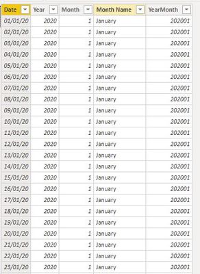
can you post an image of your date table and of the model?
Did I answer your question? Mark my post as a solution!
In doing so, you are also helping me. Thank you!
Proud to be a Super User!
Paul on Linkedin.
Helpful resources
| User | Count |
|---|---|
| 116 | |
| 73 | |
| 62 | |
| 49 | |
| 47 |
| User | Count |
|---|---|
| 173 | |
| 123 | |
| 60 | |
| 59 | |
| 57 |

