Jumpstart your career with the Fabric Career Hub
Find everything you need to get certified on Fabric—skills challenges, live sessions, exam prep, role guidance, and more.
Get started- Power BI forums
- Updates
- News & Announcements
- Get Help with Power BI
- Desktop
- Service
- Report Server
- Power Query
- Mobile Apps
- Developer
- DAX Commands and Tips
- Custom Visuals Development Discussion
- Health and Life Sciences
- Power BI Spanish forums
- Translated Spanish Desktop
- Power Platform Integration - Better Together!
- Power Platform Integrations (Read-only)
- Power Platform and Dynamics 365 Integrations (Read-only)
- Training and Consulting
- Instructor Led Training
- Dashboard in a Day for Women, by Women
- Galleries
- Community Connections & How-To Videos
- COVID-19 Data Stories Gallery
- Themes Gallery
- Data Stories Gallery
- R Script Showcase
- Webinars and Video Gallery
- Quick Measures Gallery
- 2021 MSBizAppsSummit Gallery
- 2020 MSBizAppsSummit Gallery
- 2019 MSBizAppsSummit Gallery
- Events
- Ideas
- Custom Visuals Ideas
- Issues
- Issues
- Events
- Upcoming Events
- Community Blog
- Power BI Community Blog
- Custom Visuals Community Blog
- Community Support
- Community Accounts & Registration
- Using the Community
- Community Feedback
Grow your Fabric skills and prepare for the DP-600 certification exam by completing the latest Microsoft Fabric challenge.
- Power BI forums
- Forums
- Get Help with Power BI
- Desktop
- a line (curve) with 2 colors according to a date c...
- Subscribe to RSS Feed
- Mark Topic as New
- Mark Topic as Read
- Float this Topic for Current User
- Bookmark
- Subscribe
- Printer Friendly Page
- Mark as New
- Bookmark
- Subscribe
- Mute
- Subscribe to RSS Feed
- Permalink
- Report Inappropriate Content
a line (curve) with 2 colors according to a date chosen in a slicer?
Hello
is it possible on the same line (curve) to have 2 colors according to a date chosen in a slicer ?
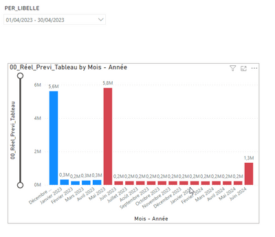
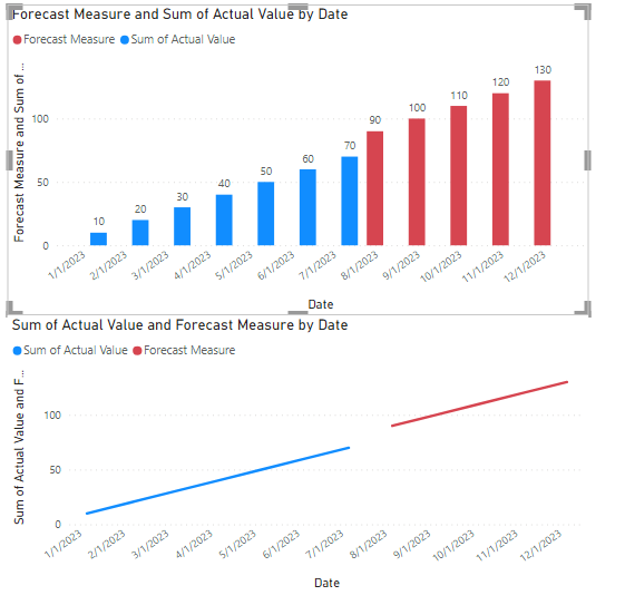
like with this bar graph :
in blue it is the actual, in red the forecast (the data are in different fact tables)
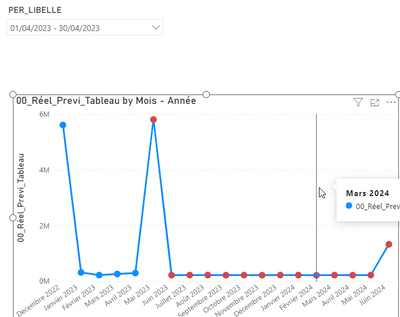
If I convert this graph to lines I get :
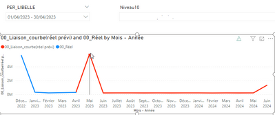
But I would not like it to be points but the line like here but suddenly realized with 2 indicators:
An idea ?
Thanks
- Mark as New
- Bookmark
- Subscribe
- Mute
- Subscribe to RSS Feed
- Permalink
- Report Inappropriate Content
Hi, @Cobra77
You can try the following methods.
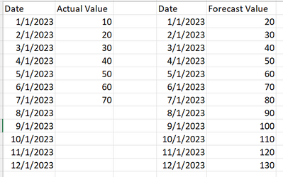
Example data:
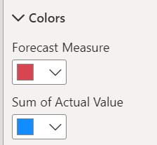
Forecast Measure = Var _actul=SUM(Actual[Actual Value])
Return
IF(_actul=BLANK(),SUM(Forecast[Forecast Value]))
Is this the result you expected?
Best Regards,
Community Support Team _Charlotte
If this post helps, then please consider Accept it as the solution to help the other members find it more quickly.
- Mark as New
- Bookmark
- Subscribe
- Mute
- Subscribe to RSS Feed
- Permalink
- Report Inappropriate Content
Hi @v-eqin-msft
Thank you for your answer, but we already obtain this result and even by linking the curves, we would like with a single indicator to be able to color from a date the curve of another color, as with the bar chart, and without the have points by putting it in line, just really the curve
Helpful resources
| User | Count |
|---|---|
| 85 | |
| 76 | |
| 73 | |
| 70 | |
| 56 |
| User | Count |
|---|---|
| 104 | |
| 99 | |
| 93 | |
| 78 | |
| 69 |
