- Power BI forums
- Updates
- News & Announcements
- Get Help with Power BI
- Desktop
- Service
- Report Server
- Power Query
- Mobile Apps
- Developer
- DAX Commands and Tips
- Custom Visuals Development Discussion
- Health and Life Sciences
- Power BI Spanish forums
- Translated Spanish Desktop
- Power Platform Integration - Better Together!
- Power Platform Integrations (Read-only)
- Power Platform and Dynamics 365 Integrations (Read-only)
- Training and Consulting
- Instructor Led Training
- Dashboard in a Day for Women, by Women
- Galleries
- Community Connections & How-To Videos
- COVID-19 Data Stories Gallery
- Themes Gallery
- Data Stories Gallery
- R Script Showcase
- Webinars and Video Gallery
- Quick Measures Gallery
- 2021 MSBizAppsSummit Gallery
- 2020 MSBizAppsSummit Gallery
- 2019 MSBizAppsSummit Gallery
- Events
- Ideas
- Custom Visuals Ideas
- Issues
- Issues
- Events
- Upcoming Events
- Community Blog
- Power BI Community Blog
- Custom Visuals Community Blog
- Community Support
- Community Accounts & Registration
- Using the Community
- Community Feedback
Register now to learn Fabric in free live sessions led by the best Microsoft experts. From Apr 16 to May 9, in English and Spanish.
- Power BI forums
- Forums
- Get Help with Power BI
- Desktop
- X-axis labelling time intervals Line & Cluster...
- Subscribe to RSS Feed
- Mark Topic as New
- Mark Topic as Read
- Float this Topic for Current User
- Bookmark
- Subscribe
- Printer Friendly Page
- Mark as New
- Bookmark
- Subscribe
- Mute
- Subscribe to RSS Feed
- Permalink
- Report Inappropriate Content
X-axis labelling time intervals Line & Clustered Column Chart
@Amit, @Greg , @tamerj1 , @lbendlin
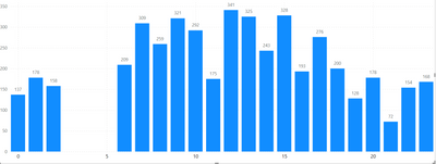
I have made a Line & Clustered Column Chart where my X-axis labels are timeclocks starting from 0, 1, 2, all the way to 23. However, when I add the Line & Clustered column chart, I can only see the labelling in the intervals of 0, 5, 10, 15 and 20 with in-between values missing. I tried to add the in between values by going under Format Your Visual and checking at Visual and General category. I found no way to edit the X-axis, I can change the color for the conditional formatting for each of the value 0, 1,2,3,4,5,6, etc..all the way to 23 but cannot add the in-between values in the X-axis. Can you please suggest how to fix this X-axis labelling issues?
Solved! Go to Solution.
- Mark as New
- Bookmark
- Subscribe
- Mute
- Subscribe to RSS Feed
- Permalink
- Report Inappropriate Content
Make the visual wider, or change the x axis type to categorical (NOTE: that will eliminate the gap).
- Mark as New
- Bookmark
- Subscribe
- Mute
- Subscribe to RSS Feed
- Permalink
- Report Inappropriate Content
What do you mean by having another column with numeric hour values? Are you saying 1:00 pm should be represented as 13:00 PM and 5:00 pm be written as 17:00 PM and then sorting them or breaking the original Hour Column into Hour AM and Hour PM and including only the relevant values there and putting the newly created columns into X-axis having 2 X-axis and sorting them ?
- Mark as New
- Bookmark
- Subscribe
- Mute
- Subscribe to RSS Feed
- Permalink
- Report Inappropriate Content
- Mark as New
- Bookmark
- Subscribe
- Mute
- Subscribe to RSS Feed
- Permalink
- Report Inappropriate Content
Thank you! This helps! Yes, after that I need to filter for the X-axis and sort the X-axis in ascending order.
- Mark as New
- Bookmark
- Subscribe
- Mute
- Subscribe to RSS Feed
- Permalink
- Report Inappropriate Content
Make the visual wider, or change the x axis type to categorical (NOTE: that will eliminate the gap).
- Mark as New
- Bookmark
- Subscribe
- Mute
- Subscribe to RSS Feed
- Permalink
- Report Inappropriate Content
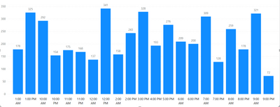
But if the X-axis is changed into AM and PM format using the DAX IF code, how do we sort the X-axis in a chronologial order from 12:00 am, 1:00 am, 2:00 am......11:00 pm? When we sort the X-axis in ascending order PowerBI reads like this:
Looks like PowerBI reads only the number in ascending order ignoring the AM & PM. Do you know how to fix this issue?
- Mark as New
- Bookmark
- Subscribe
- Mute
- Subscribe to RSS Feed
- Permalink
- Report Inappropriate Content
Have another column with the numeric hour values. Sort your x axis column by that numeric column.
Helpful resources

Microsoft Fabric Learn Together
Covering the world! 9:00-10:30 AM Sydney, 4:00-5:30 PM CET (Paris/Berlin), 7:00-8:30 PM Mexico City

Power BI Monthly Update - April 2024
Check out the April 2024 Power BI update to learn about new features.

| User | Count |
|---|---|
| 110 | |
| 94 | |
| 82 | |
| 66 | |
| 58 |
| User | Count |
|---|---|
| 151 | |
| 121 | |
| 104 | |
| 87 | |
| 67 |


