New Offer! Become a Certified Fabric Data Engineer
Check your eligibility for this 50% exam voucher offer and join us for free live learning sessions to get prepared for Exam DP-700.
Get Started- Power BI forums
- Get Help with Power BI
- Desktop
- Service
- Report Server
- Power Query
- Mobile Apps
- Developer
- DAX Commands and Tips
- Custom Visuals Development Discussion
- Health and Life Sciences
- Power BI Spanish forums
- Translated Spanish Desktop
- Training and Consulting
- Instructor Led Training
- Dashboard in a Day for Women, by Women
- Galleries
- Community Connections & How-To Videos
- COVID-19 Data Stories Gallery
- Themes Gallery
- Data Stories Gallery
- R Script Showcase
- Webinars and Video Gallery
- Quick Measures Gallery
- 2021 MSBizAppsSummit Gallery
- 2020 MSBizAppsSummit Gallery
- 2019 MSBizAppsSummit Gallery
- Events
- Ideas
- Custom Visuals Ideas
- Issues
- Issues
- Events
- Upcoming Events
Don't miss out! 2025 Microsoft Fabric Community Conference, March 31 - April 2, Las Vegas, Nevada. Use code MSCUST for a $150 discount. Prices go up February 11th. Register now.
- Power BI forums
- Forums
- Get Help with Power BI
- Desktop
- X Axis using selected month as M and then M+1, M+2...
- Subscribe to RSS Feed
- Mark Topic as New
- Mark Topic as Read
- Float this Topic for Current User
- Bookmark
- Subscribe
- Printer Friendly Page
- Mark as New
- Bookmark
- Subscribe
- Mute
- Subscribe to RSS Feed
- Permalink
- Report Inappropriate Content
X Axis using selected month as M and then M+1, M+2 and so on (to compare 2 years of orders)
Hi
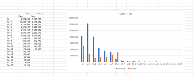
I want to visualize the below chart in PowerBI for every selected month.
For eg if the selected month is Aug (for order date)
Aug = M
Sep = M+1
Oct = M+2 and so on.
Similarly if selected month is Jul
Jul = M
Aug = M+1
Sep = M+2 and so on
The idea is to compare data for two years
is this possible? if yes is it very complicated.
- Mark as New
- Bookmark
- Subscribe
- Mute
- Subscribe to RSS Feed
- Permalink
- Report Inappropriate Content
Hi @KS_learner ,
You need to create a slicer base on base table ,and then use a measure to filter table. Due to not with your base table ,you could refer the below:
Create slicer table:
Slicer = SELECTCOLUMNS('Table',"Month",'Table'[month])Create filter measure:
filter = IF(MAX('Table'[month])>=SELECTEDVALUE('slicer'[month]),1,0)
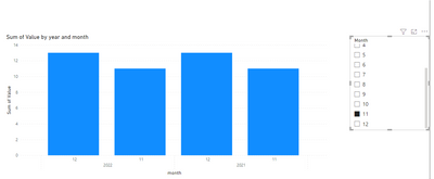
Output result:
Best Regards
Lucien
- Mark as New
- Bookmark
- Subscribe
- Mute
- Subscribe to RSS Feed
- Permalink
- Report Inappropriate Content
thanks! But i think i forgot to mention that the X axis is the requested date and the filter needs to be the order date. so the dates are 2 separate dates. do you know how to do that?
- Mark as New
- Bookmark
- Subscribe
- Mute
- Subscribe to RSS Feed
- Permalink
- Report Inappropriate Content
also the increment can be beyond 12 as well. So for eg - if a customer places an order in Sep'22 he could request it even in Oct'23. So the X asix should show customer requested date all the way to M+13 in this case (M being Sep).. is my question clear?
Helpful resources

Join us at the Microsoft Fabric Community Conference
March 31 - April 2, 2025, in Las Vegas, Nevada. Use code MSCUST for a $150 discount! Prices go up Feb. 11th.

Power BI Monthly Update - January 2025
Check out the January 2025 Power BI update to learn about new features in Reporting, Modeling, and Data Connectivity.

| User | Count |
|---|---|
| 147 | |
| 85 | |
| 66 | |
| 52 | |
| 46 |
| User | Count |
|---|---|
| 215 | |
| 90 | |
| 83 | |
| 66 | |
| 58 |


