- Power BI forums
- Updates
- News & Announcements
- Get Help with Power BI
- Desktop
- Service
- Report Server
- Power Query
- Mobile Apps
- Developer
- DAX Commands and Tips
- Custom Visuals Development Discussion
- Health and Life Sciences
- Power BI Spanish forums
- Translated Spanish Desktop
- Training and Consulting
- Instructor Led Training
- Dashboard in a Day for Women, by Women
- Galleries
- Community Connections & How-To Videos
- COVID-19 Data Stories Gallery
- Themes Gallery
- Data Stories Gallery
- R Script Showcase
- Webinars and Video Gallery
- Quick Measures Gallery
- 2021 MSBizAppsSummit Gallery
- 2020 MSBizAppsSummit Gallery
- 2019 MSBizAppsSummit Gallery
- Events
- Ideas
- Custom Visuals Ideas
- Issues
- Issues
- Events
- Upcoming Events
- Community Blog
- Power BI Community Blog
- Power BI 中文博客
- Community Support
- Community Accounts & Registration
- Using the Community
- Community Feedback
Get certified in Microsoft Fabric—for free! For a limited time, the Microsoft Fabric Community team will be offering free DP-600 exam vouchers. Prepare now
- Power BI forums
- Forums
- Get Help with Power BI
- Desktop
- X-Axis labels wrong with trend line
- Subscribe to RSS Feed
- Mark Topic as New
- Mark Topic as Read
- Float this Topic for Current User
- Bookmark
- Subscribe
- Printer Friendly Page
- Mark as New
- Bookmark
- Subscribe
- Mute
- Subscribe to RSS Feed
- Permalink
- Report Inappropriate Content
X-Axis labels wrong with trend line
I am trying to create a Line Chart with a Trend Line. However, I can't seem to get the X-Axis data labels to display correctly.
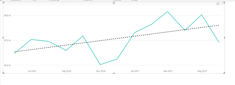
X-Axis Type=Continuous (with trend line but date labels are missing values)
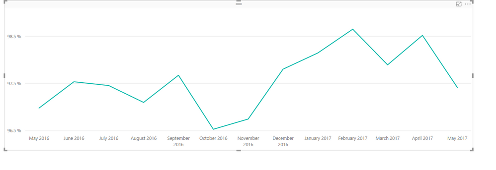
X-Axis Type=Categorical (trend line disappears)
Any help will be most appreciated!
Solved! Go to Solution.
- Mark as New
- Bookmark
- Subscribe
- Mute
- Subscribe to RSS Feed
- Permalink
- Report Inappropriate Content
What you describe is expected behavior.
In Power BI Desktop, the trend line option is only available in Line chart when you set the X-Axis to “continuous”. And Continuous is the default type for X-Axis and it does not show all values in the x-axis.
Regards,
Lydia
If this post helps, then please consider Accept it as the solution to help the other members find it more quickly.
- Mark as New
- Bookmark
- Subscribe
- Mute
- Subscribe to RSS Feed
- Permalink
- Report Inappropriate Content
Thank you for your reply. While this may be expected behavior, I can't imagine that many people would consider this as acceptable. Especially since the labels that are showing are misaligned below the data points. This makes the trend line functionality virtually useless for my application.
I hope that this functionality will be corrected soon.
Best regards,
Earlene
- Mark as New
- Bookmark
- Subscribe
- Mute
- Subscribe to RSS Feed
- Permalink
- Report Inappropriate Content
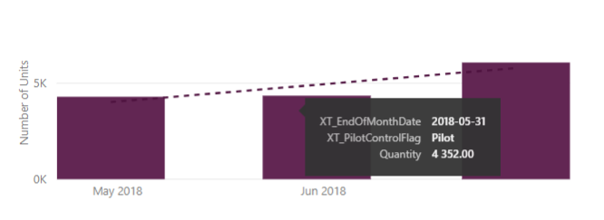
I am having the same issue and ended being forced to remove the trendline completely in order to get the correct axis labels for the bars on my clustered column chart. If I have a continuous x-axis type, the June 2018 label shifts to the middle bar which is showing the data for May 2018 (the May 2018 label also shifts left). And the righthand bar has no label (which is showing the June 2018 data). If I change the x-axis type to categorical the axis labels issues are resolved, but I loose the trendline unfortunately.
- Mark as New
- Bookmark
- Subscribe
- Mute
- Subscribe to RSS Feed
- Permalink
- Report Inappropriate Content
I have the same issue that the continuous date axis does not align with the graph itself, also one month shift.
Helpful resources

Power BI Monthly Update - October 2024
Check out the October 2024 Power BI update to learn about new features.

Microsoft Fabric & AI Learning Hackathon
Learn from experts, get hands-on experience, and win awesome prizes.

| User | Count |
|---|---|
| 115 | |
| 112 | |
| 105 | |
| 95 | |
| 58 |
| User | Count |
|---|---|
| 174 | |
| 147 | |
| 136 | |
| 102 | |
| 82 |


