- Power BI forums
- Updates
- News & Announcements
- Get Help with Power BI
- Desktop
- Service
- Report Server
- Power Query
- Mobile Apps
- Developer
- DAX Commands and Tips
- Custom Visuals Development Discussion
- Health and Life Sciences
- Power BI Spanish forums
- Translated Spanish Desktop
- Power Platform Integration - Better Together!
- Power Platform Integrations (Read-only)
- Power Platform and Dynamics 365 Integrations (Read-only)
- Training and Consulting
- Instructor Led Training
- Dashboard in a Day for Women, by Women
- Galleries
- Community Connections & How-To Videos
- COVID-19 Data Stories Gallery
- Themes Gallery
- Data Stories Gallery
- R Script Showcase
- Webinars and Video Gallery
- Quick Measures Gallery
- 2021 MSBizAppsSummit Gallery
- 2020 MSBizAppsSummit Gallery
- 2019 MSBizAppsSummit Gallery
- Events
- Ideas
- Custom Visuals Ideas
- Issues
- Issues
- Events
- Upcoming Events
- Community Blog
- Power BI Community Blog
- Custom Visuals Community Blog
- Community Support
- Community Accounts & Registration
- Using the Community
- Community Feedback
Register now to learn Fabric in free live sessions led by the best Microsoft experts. From Apr 16 to May 9, in English and Spanish.
- Power BI forums
- Forums
- Get Help with Power BI
- Desktop
- What happened to data colors and default color?
- Subscribe to RSS Feed
- Mark Topic as New
- Mark Topic as Read
- Float this Topic for Current User
- Bookmark
- Subscribe
- Printer Friendly Page
- Mark as New
- Bookmark
- Subscribe
- Mute
- Subscribe to RSS Feed
- Permalink
- Report Inappropriate Content
What happened to data colors and default color?
My current version of Power BI is 2.106.883.0 64-bit (June, 2022).
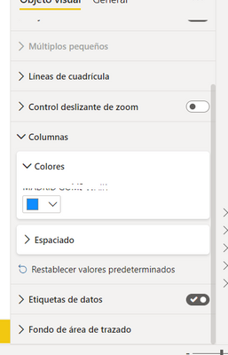
With this release, I noticed that in the formatting options for clustered bar charts, "Data Colors" was renamed to "Columns".
I have a need to update the colors of specific bars in my chart based on conditional formatting.
All content I have come across so far still refers to using "Data Colors > Default color", but this option does not exist anymore.
Can anyone tell me where/if I can find the option to set conditional formatting on my bar colors?
Thanks a bunch.
Solved! Go to Solution.
- Mark as New
- Bookmark
- Subscribe
- Mute
- Subscribe to RSS Feed
- Permalink
- Report Inappropriate Content
OK, I think I've figured it out.
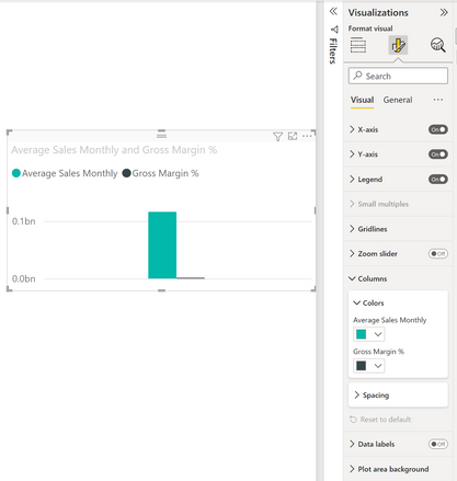
When you add multiple values in the chart, which I usually do, you don't get the default option.
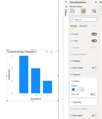
It's only when I add a single value to the x-axis, the default option appears.
In other words, you can only use conditional formatting on columns or bars if you only have one measure in the graph.
- Mark as New
- Bookmark
- Subscribe
- Mute
- Subscribe to RSS Feed
- Permalink
- Report Inappropriate Content
I want to change the color of the graph depending on the value of the bars
But I can't find data colors, or bars, I think the option is called conditional graphs.
- Mark as New
- Bookmark
- Subscribe
- Mute
- Subscribe to RSS Feed
- Permalink
- Report Inappropriate Content
OK, I think I've figured it out.
When you add multiple values in the chart, which I usually do, you don't get the default option.
It's only when I add a single value to the x-axis, the default option appears.
In other words, you can only use conditional formatting on columns or bars if you only have one measure in the graph.
- Mark as New
- Bookmark
- Subscribe
- Mute
- Subscribe to RSS Feed
- Permalink
- Report Inappropriate Content
Hi @Anonymous ,
Here it is:
Best Regards,
Jay
If this post helps, then please consider Accept it as the solution to help the other members find it.
- Mark as New
- Bookmark
- Subscribe
- Mute
- Subscribe to RSS Feed
- Permalink
- Report Inappropriate Content
This is exactly what I was looking for! It used to be under Data colors and now it's under Bars. Much appreciated
- Mark as New
- Bookmark
- Subscribe
- Mute
- Subscribe to RSS Feed
- Permalink
- Report Inappropriate Content
Not sure which version of Power BI your are using @v-jayw-msft . I'm currently using the July 2022 release, and below is what I have. There is no "Bars" option:
- Mark as New
- Bookmark
- Subscribe
- Mute
- Subscribe to RSS Feed
- Permalink
- Report Inappropriate Content
Hi @Anonymous ,
I'm using the July 2022 version too.
Under bar chart it's called "Bars" and under column chart it's called "Columns".
Best Regards,
Jay
If this post helps, then please consider Accept it as the solution to help the other members find it.
- Mark as New
- Bookmark
- Subscribe
- Mute
- Subscribe to RSS Feed
- Permalink
- Report Inappropriate Content
I noticed the same thing...looks like an "Update" thats actually a regrssion... but on the bright side you can definitely conditionally format the Y and X axis titles and Legend text 😖
- Mark as New
- Bookmark
- Subscribe
- Mute
- Subscribe to RSS Feed
- Permalink
- Report Inappropriate Content
I am really hoping this is NOT the case. I can't imagine why Microsoft would take such an important feature away, and think that users would just be content with conditional formatting on the text label around the graphs than the actual bars itself.
Helpful resources

Microsoft Fabric Learn Together
Covering the world! 9:00-10:30 AM Sydney, 4:00-5:30 PM CET (Paris/Berlin), 7:00-8:30 PM Mexico City

Power BI Monthly Update - April 2024
Check out the April 2024 Power BI update to learn about new features.

| User | Count |
|---|---|
| 108 | |
| 98 | |
| 78 | |
| 66 | |
| 53 |
| User | Count |
|---|---|
| 139 | |
| 100 | |
| 95 | |
| 85 | |
| 63 |


